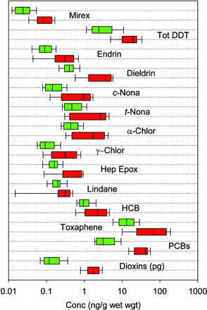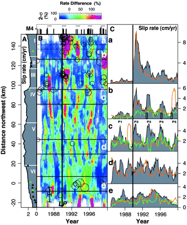

The use of visualization is pervasive in the media: explanatory diagrams in magazines, graphs describing the projected impact of a new state budget, new experimental data plotted against theoretical expectations, etc. In each case, the author of the visualization tries to convey a point of view by emphasizing some aspects of the data while toning down other aspects. The result can vary widely, from informative to misleading.
For this assignment, pick out two examples, one good and one bad visualization, from any of the following sources:
The following domains may be used:
Once you have selected a good and a bad example, make a web page. Include in your web page both pictures, and two paragraphs for each picture. The first paragraph should tell the story behind the picture: what does this picture show? The second paragraph should critique the visualization, explaining why you think it is good or bad. Be specific, and include criteria such as accessibility, clarity, accuracy, or any other criterion about the design of the visualization that you feel is important. Make your web page publically accessible, and be prepared to show your web page and briefly your findings in class.
If you do not already have a personal web site, see the webpage setup section of the CS Dept FAQ for how to set one up in the CS domain.
Send me (tmm@cs.ubc.ca) the URL of your page by noon Wednesday Sep 15.
Credit: assignment inspired by Pat Hanrahan
Examples: see last year's submissions