Good Visualization: Crystallographic structure of AmtB
From: http://www.sciencemag.org/content/vol305/issue5690/cover.shtml
This protein is a bacterial channel that transports the gas ammonia. During transport, ammonium ions (NH4+, the green sphere) are recruited and -cation stabilized; then only uncharged ammonia (NH3) enters the hydrophobic channel itself (three purple spheres). This mechanism prevents leakage of other ions or transmembrane potential.
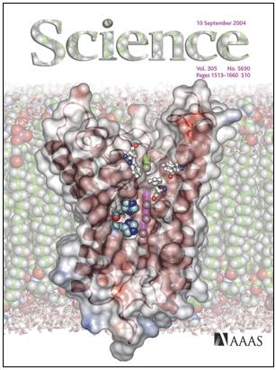
I like this visualization because it shows a lot of information (secondary and teriary protein structure, position in the larger membrane structure, types and locations of other relevant molecules) without appearing too overwhelming or cluttered. It also looks pretty. However, I might simplify the background (membrane structure) a little to highlight the object of interest and reduce clutter even more.
Bad Visualization: Ocean Depths and Locations of Seismometers
From: Science, Vol 280, Issue 5367, 1215-1218, (May 22, 1998), http://www.sciencemag.org/cgi/content/full/280/5367/1215/F1
This image shows ocean depth using a colour scale, and indicates positions of ocean-bottom seismometers (icons). Symbols indicate whether data include three-component seismometer readings (open triangle) or pressure only (open circle), or whether no data were returned (inverted, filled triangle).
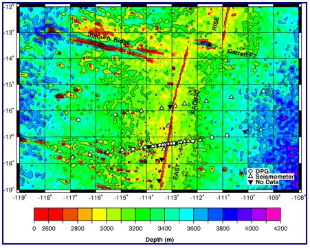
This visualization is bad because of the colour scale. The rainbow creates perceptually distinct categories, and the bright, saturated colours dominate the image and make the seismometer icons very hard to see.