Source: "The Myth of the Beginning of Time: Two Views of the Beginning," Gabriele Veneziano. Scientific American April 26, 2004.
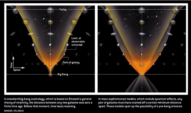
This visualization is meant to represent 2 representations of "The Big Bang." The first is based on Einstein's general theory of relativity and shows that at the moment when time began, there was no distance between any two galaxies; in other words, all galaxies occupied an infinitely small space. The second visualization represents a theory of the big bang which incorporates quantum effects. In this theory, galaxies must have come into existence with distance already between them. As the text states, this leaves the possibility of the universe existing before the big bang. The visualization depicts time progressing on the vertical axis and space expanding on the horizontal axis. The two spaces which are expanding are the distance between two galaxies moving and the limit of the observable universe.
This visualization is bad because it adds nothing to the text. We could just as easily read the caption and come away with the same information, except for the fact that the second representation allows galaxies to continue to exist and move outside the limits of the observable universe. While the picture is pretty, it does not accurately represent the movement of galaxies over time -- not in shape, color or the positions of those goofy-looking galaxy icons. The only dependable bit of information is that in one picture the galaxies begin at the same point and in the other the galaxies begin with distance between them. All in all it seems to be magazine fluff to grab the reader's eye.
A good visualization:
Source: "PADI-Simul: an agent-based geosimulation software supporting the design of geographic spaces," Bernard Moulin, Walid Chaker and Jeremi Gancet. Computers, Environment and Urban Systems Volume 28, Issue 4, July 2004, Pages 387-420.
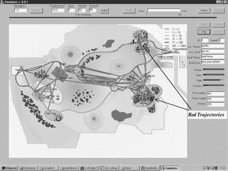
This is a screen-shot from research software designed to help design "geographic spaces" i.e. parks, playgrounds, campuses, etc. In this particular shot, a park has been designed and the simulation has been run with multiple agents traversing the park based on various needs and wants. By discovering the most common trajectories, designers can decide on useful paths to build into the park. When the graph is in color, it is a picture of the park, with various sites identified by text or icons (e.g. toilets, trees). The trajectories are color coded based on the number of agents who walked that path. Sites A & B denote red trajectories (the most highly used).
Even though this picture is not particularly pretty, and even though we have missed out on the color due presumably to the budget constraints of the journal, this visualization is good. It efficiently and without distraction lays out a detailed map upon with its points of information can be displayed. The trajectories appear to be, giving a little leeway for the grayscale, easily distinguished and do not obscure the map. Further, the extra sidebars with software options give us an idea of the motivations the agents are balancing. Finally, this appears to be a clear, relatively unskewed representation of the real geographic space.