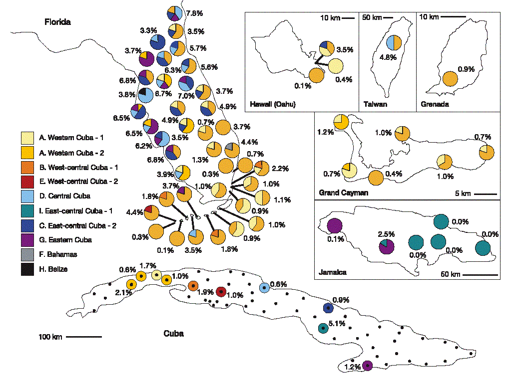
Description: This image shows the sources of genetic variation in introduced populations of a certain species of lizards, A. sagrei. The populations were introduced in Florida, Hawaii, Taiwan, Grenada, Grand Cayman and Jamaica, and the source populations came from populations native to various locations in Cuba. The variation in the introduced locations, as well as the local Cuban populations most related to the introduced types, are represented.
Rationale: This is a good visualisation because it manages to convey a very large amount of data in a relatively simple diagram, without cluttering up the viewer's perception. Its main strength is the use of various types of visualisation techniques to represent different measures. The viewer can then focus on each characteristic of interest in turn. For example, the source of genetic variation is clearly represented with pie-charts in a variety of easily-distinguishable colours. The pie-charts are positioned in space as to correspond to the locations where the measurements were taken. Moreover, it seems that the native Cuban populations are represented on a colour gradient, from yellow to purple from West to East, respectively. Coloured charts are an easy way to see the proportion of each genotype in a given location. The percentages next to each location indicate the mean genetic sequence divergence within that population. They are a single value, yet are a very effective measure of overall variation. Finally, the letters in the colour key correspond to the representations used in a previous figure (not shown), bringing consistency to the overall organisation of the paper, and allowing the reader to carry over the mental map of the species distribution developed prior to seeing this figure.
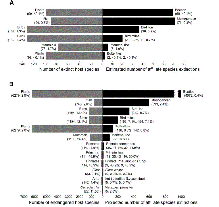
Description: This image shows the estimated numbers of
historically extinct affiliate species based on the number of host
species that have been recorded as extinct, as well as the projected
number of extinctions of affiliate species assuming all currently
endangered host species become extinct. The diagram consists of bar
graphs, as well as a set of two numbers of parentheses, both for the
host and affiliate species. The numbers show the absolute number of
extinctins as well as express it as a percentage of the overall species.
Rationale: This is not a very good visualisation because it presents the data in a somewhat confusing manner. First of all, the horizontal scale (representing the number of species) is different for the host and affiliate species in both sections, immediately skewing the viewer's perception. Secondly, the size of the bars corresponds to the number of extinct species rather than the percentage of those with respect to the overall number of species. In my opinion, a percentage on an equal scale for both sides would work better, because then the reader would immediately be able to see that, for example, for many of the pairs the percentage of host and affiliate species going extinct is approximately the same, while for the last measure in part B (Canadian fish and Metazoan parasites), the parasites seem to have proven to be quite resilient to extinction of the fish, as shown by the much smaller extinction numbers of the parasites when compared to the fish.