Assignment 1: Good and Bad Visualizations

CPSC 533C: Information Visualization

Good Visualization

Background Information

The basic food pyramid is developed by the U.S. Department of Agriculture and supported by the Department of Health and Human Services. It is used as dietary guides for Americans. The Atkins's food pyramid (Figure 1) modifies the basic pyramid and is developed by Dr. Robert C. Atkins and his associates (http://atkins.com).

Why is it good?

Figure 1 conveys a number of important information using a simple, easy-to-understand diagram. The relative sizes of the area occupied by the five food groups indicate the relative recommended daily intake of those foods. Commonly encountered foods are used both as examples, and examplars of the food groups. Note that this is achieved without the need to name the groups, and thus remove the visual complexity of hierarchical grouping.

The relative recommended intake is reinforced by the pyramid metaphor, where the "base" of the pyramid also implies "foundation". Applying this metaphor to food intake, the bottom food group is therefore the "foundation" or basis of the recommended diet.  The pyramid metaphor is visually displayed as a triangle.  In addition to being visually consistent with the pyramid metaphor, the triangular shape creates an perceptual illusion of increasing row height going from top to the bottom of the pyramid despite the equivalent row heights. This visually reinforces the emphasis on the food groups at the bottom of the pyramid..

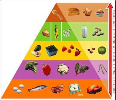
Figure 1: Atkins Food Pyramid. 
Source: Atkins Nutritionals http://atkins.com/Archive/2004/2/10-121449.html


Figure 1 has an additional feature: the arrow indicating recommended options with increasing exercise. This simple addition is effective because it,
  1. Is on the side, i.e., does not visually pollute the main basic food pyramid;

  2. Extends the basic pyramid by providing further examples of the food groups, especially for the upper groups where in the basic diagram, space have been limited;

  3. Is visually linked to the basic food pyramid by alignment and colour, so as to indicate the extra food group options made available with additional exercise--starting from the basic protein sources and move up the pyramid;

  4. Reinforces the basic philosophy of the diet by showing the recommended daily intake of the least desirable food group will never be as much as that of the bottom groups despite exercise;

  5. Builds on the pyramid metaphor where the arrow points up against gravity to indicate increasing exercise, which implying physical exertion, and perhaps progressively more so when at higher "altitudes".

Bad Visualization

Background Information

Figure 2 is a very simple visualization that attempts to display the arsenic distribution in Bangladesh, which has reached a crisis in the drinking water in that area. Figure 2 presents this relatively simple information by using a 2D geographic map of Bangladesh, and superimpose the arsenic distribution of the sub-regions on this map using a modified pseudocolour encoding.

Why is it bad?

1. Use of Pseudocolouring
Pseudocolour encoding is a technique to represent continuously varying map values using a sequence of colour.  Using this technique to encode a single variable is problematic in itself. The optimal use of hue (or colour, as used in common English) is for discrete encoding, since colour is not perceptually ordinal. For example, it is difficult to comment on the question, "is blue higher or lower than green?". For continuous (and therefore ordered data), encoding with luminance or saturation is much preferred perceptually. For example, it is easier to understand and learn that "red is higher than pink". A related problem is reading values directly from the map. Since the difference in colour is perceptually small among the different levels, it is difficult to assign values to colour on the map based on the scale. For example, the colour used for 200-300 ug/L is almost perceptually the same as that for >300 ug/L level. One side note in using colour is the consideration for users with colour-blindness. For users with red-green colour blindness, the greens and the reds are indiscernible, which is particularly problematic in pseudocolouring, as the "greens" are in mid-range of the scale (in this case, from 20-50 ug/L), and the reds are in the high range (from 50- >300 ug/L).

2. Deviations from Pseudocolouring
Figure 2 deviates from the pseudocolour encoding in two significant ways--it creates an impression that the scale and hence the encoding is discrete, and it deviates from the original encoding by using only parts of the visible spectrum.

Figure 2: The distribution of Arsenic.
Source:
Scientific American, Aug 2004, p. 89.
 

  1. Discrete scale:  Since arsenic distribution is a continuous data, and pseudocolouring is also continuous, it is unclear why a discontinuous scale is used to represent the encoding. This choice of the scale creates a confusion: "is the encoding itself discrete, or continuous?". This cannot be easily deciphered by inspecting the diagram, since the colours used in the scale is barely discernable from one another (e.g., 200-300 and >300 ug/L seem the same).  If it is discrete, then the encoding unnecessarily reduce the resolution of the visualization, and imposes arbitrary divisions.

  2. Arbitrary divisions: The same difference of 2 ug/L is presented in dramatically different ways: going from 21-23 ug/L the green colour remains unchanged; going from 19-21 ug/L, the colour changes from light-blue to green; going from 49-51 ug/L, the colour changes from green, to the much more "alarming" pink. This colour coding implies a threshold of concern of 50 ug/L, which may or may not be the intend of the author of the diagram.

  3. Missing colours? The original colour sequence approximates the visible spectrum, going from red (at the high end) to orange, yellow, green, blue and finally purple. In Figure 2, the yellow part of the spectrum is missing in the scale and from the encoding, further emphasizing the 50 ug/L division perceptually, which again, may not be intentional.

  4. Two last small notes on the scale:
    (1) Should a concentration of 50 ug/L be green, pink, or somewhere in between on this diagram?
    (2) Does the Bay of Bengal contain arsenic at 10-20 ug/L, as indicated by the light-blue colour of that area?


last updated: September 14, 2004 at 23:51 by Heidi Lam