CPSC 436V Trophy

CPSC 436V: Topics in Computer Science - Information Visualization
University of British Columbia, Instructor: Tamara Munzner

Hall of Fame

Best Projects, Spring 2020

The Disney Storey
Bang Chi Duong, Jenessa Tan, Ana Katrina Tan
We are using a scrollytelling approach to tell the story of the Disney animation studio. We provide a background of the animation studio in relation to the Walt Disney company through financial data. Afterwards, we allow our viewers to explore and learn more about the different movies, the eras of disney animation, and some of the actors behind Disney’s lovable characters.
Actor Adaptability
Mara Colclough, Ethan Tam, Ian Del Rio
Actor Adaptability is a visualization that showcases actors' flexibility and ability to act in multiple genres using data from the top 1000 movies of the last decade. The main view is a network diagram that shows all the actors of the dataset and the genres they tend to act in. Viewers can use this to see how actors compare against each other in the number of movies and diversity of genres they have been in.
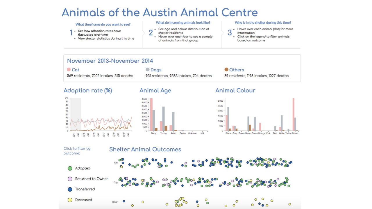
Animals of the Austin Animal Centre
Michael Zhang, Polly Tang, Eris Lam
This project features data from the Austin Animal Centre, which intakes 20,000 animals annually and whose work is a leading factor behind Austin, Texas’ status as the "largest no-kill community" in the US. Using three distinct interactive visualizations and a statistics panel, the app presents data on animal outcomes collected from Oct 2013 to Dec 2019. Users can identify trends in historical data, such as fluctuation of adoption rates by time of year or animal type, as well as comparison of animal demographics in terms of age and colour. This gives the users the opportunity to gain a better understanding of adoption preferences and focus on efforts to boost the chance of survival for historically overlooked animals due to characteristics such as age or colour.
Visualizing the New York Times' Democratic Primary Coverage
Roger Yu-Hsiang Lo, Jeff Miiller, Mike Powar
This project aims to visually assess the New York Times' coverage of the primary race of the upcoming US presidential election for the Democratic Party. One common and intuitive way to evaluate a news article is to quantify its affective states — its sentiment — that span a continuum from negative through neutral to positive. The visualization allows users to get a quick glimpse of how the NYT coverage presented the candidates to its readers in terms of its sentiment and will also show how the coverage changed over time throughout the primary race.
Facebook Political Pages
Our project allows the general public to explore a dataset from 9 American political pages on Facebook from September 2016, around the time of some key political moments such as the first presidential debate. The visualization allows users to explore patterns concerning truthfulness ratings, engagement counts, and post formats from 2000+ posts from across the political spectrum.