1127 NYT articles between December 2018 and April 2020, the headline of which mentioned Joe Biden, Michael Bloomberg, Pete Buttigieg, Bernie Sanders, and Elizabeth Warren.
One way to analyze a string of text is through sentiment analysis. Broadly speaking, sentiment analysis is a technique to identify affective states of text. Here, we use VADER, a Python sentiment analysis library, to estimate a sentiment score based on the headline, snippet, and lead paragraph for each article. A sentiment score lies in between -1 and 1, with negative numbers for negative sentiment and positive numbers for positive one.
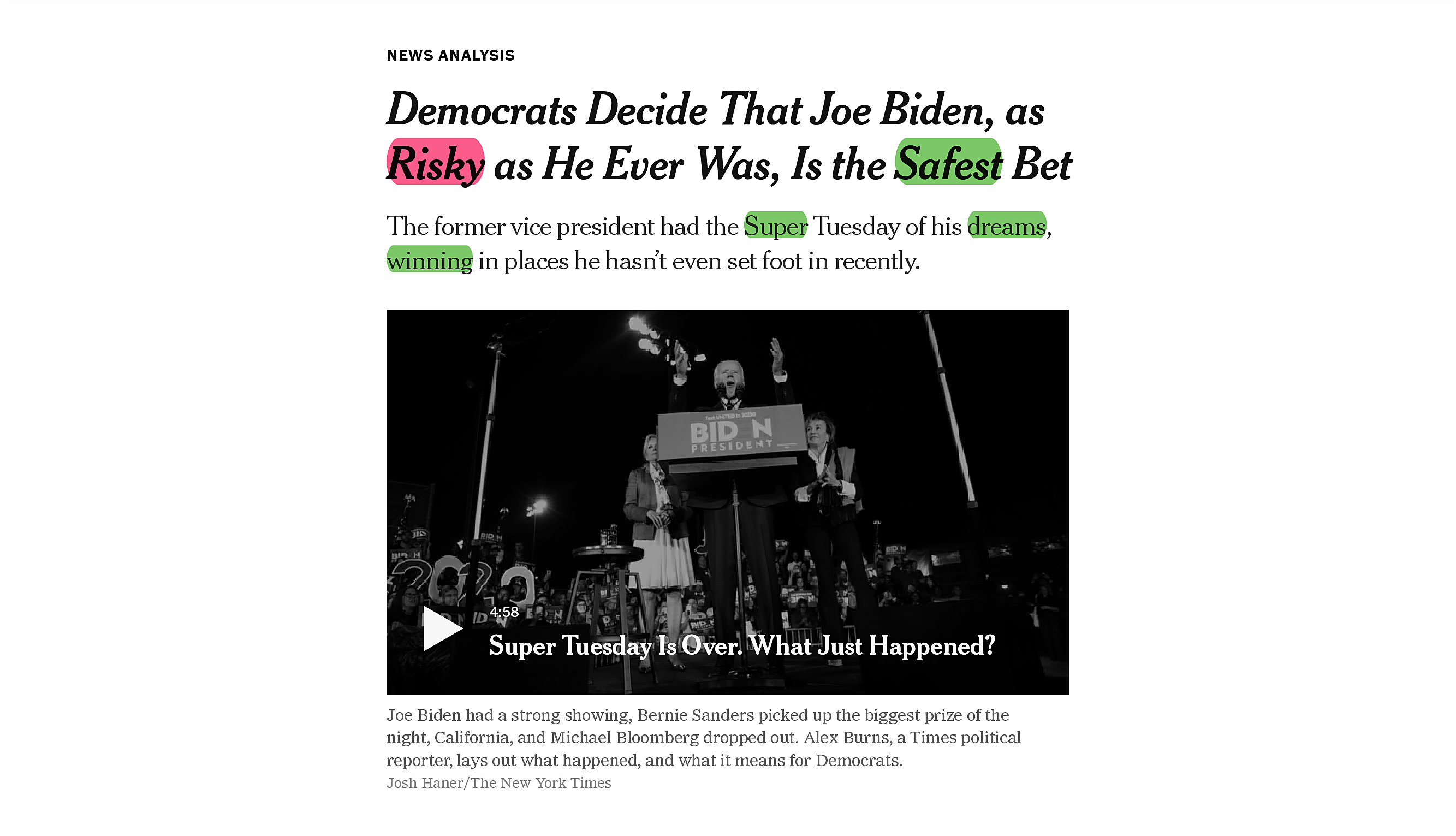
Looking at the example to the left, words highlighted in green have positive sentiment while those in red have negative sentiment. The final sentiment score is the average of these word-based sentiments.
Here, each article is represented by a bubble.
The color of a bubble corresponds to the section in which the article was published.
The size of a bubble tells you about the number of words in the article.
You can find the sentiment score associated with a bubble/article by checking its x-axis position.
The vertical bar shows you where the mean sentiment score is.
When you hover over a bubble, more information about the bubble/article will appear in a toolbox, including the headline, publication date, and sentiment score.
You can split the bubbles according to candidates by selecting
on the top of the chart.
Alternatively, you can select
to gather all the bubbles back to the center.
You can also use the checkboxes on the top to choose the categories of articles that you want to see.
Tired of politics? Then just uncheck
Interested in a particular time period of the Democratic primary? You can drag your mouse over it to select a time period you would like to focus into in the charts below. Drag it to move the selected time period.
Interested in precisely what these key events are? Hover over the events in the chart's time axis to get more info.
Want a detailed narrative description of the Democratic Primary? Select a time period smaller than a month with the brush and then move it from the start of the timeline to the end to see exposition on defining moments in the primary.
Hover over the individual candidates polling averages to see shifts in approval throughout the campaign or their sentiment scores to get a sense of the ebb and flow of sentiment analysis.