Matches, Mismatches, and Methods:
Multiple-View Workflows for Energy Portfolio Analysis

Matthew Brehmer, Jocelyn Ng, Kevin Tate, and Tamara Munzner


Abstract | Paper | Talk | Videos | Figures | Supplemental Material

Abstract

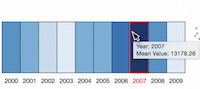
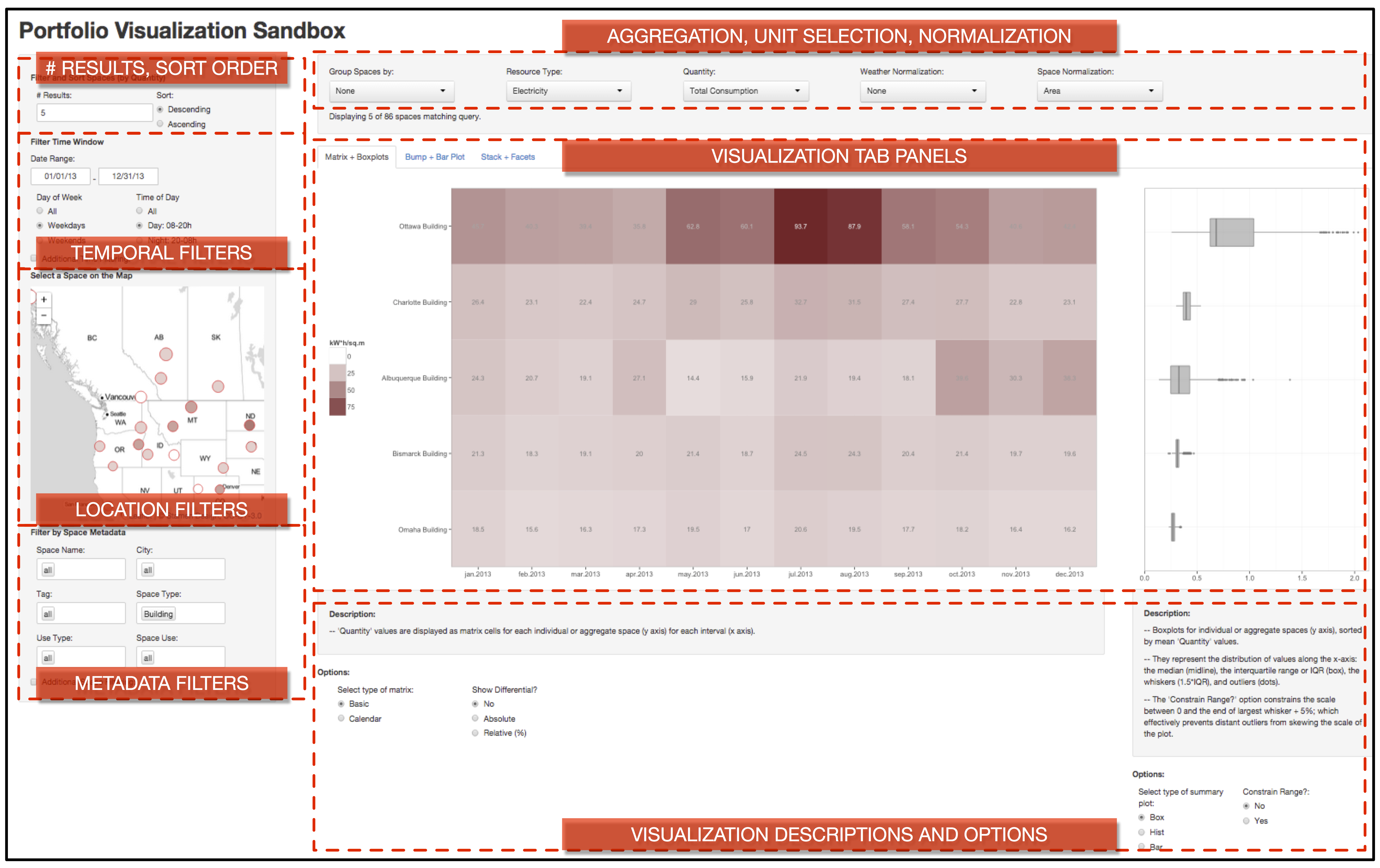
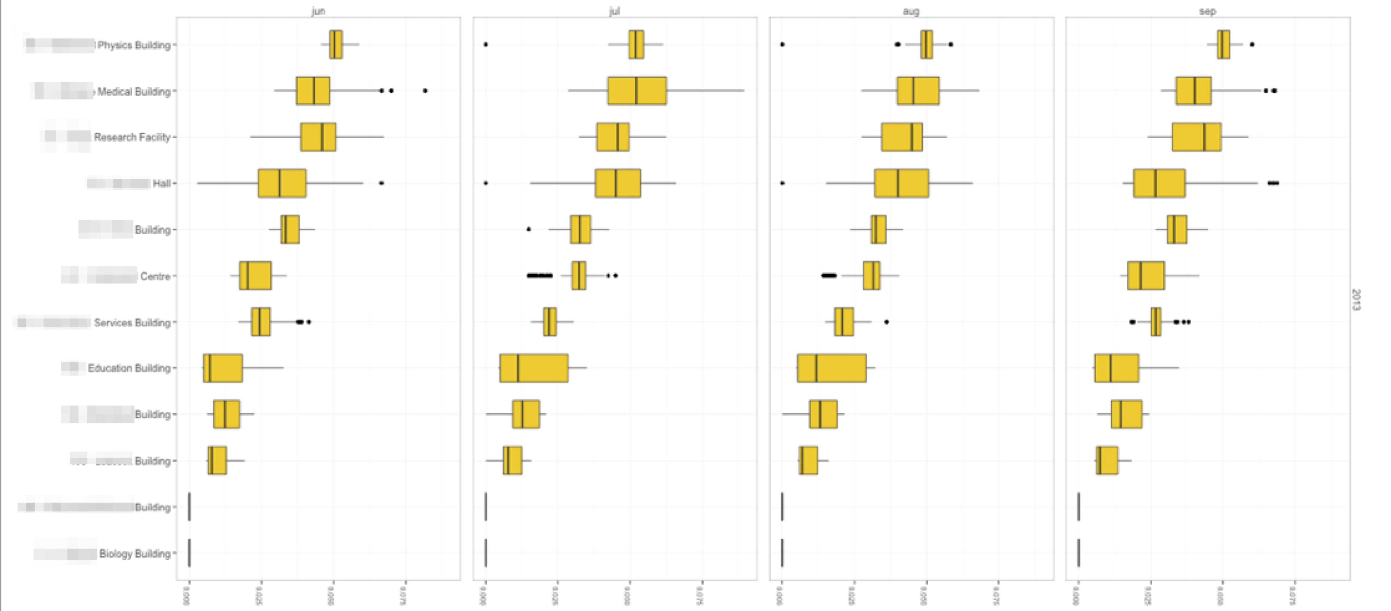
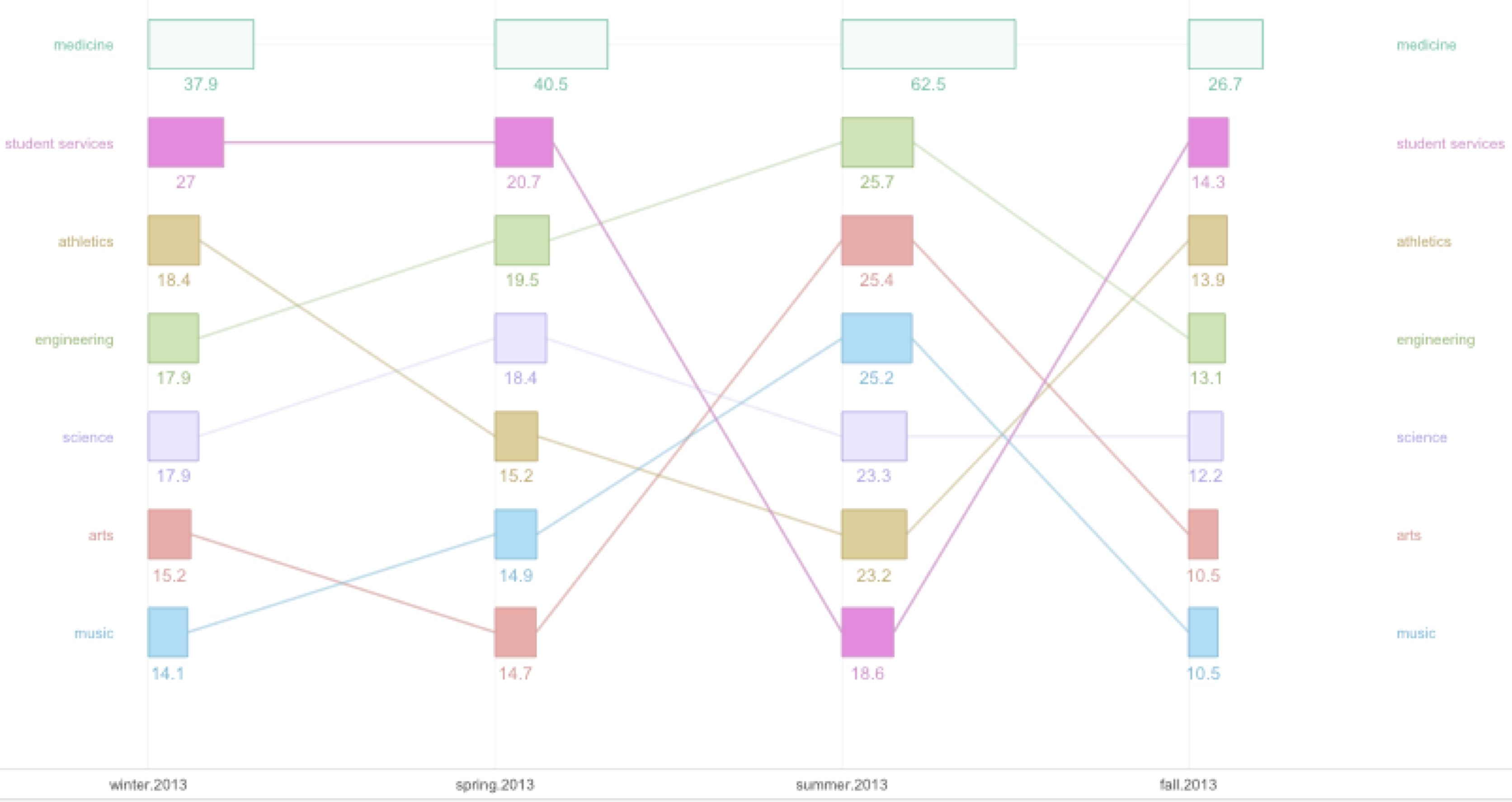
The energy performance of large building portfolios is challenging to analyze and monitor, as current analysis tools are not scalable or they present derived and aggregated data at too coarse of a level. We conducted a visualization design study, beginning with a thorough work domain analysis and a characterization of data and task abstractions. We describe generalizable visual encoding design choices for time-oriented data framed in terms of matches and mismatches, as well as considerations for workflow design. Our designs address several research questions pertaining to scalability, view coordination, and the inappropriateness of line charts for derived and aggregated data due to a combination of data semantics and domain convention. We also present guidelines relating to familiarity and trust, as well as methodological considerations for visualization design studies. Our designs were adopted by our collaborators and incorporated into the design of an energy analysis software application that will be deployed to tens of thousands of energy workers in their client base.

Paper

Matches, Mismatches, and Methods: Multiple-View Workflows for Energy Portfolio Analysis
IEEE Transactions on Visualization and Computer Graphics (TVCG). 22(1), p. 449-458.
Proceedings of IEEE Conference on Information Visualization (InfoVis), Chicago, USA, 2015
.

Talk

Matthew Brehmer presented this paper in the Design Studies and Methodology session at 11:50 AM CT on October 28th, 2015 at IEEE InfoVis 2015.

Videos

High-Resolution Figures

Click on a Figure to open in a new tab.
Fig. 1. Energy Manager, our collaborators' existing energy analysis tool. (a) A dashboard for a portfolio of buildings. (b) A superimposed line chart of energy demand and (c) a grouped bar chart of energy consumption (bottom) for a group of three restaurant buildings within this portfolio.

Fig. 2. A sandbox design environment for visualizing energy data from a portfolio of buildings. Designs depicted in Figures 3, 4, 5, and 7 were also produced within this environment. A matrix of aggregate energy intensity values with auxiliary boxplots is shown for 5 (of 86) buildings, those with the highest intensity. Client portfolio data has been anonymized by changing building names and location; all other data is real.

Fig. 3. Faceted boxplots that encode aggregate area-normalized energy demand distributions for 12 buildings across four months, sorted in descending order according to the average demand value for this four month period. A mismatch for the Drill Down task (T2). Building names are blurred to sanitize real client portfolio data.

Fig. 4. A bar + bump plot of energy intensity, encoding rank change for the top 7 building groups (buildings aggregated by tag) across four seasons. The alpha channel encodes rank variation to highlight inconsistent buildings. A potential match for the Overview task (T1).

Fig. 5. A time series calendar matrix of energy intensity savings for 7 building groups (buildings aggregated by shared categorical tag), relative to historical values (blue = savings, red = higher than historical intensity). A potential match for the Overview task (T1).

Fig. 6. An interactive auxiliary boxplot prototype: boxplots corresponding to the brushed time period are shown alongside the boxplot for the entire time series.

Fig. 7. A stacked area chart of energy demand data for 4 library buildings, juxtaposed alongside faceted line charts of the same data. The same building is highlighted in red in both the stack and the facets.

Fig. 8. The redesigned Energy Manager that incorporates many aspects of our prototype designs. On the left, the Site Overview (a time series matrix) is juxtaposed with coordinated Value Range (boxplot) views. An energy worker can easily switch between units such as energy consumption or energy demand and filter or aggregate the set of buildings to those that share a common categorical tag; by selecting a column of the matrix, she can drill down to faceted or stacked visualizations of consumption (top middle, top right) or demand (bottom middle, bottom right).

Supplemental Material


Matthew Brehmer
Last modified: Aug 3, 2015.