Introduction
Website administrators are often interested in seeing the ways in which their users navigate around the site. Most statistical tools offer plenty of reports for overall site trends and statistics. The advanced commercial packages, such as Webtrends 7 [click on 3. Path Analysis] offer visualization of incoming and outgoing traffic flow for a specific page. However, the statistics view is almost always separated from the view of the page itself. In order to understand what parts of specific page are being used frequently, what parts are generally ignored, and how the page layout can be streamlined to make most important elements more discoverable, the analyst has to flip back and forth between the traffic flow report/diagram and the page itself. Since these two views often have radically different layout, the task may end up more difficult than it could be.
Some statistical tools, for instance Urchin, do display basic popularity data inside the page. I would like to expand that approach to show the "visual return on screen space investment" for links.
Proposal
I propose an in-page view of incoming and outgoing link popularity. Since the page layout and look is retained, a single glance will show which elements of the page are "working" and which are not. Navigation is performed just like on the original page, and familiar browser features like tabbed browsing or history are available to the user.
The data is displayed in overlays above the links, or injected into text flow right after the link. Different kinds of overlays can be shown, including plain old link popularity, link popularity weighted by size, and popularity weighted by size and position.
This view is not intended to be a single comprehensive source of website usage statistics. In real world implementation, it would be useful as low-level view of the data that auguments higher-level graphs and reports
Visualisation
The following mockup shows a single fragment of a page in different view modes. Obviously, only one mode will be seen at a time. Modes could be switched with buttons that application adds to browser interface.
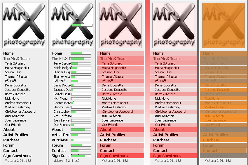
The leftmost column holds the original sidebar from a photography website
The second column demonstrates link hit meters that are attached to every link. They are going to show ratio of clicks on the specific link over the total for all the links on the page (that is, overall importance of link). Since this measure could produce radically different results for different links, logarithmic scale could be used to make both high and low ranges comparable. In this example, hit meters are positioned inside links, as placing them inside text flow will severely shift text inside menu. However, sparse links inside normal text flow would look better with the meter inserted right after the link, displacing the following text.
Another interesting efficiency measure is ratio of clicks divided by area occupied by the link. This measure indicates how well is the space is utilized. I plan to display it as coloured semi-transparent overlays that will highlight frequently-used targets that are not given adequate space (column 3), or space hogs that are not particularily useful (column 5). Position of an element should also be taken into account - top of the page attracts more attention than the bottom, and so links that are close to top could be required to capture more clicks to get the same overlay saturation (column 4, shows a gradient gutter to inform the user that the itensity is scaled).

Finally, visualization of sources (pages from which visitors arrive to current one) could be shown on top of the page. Above you can see a simplistic mockup of a spatial source display. It is partitioned spatially to fit the most popular sources, and pehaps a "More" link leading to a more detailed report could be added to it.
Example use case
Terje is interested in reorganising the menu on his site to help visitors find what they are interested in faster. He starts the application, and tries applying different views. He would probably prefer bar view for looking at popularity of photo thumbnails (as photos do not combine well with colour overlays), but in this case, overlay view is definitely cleaner. He sees that some photographers hardly get any attention, while others are popular, and makes a note to change their order or hide the less-interesting ones from the list. After enabling top-to-bottom importance scaling, he also notes that top logo does not offer much functionality for its size, and that he should consider dropping it. Finally, he notes abnormally low use of Purchase menu option. Since every photo on his site is accompanied by "Buy Print" button, visitors appear to ignore non-specific Purchase option. Therefore, it is also a candidate for removal.
Implementation structure
The simplified data flow inside the application:
- The data is extrated from HTTP server log files by the log analyzer
- The browser requests a page on analyzed site
- The request is intercepted by the proxy server
- The proxy server injects the data and a reference to Javascript renderer into the page
- When the page loads, Javascript renderer builds the visualization on top of the page. Some parts of renderer interface can be located inside the page, while others can be placed within the browser toolbars
I expect to use Opera as the browser component for my visualization system. The reasons for that are ease of toolbar and keyboard shortcut customization, and availability of full-page zoom feature (which would add instant bird's eye view with no implementation cost). I am going to use a full-weight browser and not just a slimmed down browsing control, so all the navigation features of normal browser are going to be available.
The choice of log analyzer is less clear, but since there are so many of them, finding a fitting one should not be a problem.
The proxy server will most likely be implemented from scratch in Java.
Potential pitfalls
- Browser redraw bugs and Javascript limitations may increase implementation time beyound reasonable limits
- The application structure is fairly complex, and making all pieces play together could be challenging
- Dynamic movement effects inside page itself may end up detaching elements from their overlays. This must be avoided at all costs!
Personal expertise
I have experience with client-side webpage layout and with implementing network protocols (FTP, HTTP). I do not have much experience with visualization.
Milestones
- Build a basic overlay generator in Javasript
- Modify default Opera shortcuts and toolbars to allow user to access overlay switching
- Write the mangling proxy server to inject data dynamically
- Find a good log processing tool and get someone to share their statistics with me