VISUALIZATION AND CLUSTERING OF
HEART DATA
CPSC 533C
– Information Visualization Final Report
Juan Gabriel Estrada Alvarez
Department of Computer Science
University of British Columbia
201-2366 Main Mall
Vancouver BC Canada V6T1Z4
estrada@cs.ubc.ca
Abstract: The circulatory system is one of
many complex dynamic systems that are yet not well understood. Health
scientists have long been studying its signal to try and determine its
behaviour and what can influence it. But studying a signal is difficult if you
do not compare it to other signals from the same - or another similar - system.
In turn, such comparison is difficult if, for each signal, its recording did
not start at the beginning of some ‘behaviour cycle’ (which does not have to be
the same for every signal). Some comparison techniques for dynamic system
signals range from direct (perhaps measuring a ‘distance’ between two signals)
to utilizing clustering techniques to classify them. But such techniques may fail
to convey meaningful information for raw signals that do not meet the condition
mentioned above. Here an idea for utilizing clustering to classify heart
signals is presented, and then a TimeSearcher based tool, ClusterTimeSearcher, is
introduced for performing the task of clustering and visualizing such signals.
Keywords: clustering, dynamic systems, time
series, visualization
1.
Introduction
Time series are a research focus of many scientists
looking to explain the behaviour of dynamic systems that can be found in our
everyday surroundings. The weather system is particularly of interest, for
example, because its study may provide us with a better of understanding of
climate change. But an interesting realization is that we are also excellent
examples of complex dynamic systems. Health scientists have long been
interested in finding the behaviour of our dynamic sub-systems to understand
the overall (healthy) state of the whole. This is of benefit for properly
diagnosing and consequently treating patients who may otherwise be unaware of
their own condition or in cases where the underlying cause of illness is not
well understood. Here we concentrate on the circulatory sub-system, although it
is possible to generalize the ideas presented to other dynamic systems.
Researchers have been studying data obtained from the
circulatory system in the form of cardiac rhythm for years. In particular,
recorded cardiograms provide a type of time series representation (herein
called just ‘a signal’) that can be used for analysis. Most of this analysis
would come from the comparison of different signals for the purpose of
discovering and classifying the underlying mechanisms that rule the behaviour
of the circulatory system, ultimately resulting in ways of correctly diagnosing
patients.
1.1. Motivation
As heart disease is often one of the medical areas
where doctors try to diagnose or narrow down the possibilities for what exactly
may be going on with a patient, time is critical if the patient is affected by
a severe illness. One of the things that most doctors would like to do in an
easy - and not so cluttered - way is to analyze the heart signal (using
cardiogram data or blood pressure data, among others). With an appropriate tool
to do this, they might be able to perform faster and more accurate diagnoses. But
it is only until recently that new technological advances have enabled
researchers to gather enough data for heart signals long enough to do further
study.
Now that the data is available we face other challenges
in order to perform analysis. As mentioned above, much analysis is performed by
comparison. However, comparison of raw signals is often not very meaningful if the
signals involved are not all known to start at the beginning of some ‘behaviour
cycle’ - possibly a different cycle for each signal. And without being able to
meaningfully compare them, we cannot expect to be able to classify them
properly. Another challenge is the scarcity of tools to properly visualize
heart signals that would facilitate classification.
In the next section I propose to overcome the
challenge of clustering by pre-processing the signals in order to remove the
restriction mentioned above, and introduce an algorithm for clustering the
signals. In section 3 I introduce ClusterTimeSearcher, a tool in development
for clustering and visualizing the data to facilitate its study. Finally, Section
4 deals with some evaluation of the tool and some of the results obtained.
2.
Solution
2.1.
Signal pre-processing
In order to remove the restriction that all signals
start at the beginning of some behaviour cycle, we need a different
representation for the signals that is independent of time. Such a
representation is then good for comparing signals if we assume that each signal
is contained within its behaviour cycle. Thus, all we need is to find a
function f that maps signals into such a time independent domain.
Here the Fourier Transform [1], a well
known spectral analysis technique, is used in order to map the signals to the
frequency domain. In particular, the power spectrum of signals – the plot of
the magnitude of their Fourier Transform – is often used for analysis. Other
techniques for analysis exist, such as wavelets, but may require a bigger
computational complexity. The main focus here is to use clustering to classify
heart signals, and so the Fourier Transform should suffice for this task.
2.2.
Clustering
Utilizing clustering on a set of signals would ideally
group them into clusters that correspond to the same ‘state of the heart.’
Examining a cluster would then mean to examine the individual signals contained
in it. But what kind of clustering should be done largely depends on the properties
of the data set at hand. In this case, our data set consists of the power
spectra of heart signals containing pulse interval information. These pulse
interval data is a series of values corresponding to the time each heartbeat
took to happen.
The comparison would then take place by seeing how
similar any two power spectra are. Since power spectra are graphic
representations, shape plays the role of seeing how close any two spectra are.
Thus our criterion for similarity is the closeness of shapes. A good distance
measure that takes shape into account is the normalized version of the
root-mean-square distance (RMDS) [2].
For any two series y = y1,..,yi,..,yN
and z = z1,..,zi,..,zN:
![]()
Where ymax and zmax
are the maximum values found in y and z, respectively.
Here, a straightforward agglomerative clustering algorithm is used as in [3]. A high level overview of the implementation can be seen in Figure 1, and the distances are calculated using the equation above.

Let S be a set of signals, E a set with all elements of S, and C an
empty set of clusters
Let T be a lower triangular matrix of real values
Begin
For each
pair of signals Si and Sj in S, i<j;
Calculate their distance and
store it in Tij;
While the lowest value in T is
less than a threshold and E has more than one element;
Choose
lowest Tij;
Create
a new cluster Ck containing Ei and Ej;
Delete
Ei and Ej from E;
Delete
rows i and j from T;
Delete
columns i and j from T;
Add
a new row and column k in T;
For
each element El left in E;
Calculate distance between Ck
and El and store it in Tkl;
Store
Ck in both C and E;
END
Figure 1. The clustering algorithm used.
3.
ClusterTimeSearcher
ClusterTimeSearcher builds upon Harry Hochheiser’s
TimeSearcher [4] tool, an application to perform dynamic querying of time
series. However, the focus with ClusterTimeSearcher is to be able to examine
how elements in a cluster relate to each other, and querying takes a secondary,
non-essential role, making it an added bonus.
ClusterTimeSearcher, still in development, allows the
user to visualize a set of signals and to see any accompanying information
about a signal such as an id, when it was recorded, and any other relevant
attributes known beforehand, if available. Clustering is done on demand using
the algorithm described in the last section, and each cluster contains
information about the signals within it.
This tool is implemented in Java 2, and makes use of Java2D
as well as the Piccolo toolkit developed by the HCI Lab at the University of
Maryland. The interface is implemented mostly using Swing. It is integrated
with TimeSearcher in order to provide the basic querying capabilities.
3.1. Related work
There are few tools with the aim of visualizing time
series, and currently I am aware of only one other tool that clusters time
series data for visualization purposes. The application developed by van Wijk
and van Selow in [3] provides the user with a visualization of average data
patterns, each corresponding to a cluster of time series data and uses a
calendar view in order to indicate, with a color scheme, which days of the year
fall in which cluster (see Figure 2). However, it does not allow the user to
have a detailed view of each time series.
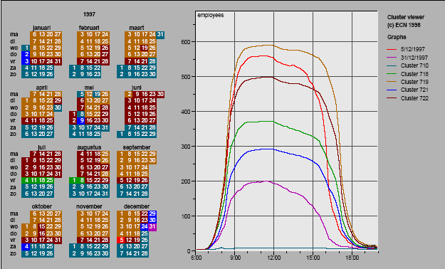
Figure 2. The calendar view. The right half of the display
contains color coded patterns, one per cluster. The left half displays a
calendar where each day is color coded with the same color as the pattern
representing the cluster it belongs to.
TimeSearcher [4] is one of few visualization tools
that concentrate on time series in a general sense. Its main feature is that it
allows a user to explore a set of time series data by using the idea of
‘timeboxes‘ in order to limit the set of graphs explored. The user places a
timebox on an overview graph, and the display is updated to present the user
only those graphs which data points cross the timebox.
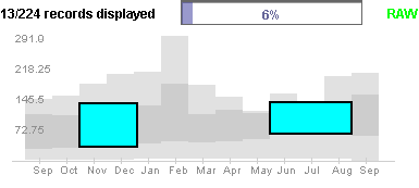
Figure 3. A timebox query in TimeSearcher.
Carlis and Konstan [5] introduce a spiral
visualization technique for serial periodic data, which displays data along a
spiral to highlight serial attributes along the spiral axis and periodic ones
along the radii, but it is not suitable for our needs.
Other existing tools focus on specific cases,
generally financial data. Because such tools do not consider time series in
general, they are classified independently of pure time series categories, and
it is generally difficult to find information about them by doing research on pure
time series visualization.
3.2.
The application
ClusterTimeSearcher takes as input a text file
specified by the user that follows a predefined formatting, consisting of
information about the data set, followed by individual records for each signal,
which may contain specific known attributes of the signal besides its main time
components. After processing the information from the input file, the tool
updates the display with a visualization of the data set signals.
The tool is comprised of 4 information displays – the
query panel, the display panel, the items list panel, and the details panel. In
the query panel (Figure 4), the user can get a general graphical overview of
all the signals in the data set. The signals plotted in the panel are
surrounded by an overall data envelope that puts them into perspective against
the minimum and maximum values for each data point. This panel allows the user
to use the same type of basic queries that TimeSearcher provides, updating the
display in the same manner, and also allows the user to highlight any
particular signal. Highlighting a signal displays a tooltip with information
about the signal’s id and the value at the time point under the cursor and brings
focus to that signal in both the display and items list panels, updating the
details panel to reflect the information available about the signal’s
attributes.
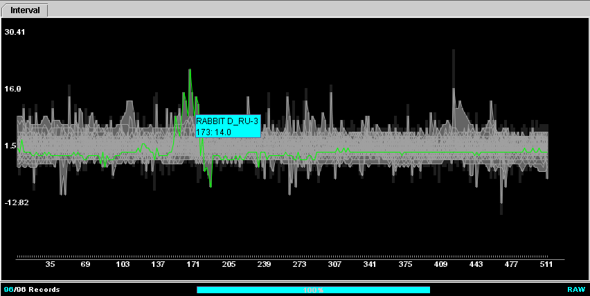
Figure 4. The query panel. A user can draw timeboxes in order to
limit the set of signals displayed.
The display panel contains a list of signal plots, one
for each signal (see Figure 5). Each plot is titled using the corresponding
name in the items list panel. If the user has performed a query using a
timebox, then the plots displayed are only for the signals matching the box.
The user can browse through the plots. Focus is brought for the signal at the
top of the display in both the query and items list panels by highlighting and
displays its attributes in the details panel.
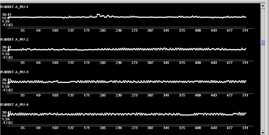
Figure 5. The display panel shows the plots for the signals that
match a query or for all signals if no query is placed.
The items list panel displays a list of the names for
each signal that is plotted in the display panel. The list is scrollable and
selectable (see Figure 6). Selecting a name in the list displays the available
details of the corresponding signal in the details panel, brings it into focus
at the top of the display panel and highlights its corresponding plot in the
query panel.
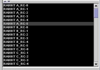
Figure 6. The items list panel shows the names for the signals
that match a query or for all signals if no query is placed.
The details panel (Figure 7) displays information
available about a signal whenever it is brought into focus in the query,
display, or items list panels. This information is supplied by the user along
with each record in the input file.
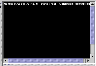
Figure 7. The details panel is updated each time a signal is
brought into focus.
The user has the option of performing clustering by
selecting it from a combo box. The options present the user with a choice of
the distance measure to be used. Currently two distance measures are supported:
root-mean-square distance and its normalized version as described in section 2.
When clustering is selected, the four display panels are updated to reflect the
number of clusters produced. Each cluster is represented in the query and
display panels with a pattern derived from the different signals inside it.
Because data for heart signals is usually recorded for
long periods of time, the user may select averaging of data points in order to
avoid cluttering in the query and display panels. By default, no averaging is
done since it may result in missing important details in the visualization.
3.3.
Scenario of use
Researchers who are interested in categorizing heart
signals using this tool are not limited to choose the power spectrum as an
alternative representation of the signal. The choice here of using the spectra
was made largely at an intuitive level, and so the representation of the
signals utilized for clustering is independent of the application, allowing the
user to choose his/her own representation depending on the situation and need
or just for experimentation of what representation may work best.
After choosing a representation, the user performs a
transformation of all signals in the data set and produces an input file
following the data format specified for ClusterTimeSearcher (at the moment, it
is the same data format used by TimeSearcher) and proceeds to load it in the
tool. Here a scenario of use is described using the personal experience of the
author, with the corresponding figures presented at the end of the paper.
First, normalization and standardization of the heart
signals in the data set was performed prior to transforming them using the
Fourier method. The purpose is to be able to meaningfully compare heart signals
recorded from both rabbits and rats, given that their heartbeat rates are
different (an average of 328 beats per minute for a rat and 205 for a rabbit).
The power spectra were derived using a Discrete Fast Fourier Transform
algorithm.
After loading the input, the first thing noticed was
that the signals in the data set were too long to be displayed properly and so
averaging of points was activated. It was clear since the beginning that it
would be difficult to perform analysis by visualizing many signals that are all
very different. This means that with the usual plot of the signal it would not
be meaningful to use the query function. Nonetheless, examining the signals in
this way it is possible to tell periods of time for each entity in the data set
where heart rate increased on decreased. The data available contained some
details about the state of the entity (either at rest or in activity) and
whether they are under the influence of artificially induced unstable blood
pressure (herein called SAD). It was noticed that for some entities, periods of
increase in heart rate did not mean that they were in activity, but seemed to
be more related to SAD in those cases where the entity was at rest. Also,
abrupt changes often characterized the signals recorded under SAD conditions
(see Figure 8).
Switching to the Frequency view,
the power spectra are now presented (See Figure 9). In this view, it was easier
to compare signals, since all the author had to look for was similar shapes.
Similarly, it was more meaningful to use querying in this view. But since
grouping similar shapes is what clustering is for, clustering was immediately
activated.
8 clusters were produced and
their patterns displayed. After doing some examination of the patterns, it was
found interesting that some of the clusters had patterns where the lowest
frequency had a really low magnitude as opposed to clusters which lowest
frequency was higher than any other (see Figure 10). Having noticed before
clustering about such signals, the author decided to investigate one of these
clusters (See Figure 11). The signals in the cluster all had power spectra with
near zero magnitude on the lowest frequency, or the lowest frequency had lower
magnitude than the following ones in most cases. More than half of the signals
in this cluster were under SAD. Going back to the time domain, it was observed
that even those signals which were not under SAD exhibited the same
irregularity and rare abrupt changes as the ones under it (see Figure 12). This
leads to the strong suspicion that this cluster characterized entities with unstable
blood pressure, regardless of whether the condition was induced, and that
generally if the lowest frequency is near zero in the power spectrum, then it
is likely due to unstable blood pressure.
It should be noted that the author has no experience
in cardiology, and so the interpretation above is not guaranteed to be correct.
Nonetheless, it is a fact that some condition was a common factor of these
signals.
4.
Evaluation
It had originally been planed that a domain expert
would take a look at the tool and see if it would be useful for him in his job.
Unfortunately, contact was not possible with this individual, and there is thus
no user evaluation available. Here we comment about some of the strengths and
weaknesses that characterize ClusterTimeSearcher.
4.1. Strengths
Being able to visualize several signals at the same
time for the purpose of comparison is extremely useful. Moreover, the tool
provides enough visual cues to know precisely which signal is currently in
focus. Being able to see details on demand about known attributes of a signal
is also very convenient. Since screen real space is limited, allowing averaging
of points on demand was a really good idea. If the data is too cluttered in the
display, then this feature can help alleviate the problem.
Having the ability to switch between representations
of a signal is also convenient, as it allows the user to relate the time
independent representation of a signal to its normal plot. It is also useful to
have individual plots for each of the signals, allowing the user to concentrate
on only one signal at a time if desired.
Clustering turned out to be useful in the author’s
case. As was described in the scenario of use, it allowed confirming that the
same condition seems to affect signals following a certain pattern at the
lowest frequencies of their power spectra. The potential of the tool in this
sense is very good. The clustering algorithm used in the tool is reasonable in
terms of speed.
Moreover, the tool turned out to be useful for
financial data as well, where most of the time we have time series that begin
at the same time. The clustering algorithm of this tool is successful in capturing
the shape of a pattern and grouping together time series that follow that
pattern. This suggests potential uses on other types of data and not just heart
signals.
4.2. Weaknesses
As is the case with many other tools,
ClusterTimeSearcher is not perfect. One of the main drawbacks is in the length
of the signals that can be displayed, that is, resolution is poor. It works
well for short signals, but signals with more than about 250 time points will
begin cluttering the display and many details are lost. Thus it turns out to be
impractical for very long signals, since averaging in order to diminish
cluttering will result in possibly important details being lost. In particular,
short abrupt changes that may be of importance to the study of a signal will
disappear in the display. One way to fix this might be to replace averaging by
taking the maximum or minimum of a set of points, but time constraints did not
permit verifying this.
Another solution is too allow averaging but provide a
zooming capability to both the query and display panels, whereby the user could
zoom into a region of a plot in order to see all the data points contained with
full resolution. This approach was the one originally proposed for this
project, but unfortunately the integration of ClusterTimeSearcher with the
original TimeSearcher turned out to be very difficult and time consuming, and
has thus not yet been implemented.
One inconvenience that the tool currently suffers
from, due to the same reason just mentioned, is that in order to examine the
signals inside a cluster, it is necessary to load a new input file containing
those signals. At the present time, ClusterTimeSearcher produces automatically an
input file for each cluster constructed when clustering is finished.
In terms of performance, although browsing, querying
and clustering are reasonably fast, the tool currently hogs a large amount of
processing power. It managed to put a load of over 90% constantly on an AMD Athlon
XP 3200+ CPU, and can be slow to refresh the display at times. Running it in
parallel with other applications results in a significant system slowdown.
Finally, because of the absence of domain expert user
evaluation of the tool, it cannot be guarantied that the kind of clustering
done is correct for the data set utilized, and this work is largely based on
following the author’s intuition.
5.
Future work
ClusterTimeSearcher could be improved in order to
reduce the cognitive load of the user. Color coding could be introduced as was
the case in [3]. One can imagine the plots in the display panel being coloured in
the background according to the cluster they belong to, with the same color
used for the corresponding entry in the items list panel. Also, the cluster
mode of the tool should be able to not only display the patterns, but also
allow the user to browse through the plots of the signals corresponding to a
pattern on demand.
Other methods for clustering should be evaluated to
determine if better results can be achieved that way. In particular, these
methods can be integrated into ClusterTimeSearcher in addition to the bottom-up
algorithm utilized in order to allow the tool to really be able to cover a wide
range of data types and be of benefit to researchers in general.
Solving the limitation of poor resolution that also
affected the original TimeSearcher is of interest in order to provide a
successful tool for visualization. Besides zooming, binning, as illustrated in
[6], could be one such method allowing signals of arbitrary length to be
displayed.
At the present time, ClusterTimeSearcher only handles
clustering of univariate time series data. A future extension can take into
account the inclusion of clustering techniques or distance measures for
analysing multivariate time series. We could then explore heart signals based
on both pulse interval and blood pressure.
Performance should also be taken into account.
ClusterTimeSearcher needs to be tweaked for speed. Finally, integrating the
tool with all modes of querying in TimeSearcher can provide a useful extension
to the analysis capabilities provided.
6.
Conclusions and Lessons learned
Here a tool that provides clustering capabilities for
analysis and classification of time series data has been proposed and a
prototype developed based on the original TimeSearcher application. Even though
no domain expert feedback was available, the tool seemed to be useful in
determining some properties of the heart signals contained in the data set
examined, suggesting that further investigation may be worth.
During the course of this project, one of the main
challenges and lessons learned is that the number of clusters that is
appropriate for visualization is largely a subjective matter. There are no
stone-written rules that dictate what the correct number is. It can vary
greatly depending on the data set and situation and hand. In general, it can be
said that once the distance measure starts producing dissimilarity values that
are too high, it is time to stop and output as result the clusters constructed
up to that point.
Trying to build on top of an existing tool is not
always a good idea. This is certainly true when code documentation is scarce
and when appropriate software design techniques have not been important in the
development process of previous solutions, since it makes extension and
integration with other tools very difficult and at times impossible without a
facelift.
User feedback from domain experts is essential.
Without it, the usefulness of an application cannot be guaranteed at all.
7.
Acknowledgments
The author would like to thank the following people
for their contribution to this project:
-
Dr. Tamara Munzner, for her advice and a great introduction
to the world of infovis;
-
Dr. Harry Hochheiser, for kindly providing the source
code for TimeSearcher;
-
Dr. Bruce van Vliet, for having provided the data set
with which the scenario of use was produced.
8.
References
[1] An
Introduction to Fourier Theory by
Forrest Hoffman. Dept. of
Physics and Astronomy, University of Tennessee.
[2] Cluster Analysis - What is it?
A course on Multivariate Statistics by Alan Fielding, Dept.
of Biological Sciences at Manchester Metropolitan University.
[3] Van Wijk, J.J.; Van Selow, E.R. Cluster and calendar based visualization of time
series data. In Information Visualization, 1999. (InfoVis
'99) Proceedings. 1999 IEEE Symposium on, p. 4-9, 140
[4] Hochheiser, H. Shneiderman,
B. Visual Queries for Finding Patterns in Time Series Data. University of
Maryland, Computer Science Dept. Tech Report #CS-TR-4365, UMIACS-TR-2002-45
[5] John V. Carlis
and Joseph A. Konstan. Interactive visualization of serial periodic data. In
UIST'98 Conference Proceedings, pages 29-38, New York, NY, 1998. ACM Press.
[6] Berry, Lior. BinX - Dynamic exploration of time
series. Submitted in fulfillment of the CPSC533C
Project component. Dept. of Computer Science at The
University of British Columbia, 2004.
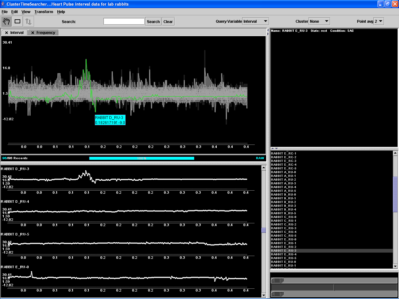
Figure 8. ClusterTimeSearcher in action.
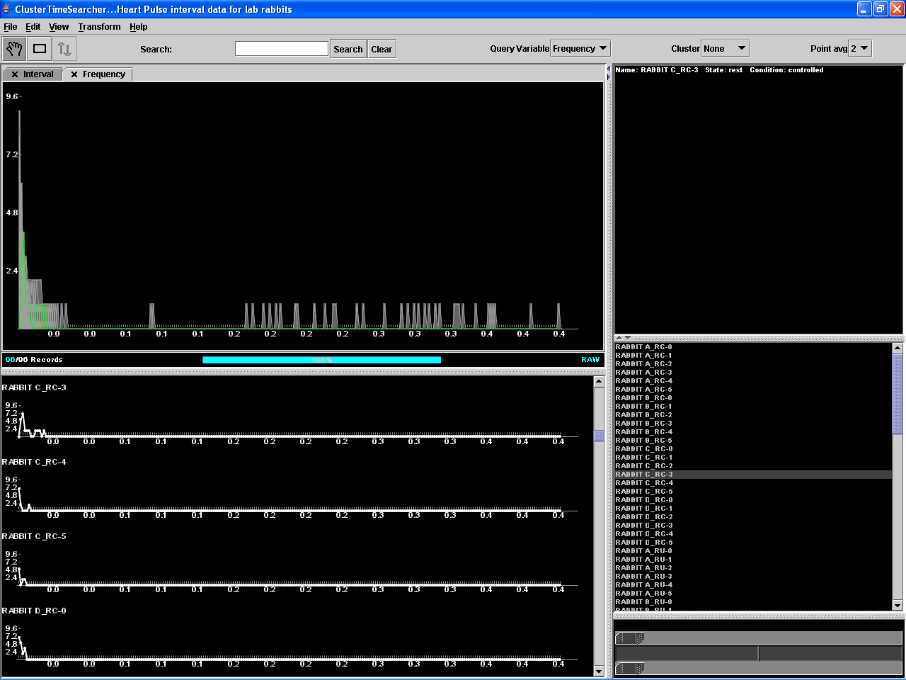
Figure 9. ClusterTimeSearcher in action.
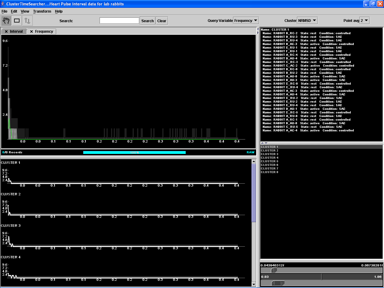
Figure 10. ClusterTimeSearcher in action.
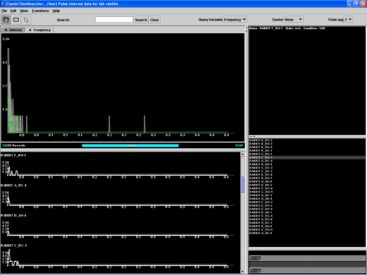
Figure 11. ClusterTimeSearcher in action.
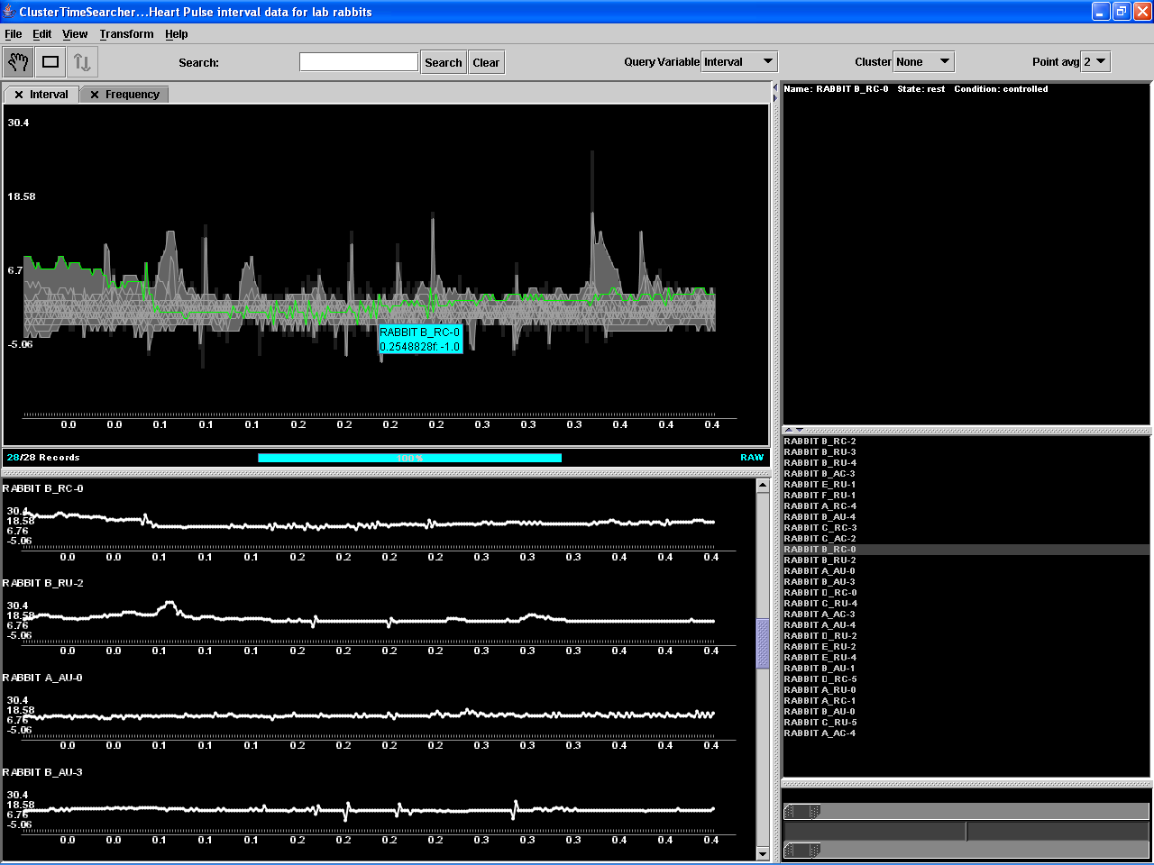
Figure 12. ClusterTimeSearcher in action.