CPSC 533C
Assignment 1
Zsuzsanna Hollander
Example of good visualization :
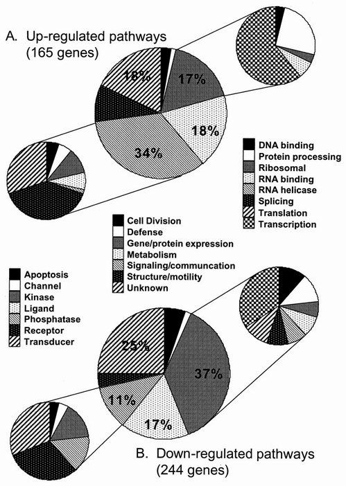
This figure illustrates genes that are up-regulated (A) or down-regulated (B) by HIV-1 BRU infection of CCRF-CEM cells [1]. The middle pie chart in part A of the figure shows the main functional groups the up-regulated genes belong to and the percentage of genes in each such functional group compared to the total number of up-regulated genes. The middle pie chart in part B shows the same thing for the down-regulated genes. In both part A and B, the signaling/communication and gene/protein expression functional groups are further divided into a number of classes, as seen in the pie charts on left and right.
One of the nice things about this figure is that it makes the comparison of the functional groups corresponding to the two types of genes ( up-regulated and down-regulated) really easy, without putting them in the same chart. By using two charts, one for each group of genes, and with the same pattern in the two graphs for the same functional groups the similarities and differences between the distributions of functional groups for up- and down-regulated genes is clear. The figure even further divides the two functional groups that differ the most, with respect to the up- or down-regulates genes. Although the information conveyed in the graph is increased by the addition of the four smaller pie charts, the visualization is still effective (easy to interpret) and efficient. This is mostly due to the common use of the legend for the piecharts belonging to the two different types of genes.
1. A.B. van't Wout, G.K. Lehrman, S.A. Mikheeva, et al. Cellular Gene Expression upon Human Immunodeficiency Virus Type 1 Infection of CD4 + -T-Cell Lines. Journal of Virology. 2003; 77(2): 1392-402.
Example of bad visualization :
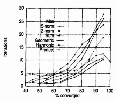
The above graph is part of the performance evaluation of a new dynamical systems based technique for clustering categorical data [2]. In this technique a dynamical system is defined to be a repeated application of a function f. In the computation of function f one can use various combiner operators. The figure above depicts the results of experiments conducted with the use of different combining operators (max, 5-norm, 2-norm, sum, geometric, harmonic, and product) and how these operators affect the speed of convergence of the technique. The winning combining operator would be the one that converges within the fewest iterations. The experiment measures average iterations until 90% convergence.
The figure is supposed to show how the speed of convergence of the algorithm is affected by the combining operator used in the process, but it does not do a good job. There are several problems with the figure. One problem is that the lines that mark the different operators are so similar (even though various lines are used, such us solid, dotted, ...) that it is almost impossible to read off the figure how do the different operators affect convergence. Also, it is very difficult to differentiate between the geometric shapes used for the encodings on the lines, due to their size. Another problem lies in the scaling of the graph, larger vertical scaling would allow for bigger distance between the lines and such for a clearer view of the information the authors of the figure are trying to convey.
2. D. Gibson, J. Kleinberg, and P. Raghavan. Clustering Categorical Data: An Approach Based on Dynamical Systems. The VLDB Journal (2000) 8: 222-236.