Assignment 1 - Qixing Zheng
a. Bad Example
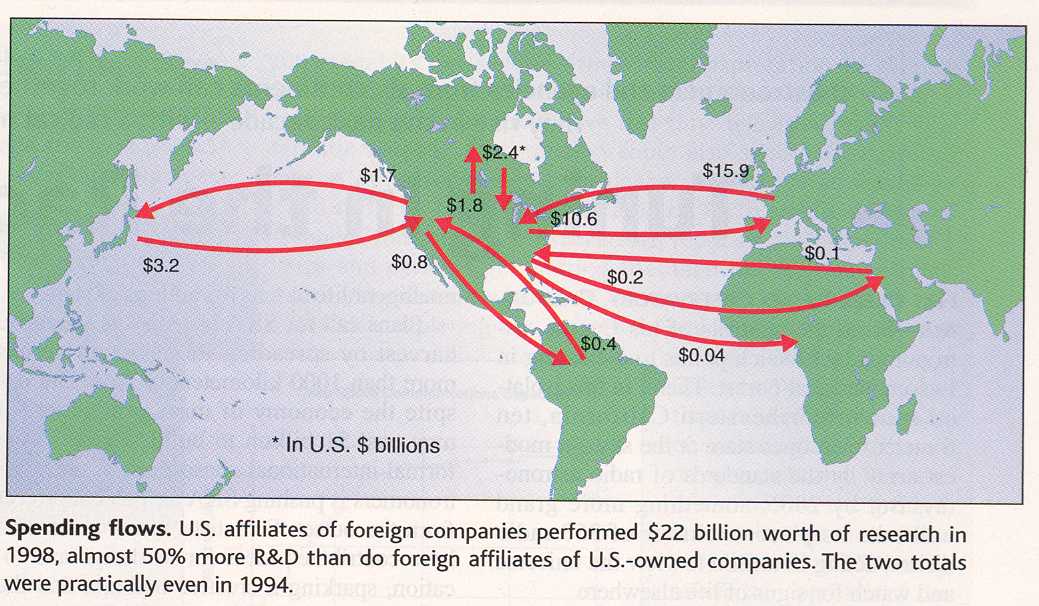
This graph is taken from the article NSF Report Paints a Global Picture in Science (Vol. 296, 2002). It shows the spending flows on science research between U.S. affiliates of foreign companies and foreign affiliates of U.S.-owned companies. The goal of the graph is to point out the U.S. affiliates of foreign companies invested much more (50% more) in research than foreign affiliates of U.S.-owned companies in 1998.
This visualization is not very effective. First, the graph uses two types of arrows: arrows going into the U.S. and arrows coming out from the U.S. to different parts of the world, representing research funds from foreign companies and U.S.-owned companies respectively. It would be visually more distinguishable if two types of arrows were in different colors (for example, one in red and one in blue), and readers could separate the two categories of companies' investments more easily. Second, each arrow has the money amount labeled at the starting point. If readers do not read the labeled numbers carefully, it is not obvious to them that the U.S. affiliates of foreign companies invested much more in research than foreign affiliates of U.S.-owned companies. One way to improve that is to use the thickness of arrow lines representing the amount of investment visually. In other words, the thicker the arrow lines are, the more money is involved in the flow.
b. Good Example
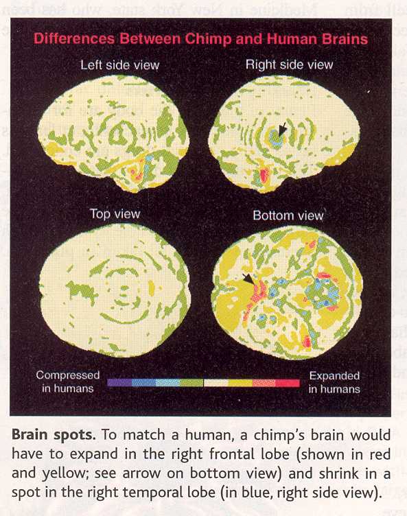
This picture is taken from the article Humans' Head Start: New Views of Brain Evolution in Science (Vol. 296, 2002). It shows the differences between chimp and human brains in great detail. The picture is intended to assist readers finding out which areas of brain expanded during human evolution.
This visualization is presented in a very clever way. First, the traditional comparison visualizations are done by presenting both compared objects parallel and letting readers to find the difference between the two. However, in this picture, only a chimp's brain is presented. It is a good choice in this case because comparing brain spots requires comparisons at each precise location on the brain. It would be too much for readers to comprehend if there were a chimp brain set and a human brain set presented. Readers would need to compared each brain spot in the two brain set to see the difference, which would be not effective. When both chimp and human brain information is merged into a chimp's brain view, the visualization is much more focused. Second, the above picture uses nice color coding to indicated which parts of chimp's brain are expended in humans'. The cold colors represent the compressed areas in human brains, and the warm colors represent the expended parts in human brains. The heavier the red color is, the more dramatic expansions there are. Thus, readers can quickly find out the hot spots in brain evolution.