CPSC533C Visualization Assignment #1
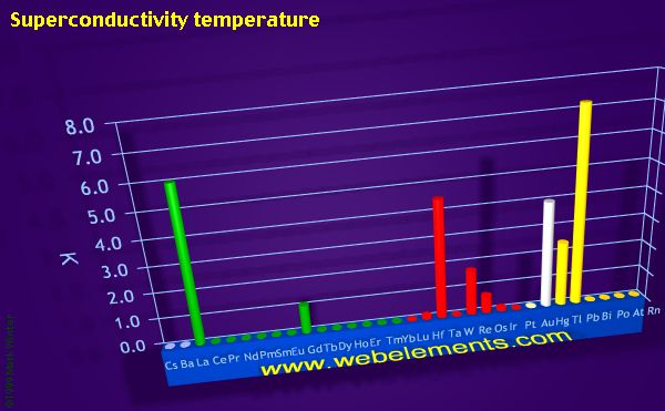
Example 1: Bad Visualization
(from http://www.webelements.com)
This picture shows the superconductivity temperature of some elements. The vertical axis is the temperature and the horizontal axis is the name of each element. The different colours of the cylinders correspond to different parts of the periodic table.
|
However, this picture has the following problems that will degrade its effectiveness: 1. The information provided by this picture is misleading. This picture provides a 2-D view of the original 3-D representation. Since we live in a 3-D world, the 3-D representation is ideal to display of data. However, when a user tries to get the superconductivity temperature from the above 2-D picture, he/she may not get the right temperature. If one wants to get the right temperature, he/she must change the perspective. Suggestion: Using interactive 3-D representation / Putting a value besides each cylinder 2. The information is not clear. As mentioned above, the different colors of the cylinders correspond to different parts of the periodic table. However, if I did not refer to the following picture, I definitely did not know which element belongs to which part.
Suggestion: Using a legend in the picture 3. The picture could give more information. This picture groups the element by the position in the periodic table. It seems that we can not get more information from the picture other than the superconductivity temperature of each element. How about rearranging the order of the element in order to give more information? Say, order the elements by the superconductivity temperature. As a result of that, if we also include a cut-off temperature which can be reached in the lab relatively easily, we can find out which elements can be taken advantage of their superconductivity. Suggestion: Rearranging the elements.
|
Example 2: Good Visualization
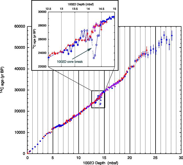
(from K. Hughen et al ., 14 C Activity and Global Carbon Cycle Changes over the Past 50,000 Years Science 2004 303: 202-207.)
|
This picture gives an overview relationship between the depth of 1002D and the age of C14. The horizontal axis is the depth of 1002D and the vertical is the age of C14. Circles indicate samples from hole 1002D; triangles are from hole 1002E. Blue data points were generated at CAMS-LLNL, red points are from NSRL-NOSAMS, and purple points are from University of California, Irvine.
|
This diagram is very straightforward. One can easily tell the relationship between the two variables at the first glance. Besides its clarity and accuracy, this picture is a good example of visualization in that: It provides not only the overall properties of the relationship between the depth of 1002D and the age of C14, but also very detailed information of an abnormal behavior at a single point. Since the diaplay area is very limited, it is impossible to put all the detailed information in one diagram. Absence of any of the overall or detailed information will result in incomplete or misleading information of the relationship. By employing the zooming technique, the author succeeds in providing both of the points. |