Assignment #1
Peiqun(Anthony) Yu
1.
A Good Example
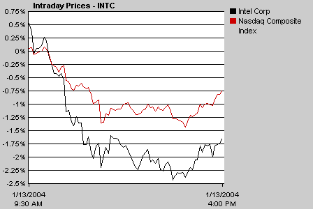
This is a chart showing the stock price change of Intel Corp, and the comparison with the change of Nasdaq Composite Index within a day period. The tool is provides by www.msn.com..
This is a good visualization example. First of all, anybody without any stock background can easily figure out what happen to the Intel Corp in the stock market today from the chart. Looking at the chart, we learn that the stock price of the Intel Corp. Dropped today; however, this is not too bad, because the Nasdaq Index dropped too. The different color is used to distinguish the line for Intel and Nasdaq. Secondly, the chart is very accurate too, because people can see the percentage of changes within the day. Thirdly, the visualization tool is also very easy to access. Users simply click the button ?isplay Chart?to show a default chart. The tool also gives the flexibility to the users to customize the chart to meet their interests.
2. A Bad Example
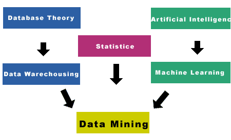
This diagram intends to show that Data Mining
consists of several areas such as Database Theory, Artificial Intelligence,
Statistics, Data Warehousing, Machine Learning. Each of these areas is individual and independent.
This is a bad visualization example. First of all, the diagram does not
accurately convey the message what it intends to. Since each of these areas is independent, using arrows to connect
them is inappropriate. It can easily
mislead the audience to think that there is an order among these areas. Secondly, the diagram does not clarify that
Data Mining consists of all the other independent areas. By looking at the diagram, people may think
that after applying all these techniques, as a result, they can achieve the
data mining results, instead of thinking that Data Mining consists of these
areas.