 |
 |
||
|
|||
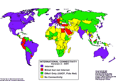
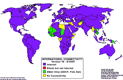
Example of GOOD Visualization
|
|
||
|
|||
The two maps above show the internet connectivity of all countries of the world in 1991 and 1997 respectively. There are four distinct classes of Internet connectivity, shown on the maps by the different coloured shadings of the countries. The bottom class is no connectivity, which is represented by shading the country yellow. Two intermediate levels, of connectivity to networks for e-mail only and to BITNET, are shown by green and red. The top category of permanent Internet connectivity, offering a full range of interactive services, is represented in blue. The task of these maps is to reveal about global Internet diffusion through 1990's.
These maps provide a clear and straightforward geographic presentation of the data. The visualization is therefore accurate if we assume the data is accurate. The use of colour is very effective. By comparing the colours for a particular country in the two maps, it is easy to see the change in connectivity levels for that country. The two maps also effectively reveal the global spread of Internet through 1990's. By 1997, the majority of the nations of the world have Internet connectivity.
Reference:
http://mappa.mundi.net/maps/maps_011/
Another example of GOOD visualization:
http://netmon.grnet.gr/map.shtml
Example of BAD Visualization
The maps above can also be considered as an example of bad visualization because they distort the reality to some degree. First, the maps ascribe a single value to a whole country, suggesting that everywhere and everyone within this area has equivalent levels of Internet connectivity. Clearly this is not the case. Second, due to the limited range of categories, nations appear visually similar on the map when in reality their level of Internet connectivity can be very different in terms of how widespread and affordable the Internet was.
Another Example of BAD Visualization
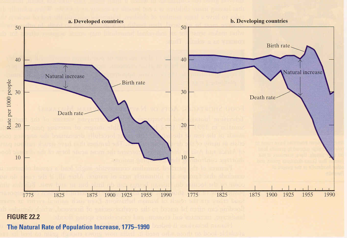
These two graphs show the natural rate of population increase for both developed countries and developing countries. The natural rate of population increase is the difference between the birth rate and the death rate. The purpose of this visualization is to reveal the difference in population growth rate (natural rate of population increase) between developed countries and developing countries.
Despite its accuracy, this picture is an example of bad visualization because it doesn't encode the important information in an effective way:
1) To get the population growth rate at a particular point in time, the viewer needs to calculate the vertical difference between the birth rate and
death rate for that particular time.
2) It's not easy to get an overview of how population growth rates change over time.
Suggestion: Consider population growth rate as the third time series variable and draw a separate line in the group.
3) The author wished to compare the population growth rates and conclude from these graphs that the population growth rate of developed
countries is low and stable, while that rate of developing countries is high. However, by drawing the graphs for developed countries and developing countries separately, it's not easy to compare the difference.
Suggestion: Draw six curves (birth rate, death rate, and population growth rate for each type of countries) with appropriate colours in one
single graph to give a better visualization.
With this new approach, people can easily see the difference between the growth rates by comparing the two curves of growth rates.
Reference:
[1]Case, K.;Fair, R.;Strain, J.;& Veall, M. Principles of Microeconomics. Prentice-Hall, 1996. p.569.