|
|
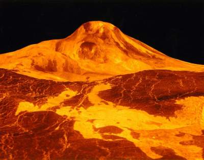
This image of Venus was released from NASA's Jet
Propulsion Lab from in the early 1990s. It has
since made its way into textbooks such as Sir Robert
Wilson's
Astronomy Through the Ages, where it is described as
how "Venus would look to the human eye". The image
is a visualization of Venus terrain data. This
particular picture is a snapshot taken from a 3D
computer generated from topographical photographs of
Venus taken by the Magellan spacecraft. This model
was also used to make a
fly-over video of the planet.
I saw the fly-over video when I was 17, and it made a
lasting impression on me. I was amazed at the
ability of computers to make an accurate relief map of
another planet. But it turns out that this image,
as well as the video, is very misleading. The
vertical scale is exaggerated 22.5 to 1. Both the
picture and a fly-over video would be quite boring if
Venus was accurately represented. This
visualization is most remarkable for what it fails to
show: any sort of indication of scale and attitude.
If the authors of the work had considered this picture
and video a scientific visualization, and not a simple
picture, perhaps the results would not have been as
misleading. The potential for a visualization to
create a lasting misconception is made evident by this
impact of this image, and by the resulting foundation of
a "Flat Venus Society".
|
|
 |
|
|
|
|
|
|
|
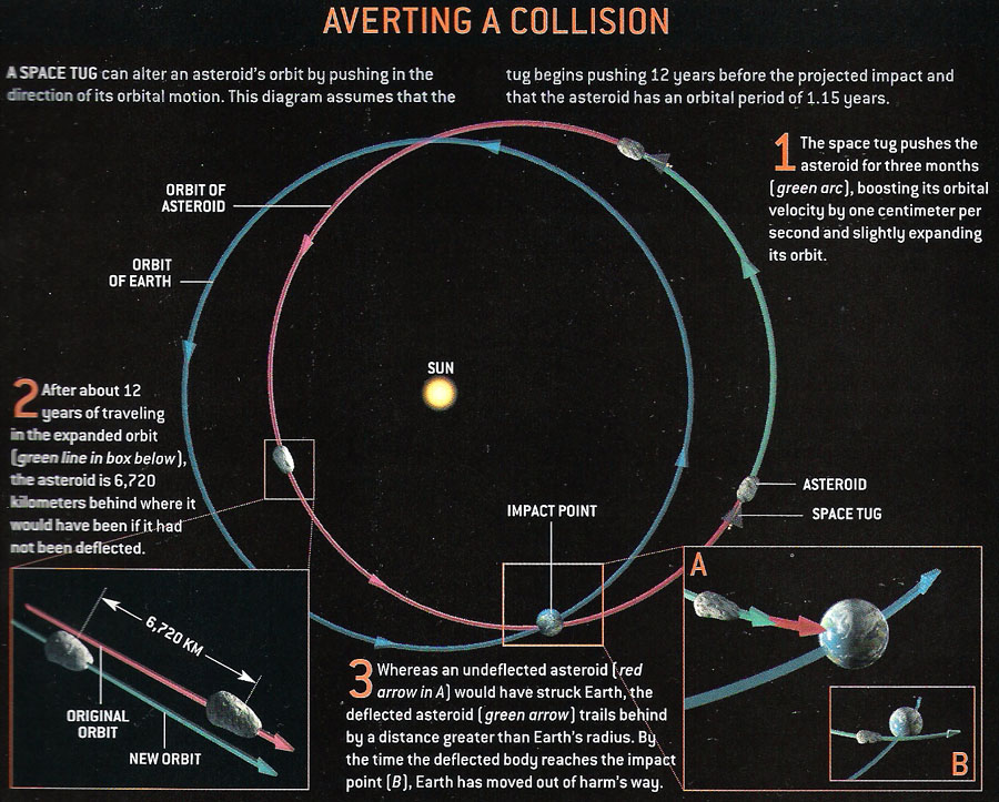
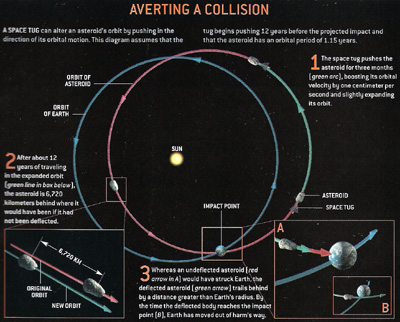
There is potential for asteroids to collide with the
earth and hope to avoid those collisions by nudging the
asteroid away from the collision orbit, as shown in this
diagram (Scientific American, November 2003, p. 57).
The diagram depicts how a "space-tug" can be used to
alter the trajectory of an asteroid on a collision
course with earth (enlarge
the image to read the text). The blue arc
show's earth's orbit, the red arc shows the asteroid's
collision orbit, and the green arc an altered safe orbit
of the satellite.
This diagram makes careful use of iconography and color,
without overwhelming the reader. The direction of
each trajectory is made clear with arrows. The
meaning of each trajectory is implicitly encoded in its
color, and the colors have a clear semantic mapping
(earth = blue, bad = red, good = green). The only
icons used are that of the sun, earth, asteroid, and
spacecraft. These are small, clear, accurate, and
don't take away from the textual descriptions of the
diagram. The diagram also shows time, made clear
by the numbered sequences and descriptions. The
text doesn't obscure the diagram thanks to a consistent
use of font & color (e.g. orange for headings).
Finally, the inset pictures do a good job at showing the
details of the interesting points in the trajectories
without taking away from the bigger picture, and
maintain context by not introducing any new elements
(just scaling icons and trajectories). |
|
 |
|
|
|
|
|