MOHAMMED ALAM
ASSIGNMENT 1
CPSC 533 C
1) GOOD EXAMPLE OF VISUALIZATION:
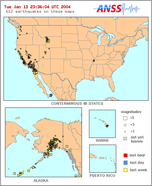
Resource: http://earthquakes.usgs.gov/recenteqs/
Figure 1a: Earthquakes in the past week in US
Figure 1b: After zoom from figure 1
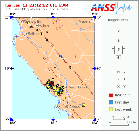
The above pictures have been obtained from United States Geological Survey (USGS) which uses the Advanced National Seismic System (ANSS) to track earthquakes that have occured in the past week in the US. Similar images can be obtained for earthquakes around the world from this site. Figure 1b is obtained after clicking on figure 1a which zooms in on the selected location. Clicking on the earthquake spot gives all available textual information on it.
This site is a good example as it allows zooming in on an area of interest. The color coding used allows to clearly distinguish between earthquakes that have occured in the last hour, day or week. The only slight drawback that occurs is when the visual tries to show regions of high seismic activity (as in Figure 1b). It becomes hard to select the required earthquake in such a case.
2) BAD EXAMPLE OF VISUALIZATION:
Resource: http://genome-www.stanford.edu/rap_sir/Maps.shtml
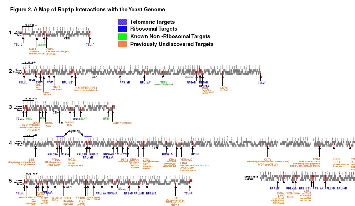
The above figure was obtained from Stanford genomic resources. The above figure is a partial representation (5 of 16 chromosomes) of the interaction between repressor-activator protein 1 (RAP1) with yeast. The top row of blocks represent Watson strand ORFs, the bottom strand represents Crick strand ORFs, and the center row represents non-coding intergenic fragments (promoters and 3'UTRs).
This visual is not impressive due to the fact that it tries to fit a lot of unnecessary , unreadable information into the diagram. The figure above was obtained after zooming in five times. Yet, lot of the information is still in an unreadable state. The labels at the top of each block (chromosome) could be removed as they lack clarity.