Assignment 1
Good example:
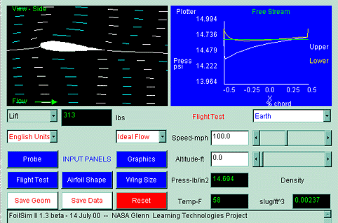
Source: http://www.grc.nasa.gov/WWW/K-12/FoilSim/index.html
This is actually part of the user interface of a program called FoilSim. The program is an interactive simulation software that determines the airflow around various shapes of airfoils. In the picture, the Airfoil View Panel is showing a simulated view of a wing being tested in a wind tunnel with air moving past it from left to right. The software displays plots of pressure or airspeed above and below the airfoil surface on the right. Various parameters can be set in the bottom half of the panel.
For a program that is intended for students of aerodynamics, accessibility is not bad. The simulated view of a wing and the lines signifying airflow are very intuitive. The top right view is harder to understand, but clearly the pressure above the wing is lower than below, which produces a lift. The picture rates high with clarity: the diagrams are all labeled well. It is nice that the rays of air are labeled with different colors alternatingly. However the scale of the y-axis on the top right corner plot might use better adjustment to eliminate the bottom half of it where nothing is happening.
ˇ@
Bad Example:
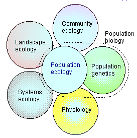
Source: http://www.ento.vt.edu/~sharov/PopEcol/lec1/whatis.html
This diagram is trying to show that population ecology is related to other ecological disciplines. It is taken from a lecture notes for a Population Ecology course.
This is a bad visualization because first, the position of the circles are not necessarily correlated to how each discipline is related. And it seems to suggest that population ecology is the sum of those five disciplines. Secondly, the size of the circles are uniform, which does not reflect the actual size of each discipline.