CPSC 533C ASSIGNMENT 1
By Juan Gabriel Estrada Alvarez (89494033).
Created on January 14, 2004.
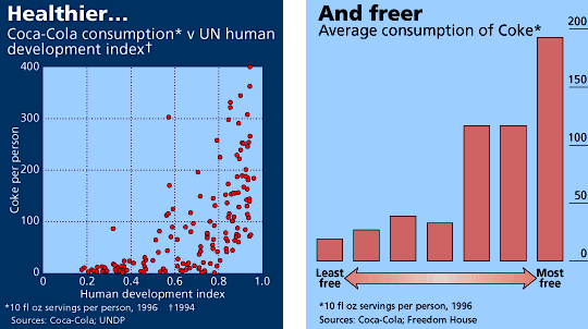
PICTURE 1 - A GOOD VISUALIZATION
This picture shows 2 plots. On the left, we have the relationship between the consumption of coke and the United Nations human development index (as measured by wealth, education, health and literacy) for most of the world's countries. On the right, the relationship of coke to political freedom (as measured by Freedom House's seven-point scale) in the world. (Source: The Economist - Markets & Data - Coca-Cola Map).
This visualization presents a clear trend: coke consumption rockets as we arrive in countries with higher UN human development indexes and higher degree of political freedom. This is an accurate reflection of the negative effects of capitalism on the masses: to make more profit, big corporations will stop at nothing to convince consumers that their products are essential needs, even if they are known to be damaging to health. This only happens as soon as they have all the freedom to abuse.
PICTURE 2 - A BAD VISUALIZATION
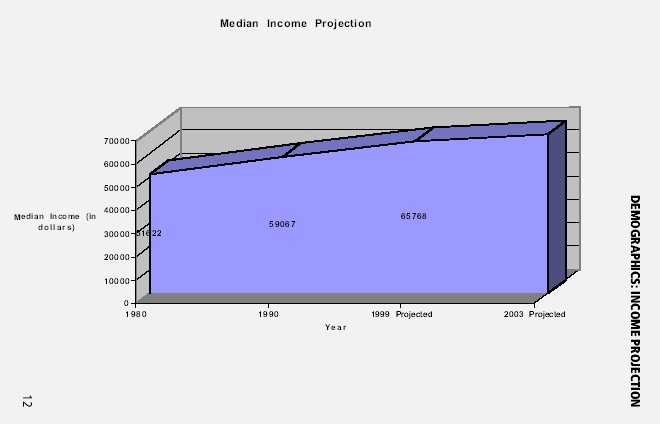
This demographics plot shows the median income projection in US dollars per person from 1980 to 2003 for the city of Cerritos in California, USA. (Source: City of Cerritos - Housing Market Analysis, by R/Sebastian & Associates.)
This plot exhibits a rubber-band scale on the horizontal axis - that is, the years have larger gaps at the beginning than at the end -, which is much less obvious when taking into account the small font in proportion to the size of the graph. The result is that this graph suggests that the median income projection's increase has slowed down. This is inaccurate, as the median income has been rising in fact as much as or a little more than in previous years. This plot misinforms the reader about the real situation.