CPSC533C Information Visualization Assignment 1
Instructor: Dr. Tamara Munzner
Student: Chia-Ning Chiang
Critiques on two pictures:
Good Example:
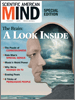
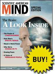
Source: Scientific American Mind. Scientific American Magazine, Special Edition – Winter 2003.
Introduction:
This is a cover page of the special issue indicating the articles included are studying how the mind and brain work.
Evaluation:
Bad Example
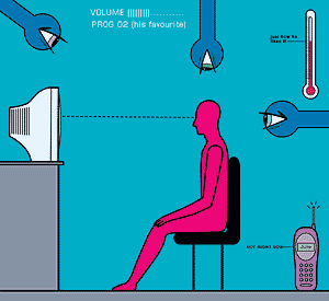
Source: “The sentient office is coming,” The Economist, June 19 2003.
Introduction:
The picture here is to explain that
Evaluation:
1. The picture doesn’t clearly deliver the design message, it just seems like a man is watching a screen under some kind of surveillance.
2. The red color human figure does attract the focus on human, but doesn’t give the idea of “the sentient computing systems”.
3. The texts (such as VOLUME ||||||……)in the picture is tiny and vague which makes reader very hard to read.
4. The cell phone doesn’t explain the situation of “If you on the phone, the TV will turn the sound down”.