Adam Bodnar - CPSC 533C Assignment 1
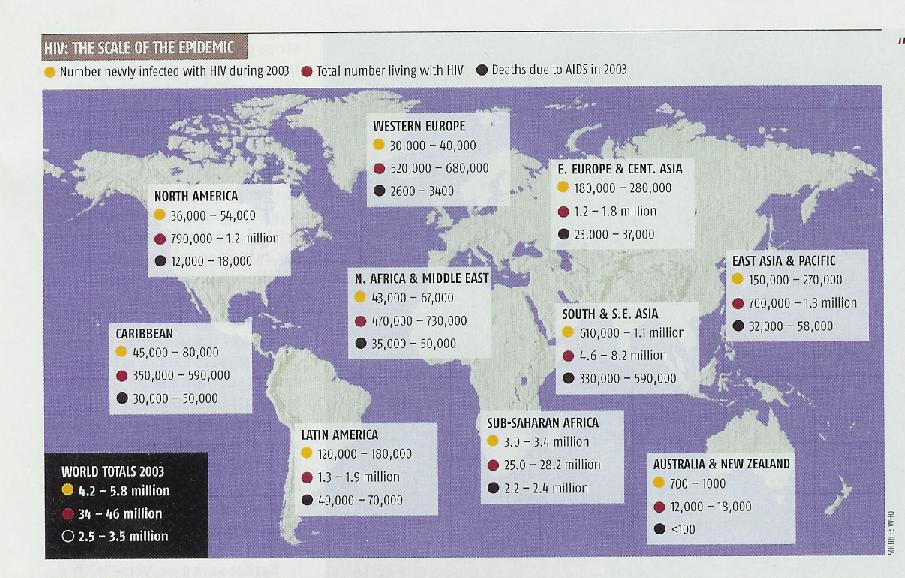
This picture illustrates several key statistics regarding the current worldwide state of the HIV epidemic. It describes ranges for 1) the number of newly infected individuals during 2003, 2) the total number of individuals living with HIV during 2003, and 3) the number of deaths due to AIDS in 2003. These statistics are grouped into large geographical regions.
This picture represents a good visualization.
The visualization is effective in that the reader can easily interpret the
displayed data. The picture is accessible in that it doesn’t require
and specialized knowledge to be understood. The picture also accurately reflects
the information presented in the article. The picture makes an efficient use
of the space provided, and attains clarity by not crowding the space with
redundant or non-important data; furthermore, by dividing the statistical
data into geographical blocks, the reader can easily draw comparisons between
one block and another. The underlay of the Earth provides the reader with
context to aid him/her in interpreting the data in terms of geographical region.
The colours representing different statistical categories are consistent and
contrast well with each other. Overall, the picture helps the reader to attain
a more complete, conceptual based understanding of the current worldwide state
of the HIV epidemic.
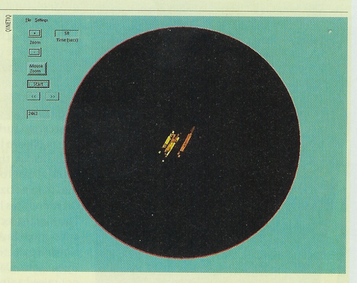
This picture illustrates an air traffic control radar trace of a wind farm. A wind farm is a collection of large-scale offshore turbines that are powered by wind and produce clean electricity. The UK Ministry of Defense is concerned about the security issues involving wind farms because the turbines from a wind farm can show up as brightly on a radar screen as a jumbo jet, which poses a potential problem for any air traffic controller.
This picture represents a bad visualization. The reader has difficulty interpreting the displayed data, making the visualization not effective. The picture is not accessible in that it requires specialized knowledge of how things appear on radar. The reader is left uncertain as to whether the displayed radar image represents a turbine, a plane, or both superimposed over each other. The picture makes poor use of the space provided, and several elements are difficult to see, let alone comprehend what they mean. The numerous buttons and numbers are more confusing than informative, and do nothing to add to the reader’s comprehension of the picture. The numerous colours used in the radar image are confusing, and no explanation or legend is provided as to what they might mean. Overall, the picture is uninformative and confusing, and does little to help explain the security issues involving wind farms.