Source: Gangui, Alejandro. 2003. "A Preposterous Universe." Science 299:1333-1334
Source: Gangui, Alejandro. 2003. "A Preposterous Universe." Science 299:1333-1334
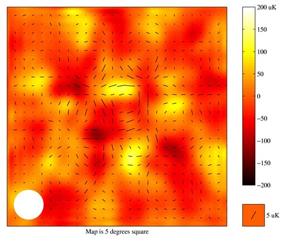
An image of the cosmic microwave background (CMB) radiation made with the Degree Angular Scale Interferometer (DASI) telescope. A black line shows the polarization at each spot in the image: the length represents the strength of the polarization and the alignment indicates the direction in which the radiation is polarized. The variations of temperature intensity of the cosmic microwave background are shown in false color, with yellow hot and red cold. The size of the white spot in the lower left corner approximates the angular resolution of the DASI polarization observations.I think this is a good example if visualization because it effectively shows the intensity and polarization of the CMB radiation. It makes good use of color to show the slight differences in temperature. It is a clear representation of strength and orieentation of polarization, with the use of a simple straight line. This simple depiction makes the image straghtforward to understand.
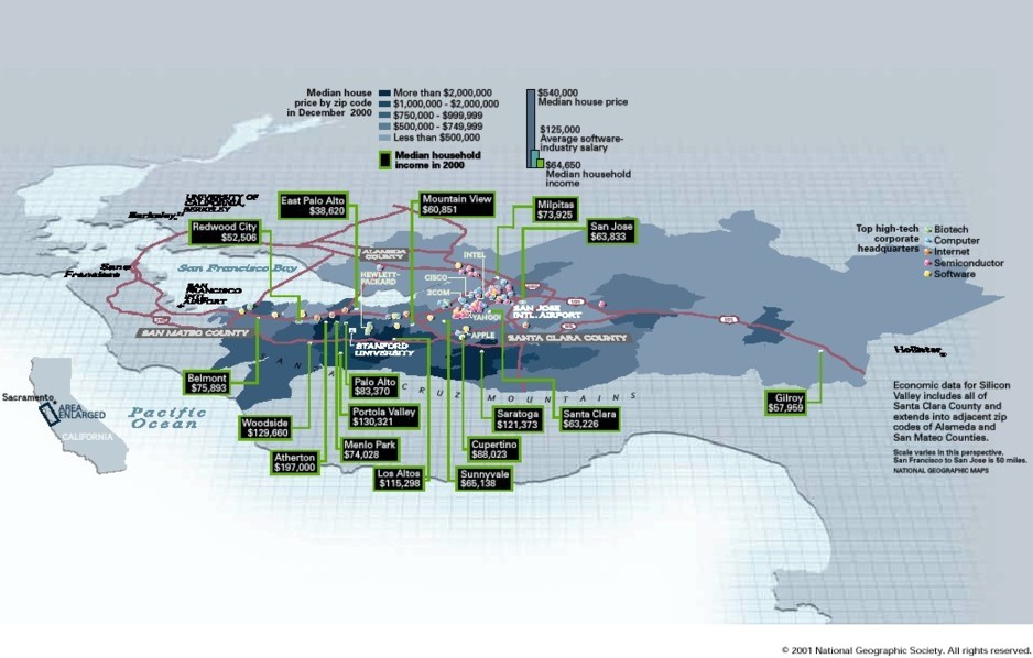
Newman, Cathy, "Silicon Valley: Inside the Dream Incubator,"
National Geographic, December 2001, 61. 10.
[Click here to zoom]
This map shows the Economic data for Silicon Valley. The deepness of shade of blue represents the median house price by zip code, the colored bullets indicate where top high-tech companies are located, and there is additional household income information is shown in the black boxes. The image depicts the high cost of living in areas near the high tech companies.This example is not very clear. Although it does effectively indicate the that high income households live in areas near the big companies, the problem with this example of visualization is the representation of Median household income. While Median house price is effectively shown be varying shades of color per range, household income pointed out by an exact dollar amount with no representation of order. In fact, the addition of so much text almost takes away from the image that is portrayed well. I didn't feel that the different colors representing business types was required, as just an idea of where they are located in general was sufficient to convey the point. If this were to be changed to simply white dots (or different shaped bullets to indicate difference), then perhaps the income information can be shown by a range and with verying of deepness of a different color other than blue.