Week 1 - Lab Assignment 1 - Intro to Shiny
Tidy Submission (5%)
rubric={mechanics:5}
Ensure that your submission is neat and tidy. Please submit...
- Your RMarkdown (
.rmd) file - The rendered PDF
- The Markdown file (use
html_documentwithkeep_md: yes) - All the figures in the
*_filesdirectory
- Be sure to look at the
.mdfile in GitHub to ensure that the figures are displayed correctly, including the animation. - Exercise 1 answers should be included in the markdown submission as usual: code, plots, and written answers.
- Exercise 2 answers should also be included in the markdown, in addition to the deployment of the app itself on shinyapps.io.
- Ensure that your markdown submission as a whole is easy to read: use appropriate formatting that clearly distinguishes between our questions and your answer, between different sub-parts of your answer, and with visible differences between code and English.
- Ensure that the low-level flow of your writing is appropriate, with full sentences and using proper English with correct spelling and grammar.
Exercise 1: Displaying trends with animation vs traces vs faceting (18%)
Animations are often the first idea that people have about how to convey trends over time. This exercise compares the effectiveness of animations to the alternatives of faceting into small multiples and the derived data of traces.
Load the gapminder dataset (you can do this by loading the gapminder library; the dataset will then appear as a tibble called gapminder). Make the following three plots using ggplot2 -- each with GDP per capita on the x-axis and life expectancy on the y-axis.
suppressMessages({
  library(tidyverse)
  library(gganimate)
  library(gapminder)
  library(scales)
  library(RColorBrewer)
})
1A Viz
rubric={viz:3}
(You do not need to put a response here. The grade here applies to the plots you make in Exercise 1.)
All of your plots should have reasonable context mechanics: an aptly chosen and informative title for the entire plot, understandable axis labels, axis tick marks as appropriate, legends as needed to document colors and other encoding choices (but without repetition with respect to other titles and labels), uncropped y axes starting at 0 unless alternative is justified, readable number formats where scientific notation is used only if clearly appropriate, and so on.
1B Animation
rubric={code:3}
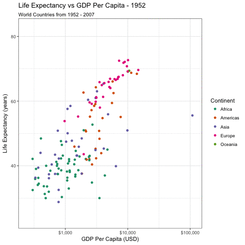
Plot 1. An animation of a single scatterplot:
- Represent each country by a point.
- Colour each country's point by continent.
- Animate this plot over time (year), using the
gganimatepackage.
gapminderAnimPlot <- ggplot(gapminder, aes(x = gdpPercap, y = lifeExp, color = continent, frame = year)) + geom_point() +
  scale_x_log10(name = 'GDP Per Capita (USD)', label = dollar_format()) +
  scale_y_continuous(name = 'Life Expectancy (years)') +
  scale_color_brewer(name = 'Continent', type = 'qual', palette = 'Dark2') +
  ggtitle("Life Expectancy vs GDP Per Capita -", subtitle = "World Countries from 1952 - 2007") +
  theme_bw()

suppressMessages({
  gganimate(
    gapminderAnimPlot, interval = .3, saver = 'gif',
    filename = 'gapminder_animated_plot.gif'
  )
})
1C Traces
rubric={code:3}
Plot 2. A single static plot with traces:
- For each country, use traces (with
ggplot2::geom_path) to indicate progression over time. These should be overlaid on one plot. - Colour each country by continent.
gapminderTracePlot <- ggplot(gapminder, aes(x = gdpPercap, y = lifeExp, color = continent)) +
  geom_path(
    aes(group = country), alpha = 0.55,
    arrow = arrow(ends = "last", type = "closed", angle = 20, length = unit(7, "points"))
  ) +
  scale_x_log10(name = 'GDP Per Capita (USD)', label = dollar_format()) +
  scale_y_continuous(name = 'Life Expectancy (years)') +
  scale_color_brewer(name = 'Continent', type = 'qual', palette = 'Dark2') +
  ggtitle("Life Expectancy vs GDP Per Capita", subtitle = "Progression by Country from 1952 - 2007") +
  theme_bw()

gapminderTracePlot
1D Faceted Traces
rubric={code:3}
Plot 3. A static trellis plot with traces:
- Use faceting to separate the countries into their own panels (with
ggplot2::facet_wrap). - Use traces (with
ggplot2::geom_path) to indicate progression over time. - Colour each country by continent.
Solution:
This can be effectively accomplished one of two ways.
- By subsetting your dataset to a smaller number of countries:
gapminderSubsetTrellisPlot <- gapminder %>%
  filter(country %in% c(
    "Rwanda", "Liberia", "New Zealand", "Germany", "Morocco",
    "Pakistan", "Vietnam", "United States", "Albania"
  )) %>%
  ggplot(aes(x = gdpPercap, y = lifeExp, color = continent)) +
  geom_path(aes(group = country), arrow = arrow(ends = "last", type = "closed", angle = 20, length = unit(7, "points"))) +
  scale_x_log10(name = 'GDP Per Capita (USD)', label = dollar_format()) +
  scale_y_continuous(name = 'Life Expectancy (years)') +
  scale_color_brewer(name = 'Continent', type = 'qual', palette = 'Dark2') +
  ggtitle("Life Expectancy vs GDP Per Capita", subtitle = "Progression in Six Countries from 1952 - 2007") +
  facet_wrap(~country) + theme_bw()

gapminderSubsetTrellisPlot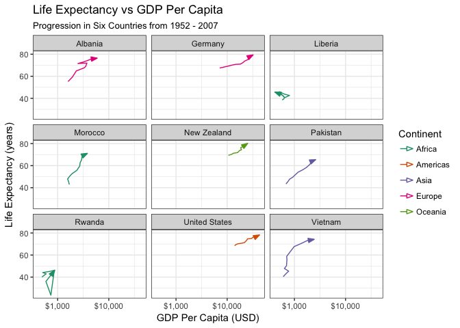
2: By tweaking your R chunk options, facet_wrap parameters, and theme
options to make your visualization of all 142 countries more effective. For
saving the file, instead of using chunk options, you can use the scale
parameter to ggsave().
The chunk options used here are: {fig.width = 10, fig.height = 12}
gapminderFulltrellisPlot <- gapminder %>%
  ggplot(aes(x = gdpPercap, y = lifeExp, color = continent)) +
  # geom_point() +
  geom_path(aes(group = country),
            # This adds arrows to the end of each geom_path
            arrow = arrow(ends = "last", type = "closed", angle = 20, length = unit(5, "points"))
            ) +
  ylab("Life Expectancy") +
  scale_x_continuous(name = "GDP per capita (USD)", trans = "log10", labels = scales::dollar) +
  ggtitle("Life Expectancy vs GDP per capita", subtitle = "Progression by Country from 1952 - 2007") +
  # label_wrap_gen() lets you specify line-wraps for your facet titles, so the
  # countries with longer names don't run off the small title panes.
  facet_wrap(~country, labeller = label_wrap_gen(width = 12)) +
  theme(
    # This wil rotate your x-axis ticks so they do not run into each other
    axis.text.x  = element_text(angle = 90, hjust = 0),
    # This will shrink your facet titles
    strip.text.x = element_text(size = 7)
  )


gapminderFulltrellisPlot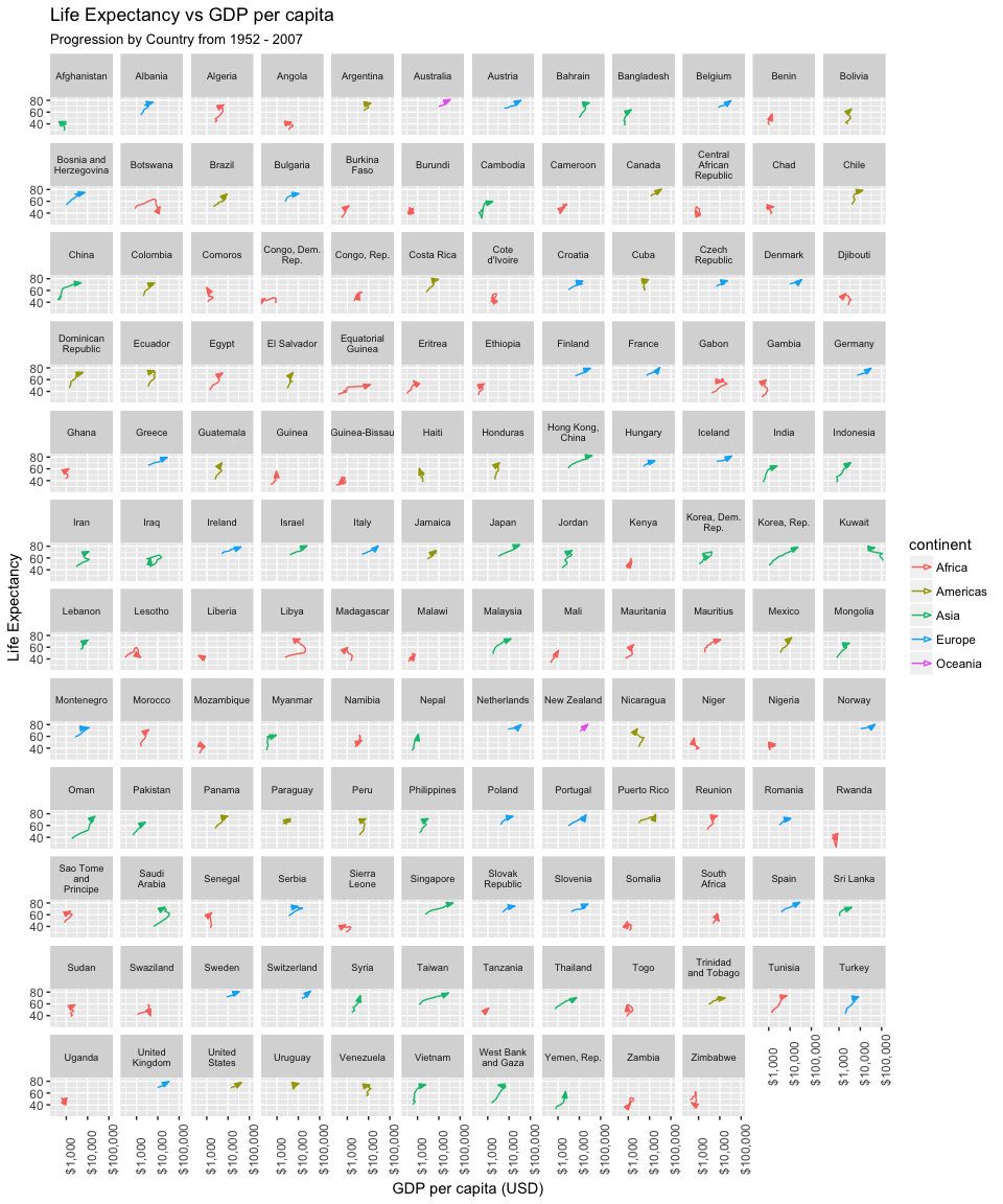
# Here's the way to save the figure with better scaling
# ggsave("gapminder_full_trellis_plot.png", gapminderFulltrellisPlot, scale = 1.2)
1E Analysis
rubric={reasoning:6}
Discuss the pros and cons of the three approaches, in terms of what tasks each approach supports well or poorly. Call out specific aspects of what structure is clearly visible in each plot, versus difficult to notice.
By animating the plot, we can get a gist of the big picture. Broadly speaking, over time, countries are becoming wealthier and gaining longer life expectancies. However, what we gain in big picture, we lose in nuance. In an animated plot, a viewer must use their memory to remember any previous point. In a 12-frame animation, this is impossible. Additionally, because we have only color-coded by continent and not country, we are unable to track any individual point through the animation.
The trace plot offers a solution to this, by plotting the history of each point in the animated progression. However, due to the number of countries, we suffer from severe overplotting, and are still unable to determine any one country's progression. With the addition of an arrow to the path we are able to determine the general directionality of the points, but overplotting still hinders the ability of the viewer to follow the entire path from the head to the tail.
Finally, the trellis plot allows the viewer to clearly determine the trend of any given country. However, due to the number of countries in the dataset (142), a full facetting would require a very large surface area to display meaningfully, and would make comparison between distantly facetted countries difficult. Instead, we have restricted the number of countries displayed, allowing for a more detailed analysis of a select few countries, while giving up the big picture view of the dataset.
1E Marking Criteria:
- Animation pros
- Tells an interesting story - good communication device
- Works well with a small number of points (<200)
- Works well when told where to focus
- Can show an emerging trends (evokes emergent property)
- Animation Cons
- Doesn't work well with many data points
- Confusing when not told where to focus (animations are difficult to follow)
- Traces pros
- Show anomalies
- See points as clear trend lines
- Can get a sense of direction (but only with the transparency fix like in Roberston paper)
- Traces Cons
- Difficult to spot country trends
- Cluttered - Similar trends just overlap (true with animation but lesser degree with animations)
- Small Multiples Pros
- A way to deal with the clutter of points
- Easier to spot anomalies
- Small Multiples Cons
- Smaller graphs (because there are more of them), means the lines is smaller & it's harder to discern direction of flow
- Takes more time to read all the data
- Can be difficult to make comparisons between countries
- Difficult to see aggregate (i.e. continent level) trends
1F Paper (Optional)
rubric={reasoning:3}
1F Marking Criteria:
- There are four hypothesis listed in the paper, did you agree with them or mention them?
- Differentiating between presentation and analysis
- Talking about fun/entertainment vs accuracy.
Read the research paper
https://www.cc.gatech.edu/~john.stasko/papers/infovis08-anim.pdf
Effectiveness of Animation in Trend Visualization. Robertson, Fernandez, Fisher, Lee, and Stasko. IEEE Transactions on Visualization and Computer Graphics (Proc. InfoVis 2008), 14(6):1325-1332, 2008.
Discuss whether your analysis above aligns or disagrees with the conclusions of the paper authors.
Your answer here.
Exercise 2 - Interactive plots with Shiny (77%)
2A Design and Code
rubric={code:40,viz:12}
Create an interactive visualization using Shiny with the gapminder dataset.
You should implement at least five input methods. You may tie these to any of the attributes in the dataset or to any aspects of the visual encoding; do design your app so that the interactivity is usefully adding value for the user. Here are some ideas:
- select input - pick which attribute to encode, or pick which encoding to use
- numeric input - change geom alpha/transparency value, or change attribute thresholds
- radio buttons - change geom type, or change between showing raw and normalized data
- slider input - change geom size, or change attribute thresholds
- checkbox input - pick continents
- text input - change graph title/legend, or add annotation
- color input - change geom color
library(colourpicker) # library(devtools); devtools::install_github("daattali/colourpicker")
Visual guide to some of the Shiny inputs
2B Deploy
rubric={mechanics:15}
Deploy your Shiny app to shinyapps.io and upload your source code to your assignment repository. Sometimes deployment will introduce bugs, so make sure to save some time for debugging! The shinyapps.io console logs are very helpful here.
2C Document
rubric={writing:5, mechanics:5}
Document the functionality of your Shiny app in the markdown document in this repository. Explain each function included. YOU MUST INCLUDE SCREENSHOTS illustrating all of the functions your Shiny app performs. If your Shiny app fails to deploy to shinyapps.io, we will be grading you solely on your screenshots; even if your deployment is perfect, screenshots are required.
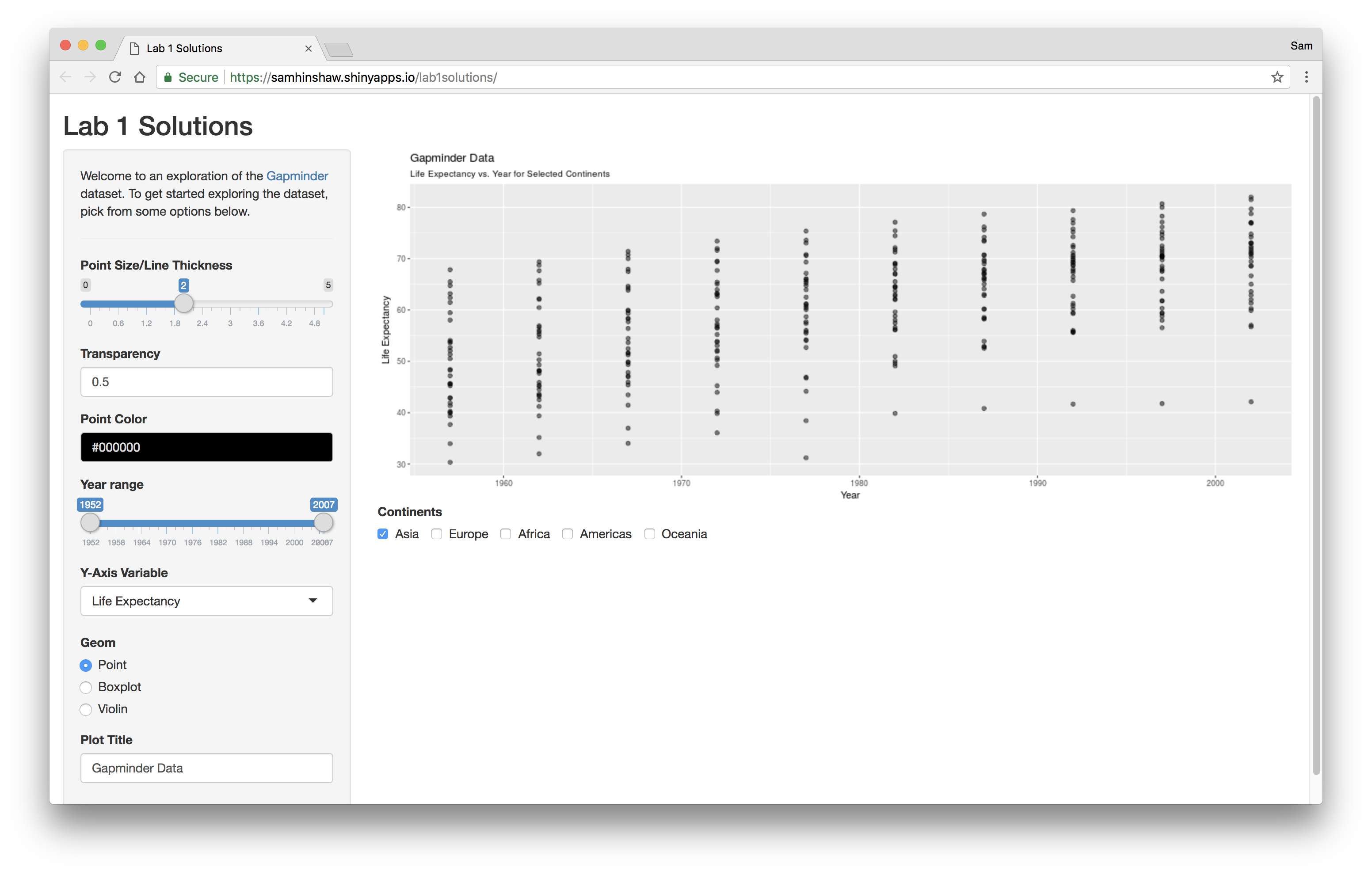
- App Homepage.
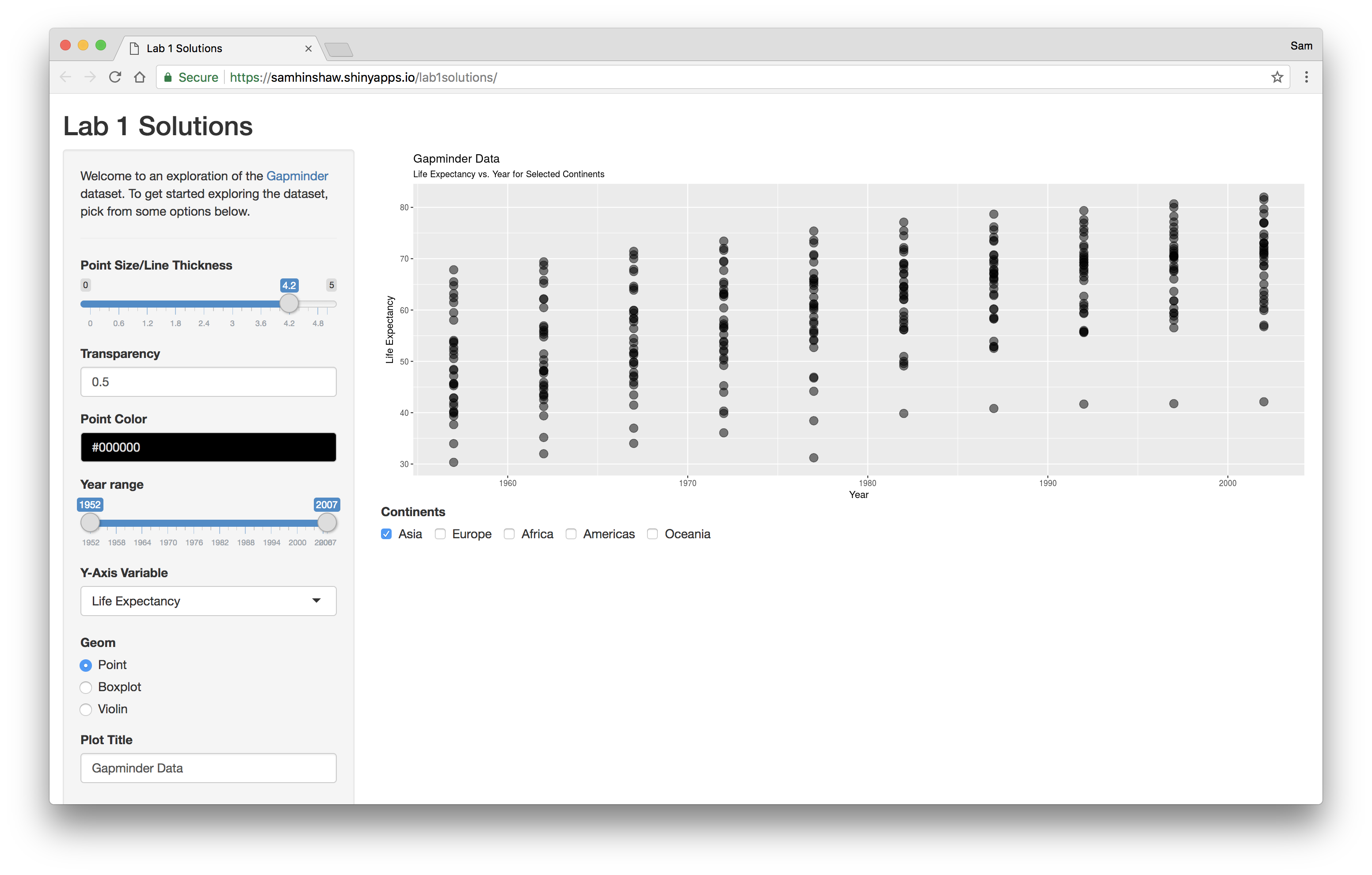
- Users can modify point size/line thickness.
- Inside of ggplot,
size = input$pointSize(not inside ofaes())
- Inside of ggplot,

- Users can modify the alpha transparency of the points displayed.
- Inside of ggplot,
alpha = input$alpha(not inside ofaes())
- Inside of ggplot,
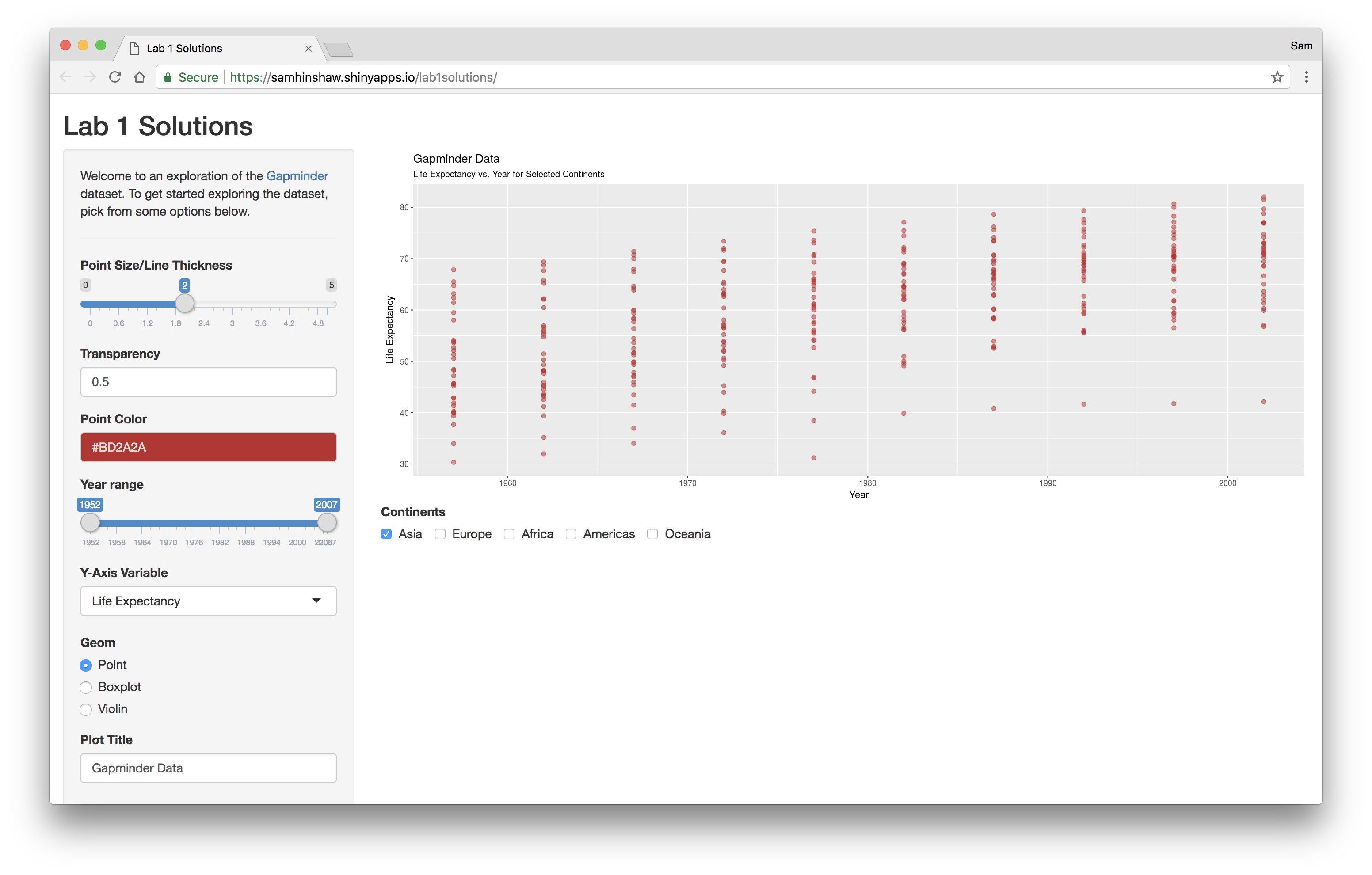
- Users can modify color of the points displayed.
- Inside of ggplot,
color = input$pointColor(not inside ofaes())
- Inside of ggplot,
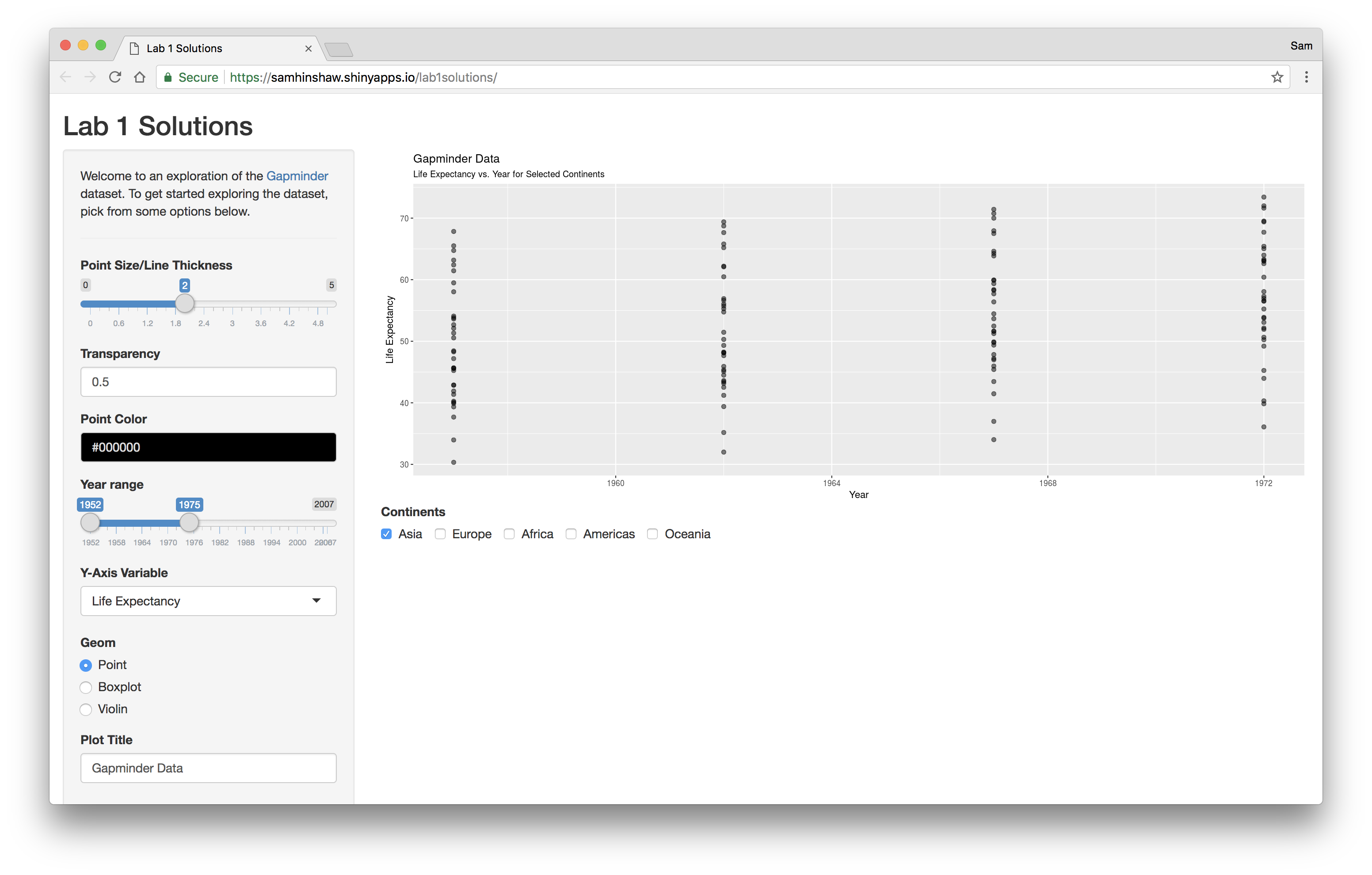
- Users can filter the years they wish to display on the chart.
- Implemented with
dplyr::filter(year > min(input$years) & year < max(input$years))
- Implemented with
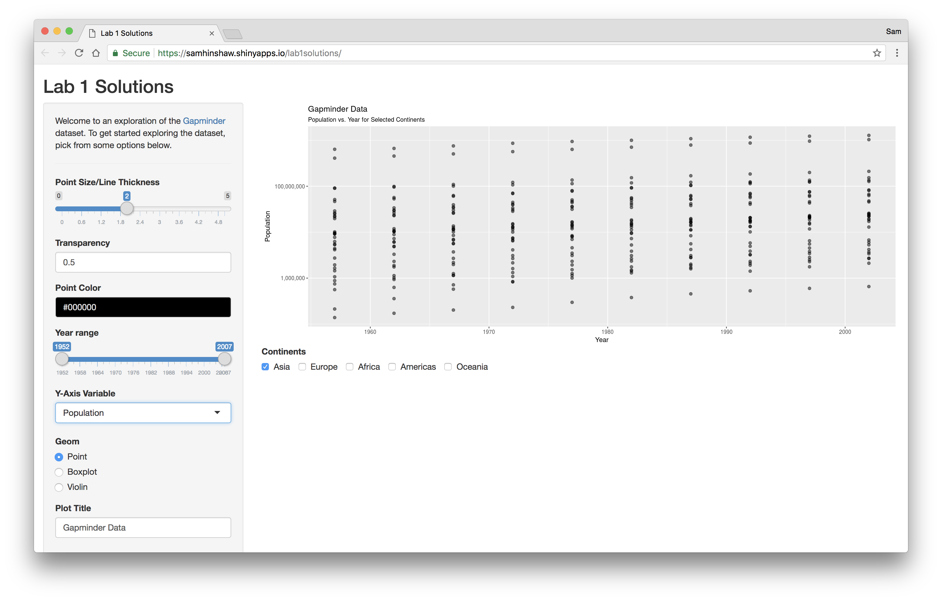
- Users can change the variable displayed on the y-axis.
aes_string(y = input$y_axis)
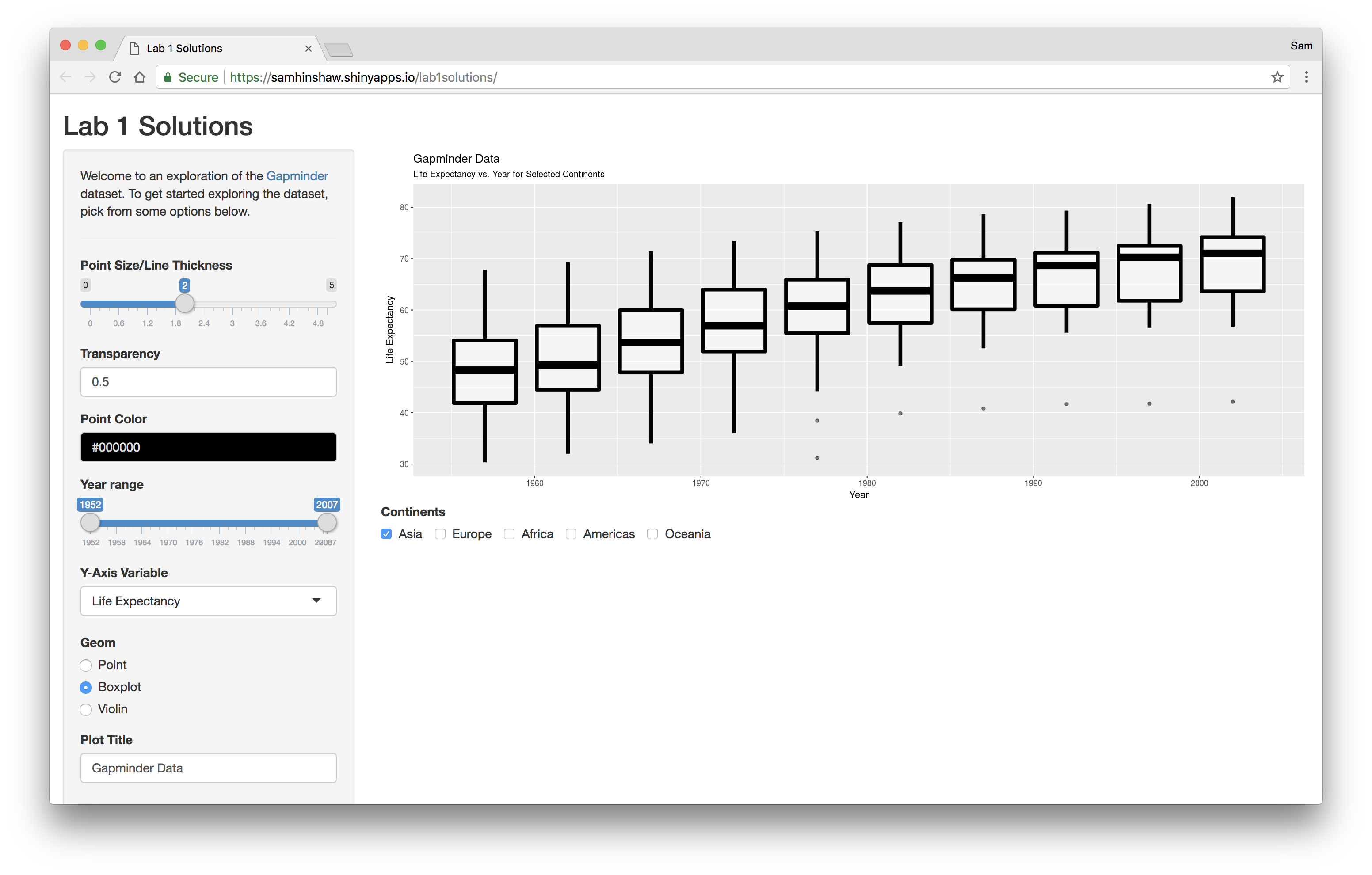
- Users can change the type of plot displayed by changing the ggplot2 geom layer used.
- Implemented with
if elsestatements changing thegeom_*()layer added to the plot.
- Implemented with
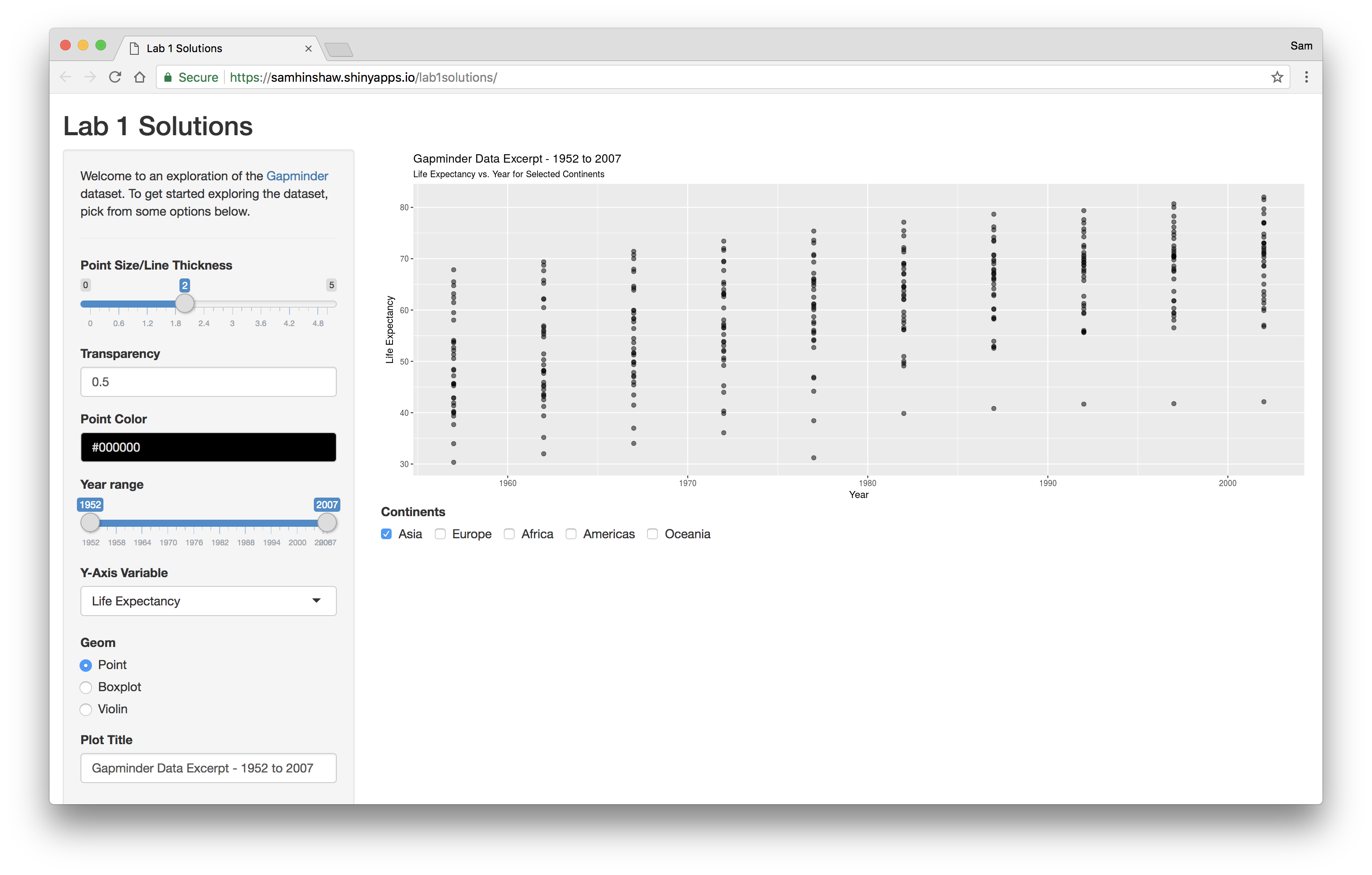
- Users can manually edit the plot title.
ggtitle(title = input$title)

- Users can filter the continents they wish to display on the plot.
- Implemented with
dplyr::filter(continent %in% input$continents)
- Implemented with