DSCI 532 Quiz 2
Time: 30 minutes
Overall writing
rubric={writing:1}
You have 30 minutes to complete the quiz, and there are 30 marks. The single mark in this section accounts for the overall quality of your writing across all the questions below.
Question 1: Spatial Aggregation
rubric={reasoning:5}
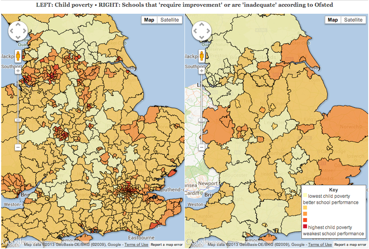
Consider the side by side views of England showing two attributes: poverty on the left and school inadequacies on the right. Critique the ability of readers of this visualization design to compare these two attributes given that the spatial aggregation is different between the two views, incorporating a discussion of the Modifiable Areal Unit Problem (MAUP) into your answer.
Answer 1
The different aggregation methods indeed makes it difficult to draw any connections between the two plots. In fact, it seems as though aggregation on the right-hand plot was done specifically to weaken any arguments that there might be a correlation between poverty and school inadequacies. The Modifiable Areal Unit Problem comes into play here in that it is possible that the plot on the left-hand side was made with unit boundaries that highlight pockets of poverty, whereas the larger units on the right-hand plot aggregate over larger areas, masking potential smaller local problems. It would be more effective to have the same scale over both plots, possibly even with a slider option to aggregate over smaller and smaller units, based on some even distribution of the data points in those units.
Answer 2
It is tricky to compare the two because the interior boundaries are different. For example in the cluster of povery in the southweast it's hard to see how that area maps to the school inadequacies on the right. THe high poverty is not necessarily centered in on the the area that also has poor school performance. The doubling-up on the scale is actually quite confusing as well (I would prefer two independent scales). The main issue is the aggregation --it just makes it too difficult to compare one region to the other. At a minimum, the subdivisions used in both maps should be identical. If that means throwing away some detail in the left map by aggregating it into regions on the right map, then so be it, as it would be easier to make comparisons between the two regions. One potential option would be to show them side by side as is, but perhaps use the right most map scaled by school inadequacies but also with a modified shape (MAUP) that is exagerated in size or diminished in size from the true spatial coordinates based on the poverty. Depending on the audience this might work--but it may also confuse people if they are expecting to see common sized boundaries that have now been modified (aka: the uncanny valley effect).
Question 2: Cluttered Network
rubric={reasoning:6}
Consider Fig 4 from the paper Effects of Space and Scale in the Food Web Structure of the Aleutian Archipelago
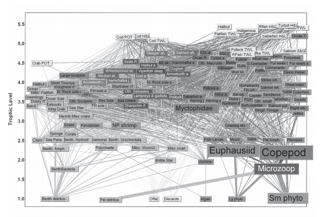
This network diagram suffers from serious visual clutter. Propose two specific, different alternatives from the suite of three possibilities for handling complexity covered in this module: manipulating the view through changes over time, faceting into multiple views, reducing the amount of data shown. Compare the scalability of your two alternatives.
Answer 1
The two alternatives that come to mind are faceting into multiple views, and reducing the amount of data shown. First, it appears as though the boxes and text are colour-coded to represent different groups or species here. I don't have enough detail on the data, but it appears as though multiple plots could be created, faceting for these groups. This would, however, eliminate connections between the groups, but perhaps that's okay. We could also try to reduce the amount of data shown. It appears as though there might be a hierarchy in this data, based on the sizes of the text boxes. We could possibly create an icicle plot, or something similar to capture that and show details on demand.
Answer 2
Option 1: Reducing the amount of data shown (both reducing the amount of data shown AND manipulating the view through changes over time)
- The data could be filtered to only show links between labels that are strong (aka: above some threshold)
- This threshold may be controlled by a slider so that the user can select their level of visual clutter (the lowest threshold being the image shown)
- interactivity can be used so that if a user clicks a label the following following:
- the network links for that particular label are shown in bold
- the network links for other labels are faded to the background
- the network graph itself is modified (aka: other network links are squeezed together/shunted together into a small area, aka: reducing the amount of data being shown by taking up screen real estate without deleting it entirely so the user could still navigate back to it) so that the main effect of the network selected is shown in great detail w/ minimal clutter This would work for the scale of the labels shown but I feel like it is at the limit. You can still pick out major topics and some of the minor ones. If the network density was doubled I don't think it would work
Option 2: Facet into multiple views
The main network graph can be shown with an adjacent plot. Should the user click on a label, the adjacent graph could be populated with just the network links for the selected node. This could even be extended to a third graph that shows the immediate neighbours (1-hop away) only, resulting in three views:
- the main view shown in the example figure (think of this as a bird's eye view)
- the facetted view showing every label that is connected to the current label
- a zoomed in view of JUST the immediate labels of the selected label
- this could be interactive with the 2nd view, e.g. it could be used to update neighbours based on the current selected label in the zoomed in view This somewhat suffers from the same scalability as the first option as you would still need to be able to pick targets out of the cluttered main map. Doubling the density would again make for more complexity.
Question 3: Cars
rubric={reasoning:12}
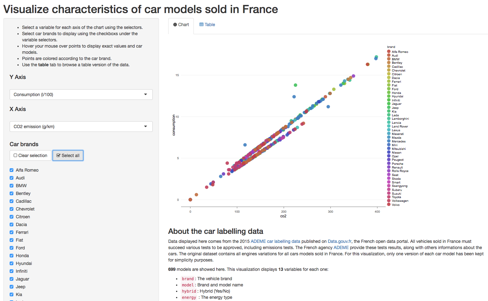 Consider the shiny app at [http://shiny.frenchkpi.com/carlabelling-viz/] which already incorporates some basic interactivity: the user can select which 2 of the 13 attributes to show on each axis of the single scatterplot, can filter the 700 points representing car models according to the levels of the categorical attbute car brand, and can obtain details on demand with a popup when hovering over each point.
Q3a Faceted redesign
Suggest an appropriate redesign using faceting into multiple linked views and provide a rationale for your choice that includes an argument for what limitations of the current design that you address.
rubric={reasoning:6}
Answer 1
There seem to be many variables here, and unfortunately only two can be seen at a time, which seems like a severe limitation. Perhaps the user could choose two more axes and brush the points on the first scatterplot to create a new plot based on the new attributes. Or, we could decide which attributes are the most important or frequently used, and have the brushed points on the first scatterplot create a new plot with these attributes. That way, we would not have to use memory to visualize more than two variables and how they interact, but could see at least 4 variables at a time.
Answer 2
This problem could be redesigned into multiple linked views using small multiples. I find the differences between the car brands to be the most interesting so many small scatter plots of the selected variable could be plotted resulting in small multiples of the same plot but separated out by each car brand. They could be linked such that a particular point in a graph can be clicked on, which would then be inserted into every graph so a comparison against all manufacturers could be made. For example, I could click on the a cylinder vs gas milage plot and select a 2008 honda fit from the onda small multiple, have this point show up in all graphs, and then see how well other 4 cylinder economy vehicles compare in gas mileage across all makes, in quite great detail.
Q3b Aggregation redesign
Suggest an appropriate redesign using aggregation, and provide a rationale as above.
rubric={reasoning:6}
Answer 1
Currently the colour coding is done alphabetically, and not in any systemized way. It might be good to be able to group companies either by country, by age of company, or by market share to see if there are any major differences across these variables. Then the groups could be colour-coded.
Answer 2
Aggregation can be used. Perhaps similar car models can be averaged across each manufactur for the particular variables being shown. To extend the gas mileage, perhaps "honda" can get aggregated so that all their 4 cylinder vehicles are aggregated into a boxplot for "honda 4 cylinder vehicles" (you would expect a particular cars brand to be similar within a similar engine class). Further subplots could be made by aggregating on "manufacturer" and then type (sedan, economy, truck, etc). The resulting plot would be a boxplot for each manufacturer with the y-axis the same as the original graph and the x-axis being the manufacturer, and the box-plot encoding the third variable chosen by the user (gas mileage, price, whatever). This is again solving the comparison problem of having to compare 700 vehicles being too complicated. Instead of now comparing a single model to all other models across all the small multiples in the above solution to q3a, this would be comparing the median/variability of each variable between all manufacturers. Perhaps BMWs all have the same performance for a specific class but Kia has a huge range in the minimum and maximum gas mileage for a particular category that is selected as the x axis.
Question 4: Focus+Context
rubric={reasoning:6}
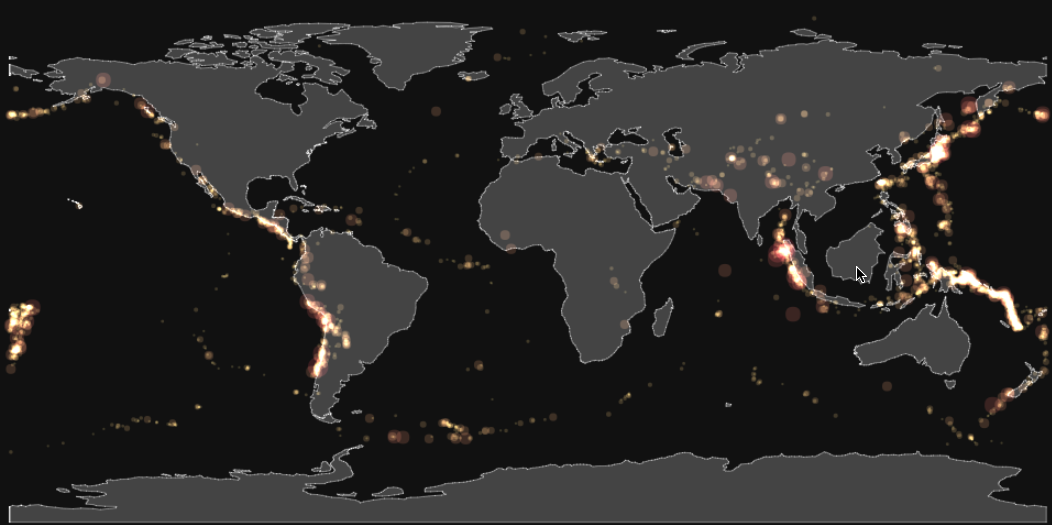 Consider the fisheye lens at [http://bl.ocks.org/enjalot/a50efa43ec84aba00e33349c8da7fc9a]. List at least one benefit and at least one disadvantage of using geometric distortion to provide focus+context interaction.
Answer 1
One obvious benefit is that focussing in on a region gives a more detailed view of the historical earthquake frequency and severity. Given that this is a map of the Earth, the distortion does not affect our perception of the entire plot. The distortion that is sometimes a problem with fisheye lenses is not an issue here in that sense. However, the distortion of the fisheye lens does make comparisons of areas more difficult. Once I've zoomed in on Japan, I can no longer compare the size of those point with those of the Central America with any certainty. In fact, I can't even compare the size of the points in the middle of the fisheye lens with points on the periphery of the fisheye lens. A more simple zoom here might be more appropriate for that task.
Answer 2
The benefit is that you get some level of zooming into more detail from the overview map while still maintaining some amount of orientation information at areas outside the center of fish eye lens (the area that does not suffer from radial distortion) so interesting things may still be seen at the edges of the lens for the user to go do. The disadvantage of the fisheye lens is that it's trying to do two things: ZOOMING and MAINTAING ORIENTATION and it's actually doing neither of these particular well. The zoomed area that is not affected by distortion is actually quite small (compared to just using a 'basic' zooming lens), and the area that is radial distorted is actually pretty confusing (if you didn't know what you were looking for / what areas are supposed to look like, you may miss details in this radially distorted area by not being able to make back to the undistorted image in your mind).
Question 6 (OPTIONAL): Animation Sliders
rubric={reasoning:4}
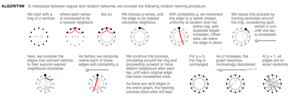
Consider this visual explanation of a construction algorithm for Watts-Strogatz networks that incorporates interactivity through sliders:
Scientific Communication As Sequential Art, by Bret Victor
Critique the use of interactive animation: if you think this approach is appropriate then explain why this design choice is effective, or if not then propose an alternative approach that uses a different strategy for handling complexity.
Answer 1
I think that the use here of interactive animation is almost effective. Since the writers of this paper are simply trying to demonstrate their method, the fact that the user can have some control over the wiring and probabilities of the re-wiring helps make it clear what the options and results are of different algorithm choices. However, I am not a huge fan of the use of hover exclusively with the sliders, with no ability to click on the slider to set it to a specific point. The sliders are also quite small with a large range over such a small length. I would suggest having either longer sliders or less options, with the ability to click on the slider to set it where you want it.
Answer 2
It actually took me a full 30-40 seconds to realize there were any interactions in this figure at all (going to Tamara's comment on interactivity that 90% of the time the users don't even bother). I did not notice the sliders at first. When I started moving the sliders, the changes were subtle. There was too much on the screen. My solution: use scrolly-telling to highlight ONE widget/thing to explain at a time. This would break the original figure into 3-5 panels I think. I would remove the user-driven sliders and instead just put it on rails to animate (perhaps with a stop/reset/pause for the user to click) so that the animation is always run, not only when the user notices. I would add clearer explanation for each 'storyboard' in the scrollytell.