DSCI 532 Quiz 1
Time: 30 minutes
Instructions
rubric={reasoning:1}
Complete the quiz by editing this very template .md file with your responses.
The accompanying shiny app will be depoloyed as the quiz is opened, but you can run it locally. It will be found here.
Question 1
rubric={reasoning:4}
State one of the major disadvantages of side-by-side linked views.
Your response here
Question 2
rubric={reasoning:4}
State one of the major disadvantages of animations.
Your response here
Question 3
rubric={reasoning:8}
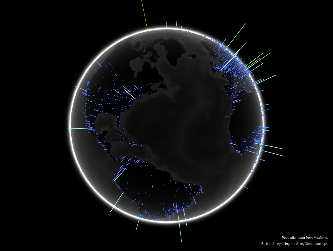
Consider the shiny app which features a 3D globe using rotation for navigation. State two of the disadvantages of this approach. Propose an alternative approach involving multiple linked views, possibly with a different visual encoding, that addresses these problems.
NOTE: The original app looks to be temporarily unavailable, but see Tamara's copy. The image of the app suffices as well, found below and at quiz1_questions/data/image.png.
Your response here
Question 4
Daily measurements of snowmelt and river discharge were collected for the Bow River at Banff between the years 1984 and 2014.
4(a)
rubric={reasoning:4}
The scatterplot below shows daily snowmelt vs. river discharge. A simple linear regression is shown, but the regression line changes with the time of year. How would you add interactivity to explore that? Describe the specific user interface that you would create in prose, you are not expected to provide code.
Your response here
4(b)
rubric={reasoning:5}
Consider how to link together the three views below to help an analyst investigating what happened during the 2013 flood. Compare the power of unidirectional linking, where the master view is the flow time series curve on the bottom left and the other two views update according to a selection there, versus the power of bidirectional linking where points can also be selected in the daily discharge/snowmelt scatterplot on the right side.
Your response here
Question 5
rubric={reasoning:4}
This question uses the same data set as above, but subsetted to years since 2000 to speed up interactivity. The log discharge is plotted against the day-of-year below it, for which a non-parametric smoother is fit, with bandwidth controlled by a slider.
Identify at least one improvement that could be made to enhance exploration of this dataset.
Your response here