DSCI 531 Quiz 2
Time: 30 minutes
Visualizing spatial data, color, visualizing network data and rules of thumb
Part 1 - Visualizing spatial data
rubric={reasoning:2}
In 2-3 sentences, explain the relationship between a choropleth map and a heatmap from a structural point of view, in terms of marks and channels. Comment on similarities & differences.
| Choropleth map | Heatmap |
|---|---|
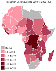 Source: http://www.petercollingridge.co.uk/data-visualisation/choropleth-maps-africa Source: http://www.petercollingridge.co.uk/data-visualisation/choropleth-maps-africa |
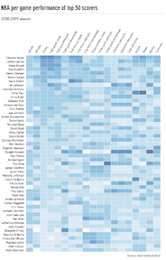 Source:https://flowingdata.com/2010/01/21/how-to-make-a-heatmap-a-quick-and-easy-solution/ Source:https://flowingdata.com/2010/01/21/how-to-make-a-heatmap-a-quick-and-easy-solution/ |
Answer
Similarities: both encode data using the color channel and use area marks.
Differences: the area mark is just a box in the case of the heatmap (a cell in the aligned 2D matrix) whereas it's a complex geometric shape in the case of the choropleth (some kind of geographic boundary).
Part 2 - Color
rubric={quiz:2}
Which statement(s) below is/are true regarding the major problems with using a rainbow colormap for showing ordered data:
a. From a perceptual standpoint, more differences can be observed when greyscale is used compared to a rainbow colormap.
b. The hue channel is not ordered. Colors such as red versus blue versus green versus purple have no intrinsic perceptual ordering.
c. Due to constraints of the human visual system, color is not a useful channel for ordered data.
d. The rainbow is not perceptually linear: a box that shows two or three different discernable colors in some regions of the colormap may show only one distinguishable color in other regions (especially the large green-yellow area near the middle).
Answer
True: b & d. A is false: the problems with the rainbow are about the lack of ordering and the perceptual nonlinearity, not an inability to distinguish a sufficient number of levels. C is false: luminance and saturation both convey order, even though hue does not.
Part 3 - Visualizing network data
rubric={reasoning:3}
In 1-2 paragraphs, Explain the tradeoffs between the use of node-link diagrams and adjacency matrix representations of networks in terms of the tasks that they support, as well as scale of the data.
| Node-link diagram | Adjacency matrix representations of network |
|---|---|
 Source:http://www.mdpi.com/2079-9276/5/1/4/htm Source:http://www.mdpi.com/2079-9276/5/1/4/htm |
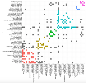 Source:http://matthewlincoln.net/2014/12/20/adjacency-matrix-plots-with-r-and-ggplot2.html Source:http://matthewlincoln.net/2014/12/20/adjacency-matrix-plots-with-r-and-ggplot2.html |
Answer
Node-link diagrams support path tracing and topological structure understanding well for smaller and less dense graphs. They are good for sparse network matrices where the number of edges is less than 4 times the number of nodes.
Adjacency matrix views work well for dense graphs when topology tracing is not the main objective, they can show clusters and outliers. Scalability wise, they can show a lot more than the node-link diagrams, and we can also see patterns with the data more discernibly. We also have some control over spatial layout in that you can order the axis by some amount of factors (the panel in the right has been ordered). However, adjacency matrices require more training to understand, node-link diagrams are intuitive to the untrained eye.
Part 4 - Analyzing visualizations
4(a)
rubric={reasoning:4}
In 2-3 paragraphs, critically analyze this visualization in terms of marks and channels, including the use of categorical vs ordered attributes. Critique its effectiveness, and suggest at least one improvement.
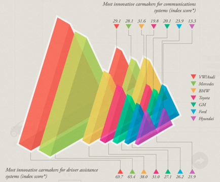 Source:http://viz.wtf/post/137826497077/eye-popping-3d-triangles
Answer
This plot uses volume marks (3D triangles). It's hard to tell exactly how they're size coded, whether it's height of triangle (1D) or area of triangle (2D) or volume of triangle (3D). There is one categorical attribute that is color coded (car brand) and two quantitative attributes that are shown by the marks, communications systems and driver assistance. There is additional annotation where the exact number is shown with a leader line, presumably because the designers realized it was so difficult as to be almost impossible to read off the values from the chart itself.
The marks are laid out in 3D, so there is a problem with occlusion for the back objects which are partially hidden by the front objects.
The use of color is ok but not perfect: categorical data is shown with hue, which is good. The number of categories is only 7 so it should be possible to create distinguishable colors. However, the actual colors chosen are not as distinguishable as they could be, the purple and pink and yellow are quite close to each other.
Another improvement would be to use a better color palette, using the online ColorBrewer tool.
The major improvement would be to have two bar charts, either grouped or side by side.
4(b)
rubric={reasoning:4}
In 2-3 paragraphs, critically analyze this visualization in terms of marks and channels, including the use of categorical vs ordered attributes. Critique its effectiveness, and suggest at least one improvement.
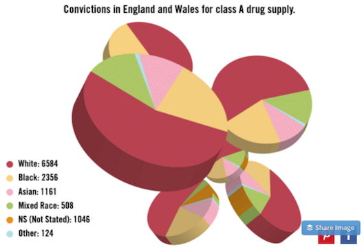 Source:http://viz.wtf/post/139002022202/designer-drugs-ht-ducqn
Answer
There are multiple 3D pie charts, each encodes 6 levels of a categorical attribute (race) with a quantitative attribute (counts). The segments can be considered either as area marks either with size or angle coding (simply extruded into 3D), or as volume marks. The segments are redundantly coded with color.
Even a single 3D pie charts are a bad idea because perspective distortion impedes the ability to compare sizes. It is certainly not helpful to have multiple versions of the exact same chart because they occlude each other.
The use of color is reasonable: categorical data is shown with hue, and the number of categories is only 6 so it is possible to distinguish the colors from each other in theory, and in practice the chosen colors are easy to tell apart.
Even 2D pie charts are less effective than bar charts since they use the lower accuracy channels of area & angle rather than high-precision aligned 2D spatial position.
There's some oddness where the orange Not Stated category can't be seen in most of the copies, which appear to have only 5 categories. The orange can be seen from the side in two of the bottom copies.
Improvement: show a single bar chart with 6 bars.