DSCI 531 Quiz 1
Time: 30 minutes
Introduction to visualization, marks, and channels, select and justify a data abstraction to use for a given task, and table data part
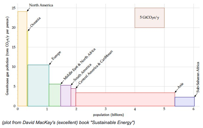
- Marks:
- area marks encode the items representing locales. [give full credit for any synonym like regions, geographic areas, world regions, etc. this solution key avoids the term region for the items since it's ambiguous whether it means regions of the world or regions on the display!]
- alternative answer of line mark is only given full credit if size/width/area is also mentioned as a channel below.
- Channels:
- vertical position (along a common scale) encodes the quantitative attribute of per-capita pollution. [give full credit even if common scale not mentioned explicitly]
- 1D size (width) encodes quantitative attribute population. [do not give full credit for horizontal position, which implies absolute position along a common scale; it's size coded not position coded!]
- color (hue) encodes categorical attribute locale name [give full credit for any combination of color and/or hue]
- the horizontal axis is separated into regions that are aligned vertically and ordered horizontally by the per-capita pollution attribute [this answer not required for full credit. give spark mark if separate/order/align discussed correctly.]
- *label/text is acceptable [not required, but no credit lost if it is listed] *
1aii. State if any attributes are redundantly coded with morethan one channel.

No. [full credit if label/text identified as a channel and then claim is redundant because have both color and text]
1aiii. Specify two abstract tasks for which this visual encoding would be effective.

This visual encoding would be effective for:
- Comparing values among groups.
- Looking up values.
1aiv. Describe the maximum scale for which a plot of this type would be effective (in terms of the number of items, the number of attributes, and the number of distinct levels for the attributes).

This kind of plot could scale up to one or two dozen items [give full credit for any answer from 10 to 50]. It encodes three attributes: population, per-capita pollution, and region name [do not give full credit for four attributes]. It scales to hundreds of levels for the quantiative population and pollution attributes and a dozen or so levels for the categorical locale name attributes. [Since this quiz does not cover the use of color, the full credit given for arguing for more locale levels, students are not expected to discuss the fact that the scalability of categorical color coding is limited to a dozen or so levels.]
1(b)
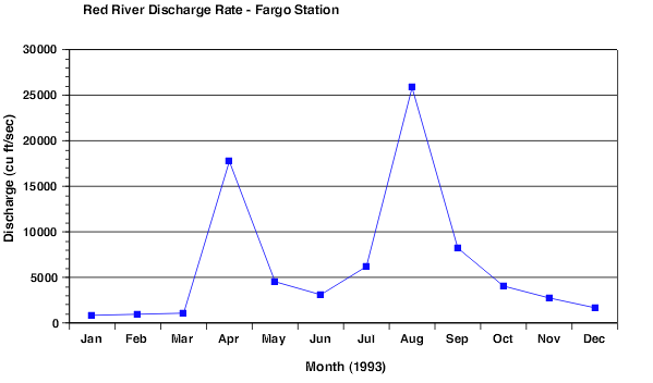 Source: https://www.ncsu.edu/labwrite/res/gh/gh-linegraph.html
1bi. State which mark type and which visual channels are being used to visually encode which attributes.

- Mark type: points and lines.
- Visual channel:
- vertical position of the points encodes discharge.
- horizontal position of the points encode month.
- lines are used as connection marks between the points; alternately, line tilt encodes rate of discharge increase/decrease [full credit given for either answer]
1bii. State if any attributes are redundantly coded with morethan one channel.

None of the attributes are redundantly coded with more than one channel.
1biii. Specify two abstract tasks for which this visual encoding would be effective.

This visual encoding would be effective for:
- Identifying outliers
- Identifying trends.
1biv. Describe the maximum scale for which a plot of this type would be effective (in terms of the number of items, the number of attributes, and the number of distinct levels for the attributes).

This plot would be effective for hundreds of key levels, hundreds of value levels.
Part 2 - Redesign plots to address shortcomings
Review the plot below and answer the questions that follow:
# some set-up code to load libraries and data
import pandas as pd
import matplotlib.pyplot as plt
% matplotlib inline
chopstick = pd.read_csv("http://blog.yhat.com/static/misc/data/chopstick-effectiveness.csv")
chopstick.head()
chop_scatter = chopstick.plot.scatter(x = 'Chopstick.Length', y='Food.Pinching.Effeciency', color = "black" )
plt.xlabel('Chopstick length (mm)')
plt.ylabel('Food pinching efficiency')
chop_scatter.set_ylim(25, 50)
chop_scatter.set_xlim(0, 400)
plt.show(chop_scatter)

2a. identify at least one shortcoming of this plot and propose a solution in words that would make it more effective

- Overplotting.
- Solution: add an alpha channel to be able to use luminance to see density.
- Chopstick length is categorical.
- Solution: use a boxplot instead.
- y-axis doesn't start at 0, may cut out some values.
- Solution: adjust y-axis.
2b. Re-implement the plot below, fixing the problem you identified

fig_q2 = chopstick.boxplot(column='Food.Pinching.Effeciency', by = 'Chopstick.Length')
plt.xlabel('Chopstick length (mm)')
plt.ylabel('Food pinching efficiency')
plt.title('')
plt.suptitle('')
plt.show(fig_q2)

Part 3 - Critique channel usage
Review the plot below and answer the questions that follow:
mtcars = pd.read_csv("mtcars.csv")
mtcars.head()
import matplotlib.patches as patches

fig1 = plt.figure()
ax1 = fig1.add_subplot(111)
ax1.set_xlim(25,300)
ax1.set_ylim(0,45)

for i in range(0,mtcars.shape[0]):
    ax1.add_patch(
        patches.Ellipse(
            (mtcars.hp.iloc[i], mtcars.mpg.iloc[i] ), # (x,y) position
            mtcars.disp.iloc[i]/10, # width
            mtcars.gear.iloc[i]**2, # height
        )
    )

plt.xlabel("horsepower")
plt.ylabel("miles per gallon")
ax1.annotate('bubble width = diplacement/10', xy=(150, 40),xytext=(150, 40))
ax1.annotate('bubble heigth = $gear^{2}$', xy=(150, 38),xytext=(150, 38))
plt.show(fig1)

3a. In 2-3 sentences, critique this plot in terms of integral vs separable channels.

The horizontal size and vertical size channels are automatically fused into an integrated perception of area. What we directly perceive is the planar size of the circles, namely, their area.
3b. Propose an alternate visual encoding that is more effective.

Change the channels: Use color to encode gear, and use size to encode displacement.
3c. Re-implement the plot below to make the visual encoding more effective (as you suggested in 3b).

# A one-line solution, which is not perfect.
mtcars.plot.scatter("hp", "mpg", c = mtcars.disp, s = mtcars.gear*50, alpha = 0.8)

# A better solution

fig, ax = plt.subplots()
ax.margins(0.05) # Optional, just adds 5% padding to the autoscaling
color = ['black', 'magenta', 'blue']
i = 0
for name, group in mtcars.groupby('gear'):
    ax.scatter(group.hp, group.mpg, s = group.disp, marker = 'o',
               label = name, color = color[i], alpha = 0.5)
    i += 1
ax.legend(title = "gear", fontsize = 10)
ax.annotate('bubble size = $displacement^2$', xy=(250, 25), xytext=(220, 25))

plt.xlabel("horsepower")
plt.ylabel("miles per gallon")

plt.show(fig)

Part 4 -Visual popout
Which of these visual encodings supports popout? Answer True or False for each:
4a. position and color

True
4b. orientation and color

False
4c. width and height

True
4d. color and shape

False
4e. position and color

True
4f. parallelism

False
4g. color

True
4h. orientation

True