DSCI 531 Lab 1 Sample Solution
Exercise 1
Data wrangling:
library(tidyverse)
library(stringr)
library(gridExtra)
library(grid)
library(coin)
library(lazyeval)
sum_viz <- function(df, col) {
# function to do a summary of a dataframe for a spec. col
# grouped by viz
# params
# ------
# df - input dataframe
# col - variable
#
# returns
# -------
# dataframe of column summarized
df %>%
group_by(viz) %>%
summarize_(mean = interp(~ mean(var, na.rm=TRUE), var = as.name(col)),
sd = interp(~ sd(var, na.rm=TRUE), var = as.name(col)),
median = interp(~ median(var, na.rm=TRUE), var = as.name(col)))
}viz_a <- read.csv("vizA.csv")
viz_b <- read.csv("vizB.csv")# channge out those godawful column names
# key
# rank_ -> questions that vary from 0 to 5
# dist_ -> questions about distributions
# q_x_ -> questions about specific values
c_names <- c("time", "rank_dist", "rank_outlier", "rank_trends", "q_int_walks",
"dist_walk", "dist_runs", "q_walk_out", "q_run_out", "q_walk_freq",
"q_runs_freq", "q_walk_small", "q_run_small")
names(viz_a) <- c_names
names(viz_b) <- c_names
viz_a$viz = "A"
viz_b$viz = "B"
# everything coming in different between viz_a and viz_b
# want to get rid of factors and you can't bind togehter
# columns that are factor and int, etc.
# ultimately at some point get rid of character strings in
# columns that should be numeric
#step 1 -> turn everything into a character and glom togthether
# into a single dataset
cols <- rep(TRUE, length(viz_a))
viz_a[cols] <- lapply(viz_a[cols], function(x) as.character(x))
viz_b[cols] <- lapply(viz_b[cols], function(x) as.character(x))
viz <- rbind(viz_a, viz_b)# step 2
# convert the things I want to be numeric to be numeric
# this converts all character strings in numeric fields to NAs
# Assumption made: anything that doesn't perfectly conform to numeric (e.g. 2-3, Probably 2, etc) is dropped
# Reality: I'd use a webform with form validation that checked user input BEFORE saving it. Poor google survey design!
cols_to_clean <- seq(1:length(viz)) %in% c(2, 3, 4, 5, 8, 9, 10, 11, 12, 13)
viz[cols_to_clean] <- lapply(viz[cols_to_clean], function(x) {
as.numeric(as.character(x))
})## Warning in FUN(X[[i]], ...): NAs introduced by coercion
## Warning in FUN(X[[i]], ...): NAs introduced by coercion
## Warning in FUN(X[[i]], ...): NAs introduced by coercion
## Warning in FUN(X[[i]], ...): NAs introduced by coercion
## Warning in FUN(X[[i]], ...): NAs introduced by coercion
# put things in that should be factors
viz$dist_walk <- as.factor(viz$dist_walk)
viz$dist_runs <- as.factor(viz$dist_runs)
viz$viz <- as.factor(viz$viz)

#remove unnecesary junk
remove(viz_a, viz_b, cols, cols_to_clean, c_names)
Ratings
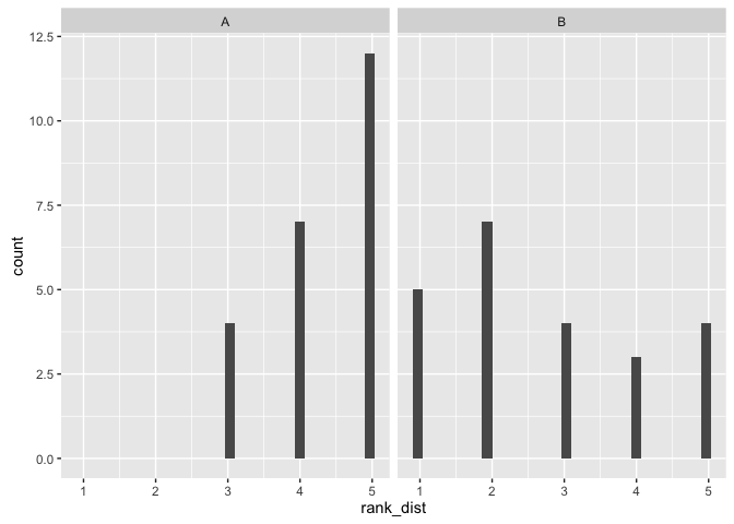
This visualization makes it easy to see the distribution of the data
ratings <- viz %>%
  select(viz, rank_dist, rank_outlier, rank_trends)

p1 <- ggplot(ratings, aes(x=rank_dist)) + geom_histogram() + facet_wrap(~viz)
p1
## `stat_bin()` using `bins = 30`. Pick better value with `binwidth`.
testing method Mann-Whitney Wilcoxin Rank Sum Test (one-sided)
The Wilcoxon rank-sum test is a nonparametric test of the null hypothesis that it is equally likely that a randomly selected value from one sample will be less than or greater than a randomly selected value from a second sample. Unlike the t-test it does not require the assumption of normal distributions.
We use Wilcoxin test because the data is ordinal. T-test is not appropriate here.
hypotheses: H0: The two popularions are equal (derived from the same population with equal means). H1: Viz A has a higher rank (higher median, positive shift), that is participants thought viz A made it easier to see the distribution of the data.
set.seed(15)

(sum_viz(ratings, "rank_dist"))
## # A tibble: 2 × 4
## viz mean sd median
## <fctr> <dbl> <dbl> <dbl>
## 1 A 4.347826 0.7751068 5
## 2 B 2.739130 1.4211836 2
wilcox.test(x=ratings$rank_dist[ratings$viz=="A"],
            y=ratings$rank_dist[ratings$viz=="B"],
            paired = FALSE,
            alternative = "greater")
## Warning in wilcox.test.default(x = ratings$rank_dist[ratings$viz == "A"], :
## cannot compute exact p-value with ties
##
## Wilcoxon rank sum test with continuity correction
##
## data: ratings$rank_dist[ratings$viz == "A"] and ratings$rank_dist[ratings$viz == "B"]
## W = 430.5, p-value = 8.698e-05
## alternative hypothesis: true location shift is greater than 0
comment on viz: It was easiest to see the ratings as factors in a histogram which clearly shows a preference for viz A for showing the distribution of the data, with significantly higher scores for viz A and a minimum score of 3 compared to a minimum score of 1 for viz B.
comment on test: We reject the null hypothesis that the populations are equal and accept the alternative that viz A has a positive shift / higher median with a p-value of 9x10⁻⁵.
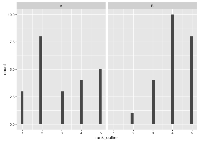
This visualization makes it easy to identify outliers
ggplot(ratings, aes(x=rank_outlier)) + geom_histogram() + facet_wrap(~viz)## `stat_bin()` using `bins = 30`. Pick better value with `binwidth`.
 testing method Mann-Whitney Wilcoxin Rank Sum Test (one-sided)
hypotheses: H0: The two popularions are equal (derived from the same population with equal means). H1: Viz A has a lower rank (lower median, negative shift), that is participants thought viz A made it harder to identify outliers
(sum_viz(ratings, "rank_outlier"))## # A tibble: 2 × 4
## viz mean sd median
## <fctr> <dbl> <dbl> <dbl>
## 1 A 3.000000 1.4142136 3
## 2 B 4.086957 0.8481554 4
set.seed(15)
wilcox.test(x=ratings$rank_outlier[ratings$viz=="A"],
            y=ratings$rank_outlier[ratings$viz=="B"],
            paired = FALSE,
            alternative = "less")
## Warning in wilcox.test.default(x = ratings$rank_outlier[ratings$viz ==
## "A"], : cannot compute exact p-value with ties
##
## Wilcoxon rank sum test with continuity correction
##
## data: ratings$rank_outlier[ratings$viz == "A"] and ratings$rank_outlier[ratings$viz == "B"]
## W = 148, p-value = 0.00426
## alternative hypothesis: true location shift is less than 0
comment on viz: It was easiest to see the ratings as factors in a histogram which clearly shows a preference for viz B for showing identifying the outliers.
comment on test: We reject the null hypothesis that the populations are equal and accept the alternative that viz A has a negative shift /lower median with a p-value of 0.004 (that is, viz B is preferred).
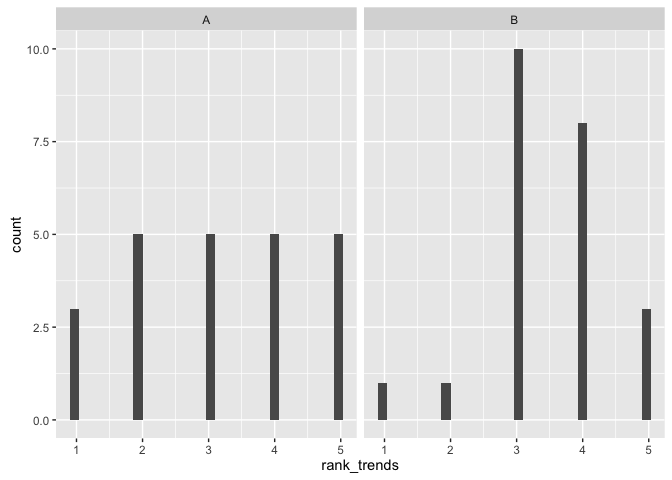
This visualization allows you to easily identify trends in the data
ggplot(ratings, aes(x=rank_trends)) + geom_histogram() + facet_wrap(~viz)## `stat_bin()` using `bins = 30`. Pick better value with `binwidth`.
testing method Mann-Whitney Wilcoxin Rank Sum Test (one-sided)
hypotheses: H0: The two popularions are equal (derived from the same population with equal means). H1: Viz A has a lower rank (lower median, negative shift), that is participants thought viz B performed better at identifying trends in the data.
set.seed(15)

(sum_viz(ratings, "rank_trends"))
## # A tibble: 2 × 4
## viz mean sd median
## <fctr> <dbl> <dbl> <dbl>
## 1 A 3.173913 1.3702081 3
## 2 B 3.478261 0.9472239 3
wilcox.test(x=ratings$rank_trends[ratings$viz=="A"],
            y=ratings$rank_trends[ratings$viz=="B"],
            paired = FALSE,
            alternative = "two.sided")
## Warning in wilcox.test.default(x = ratings$rank_trends[ratings$viz ==
## "A"], : cannot compute exact p-value with ties
##
## Wilcoxon rank sum test with continuity correction
##
## data: ratings$rank_trends[ratings$viz == "A"] and ratings$rank_trends[ratings$viz == "B"]
## W = 231.5, p-value = 0.4603
## alternative hypothesis: true location shift is not equal to 0
comment on null hypothesis: We fail to reject the null hypothesis that there is a difference in medians, that is, nothing saying that viz A is preferred over viz B by the participants for rejecting the null.
Distributions
From this visualization, estimate the distribution of the intentional walks:
testing method Fisher Exact Test
The Fisher's exact test is used when you want to conduct a chi-square test, but one or more of your cells has an expected frequency of five or less. Remember that the chi-square test assumes that each cell has an expected frequency of five or more, but the Fisher's exact test has no such assumption and can be used regardless of how small the expected frequency is.
hypotheses: H0: the relative proportions of the selected distributions is the same whether or not you are looking at viz A or viz B. H1: The relative proportions of the selected distributions are different depending on which viz you are looking at.
d <- viz %>%
  select(viz, dist_walk) %>%
  group_by(viz, dist_walk) %>%
  summarize(count = n())

p1 <- ggplot(d, aes(x=dist_walk, y=count)) +
  geom_bar(stat="identity") + facet_wrap(~viz) +
  theme(axis.text.x = element_text(angle=70, hjust=1)) +
  ggtitle ("Predicted Distribution of Walks")

p1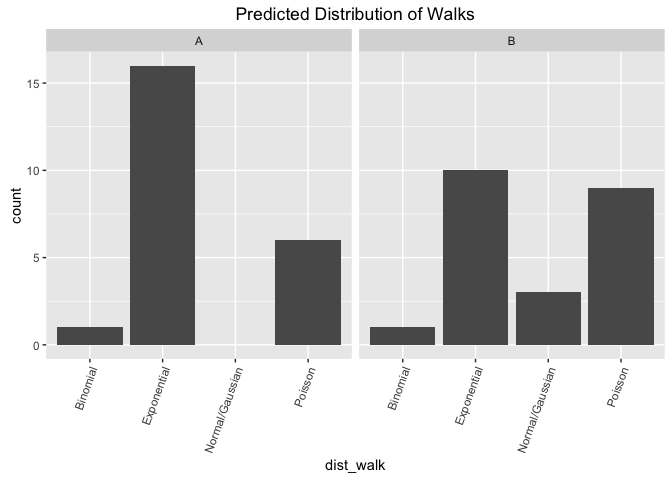
comment on viz: This looks good as a facetted bar graph as it makes it easy to compare across groups (e.g. count of viz A exponential vs count of viz B exponential). The viz shows that for both participants strongly favored the underyling data to be coming from an expontential or a poisson distribution, and unlikely to be coming from a binomial or normal distribution.
comment on test: We fail to reject the null hypothesis that the proportion of chosen distributions is different between the tests.
set.seed(15)

d_count <- d %>%
  spread(dist_walk, count) %>%
  ungroup() %>%
  select(-viz) %>%
  data.frame()

# we do not reject the null that they are independenc

# null hypothesis:
# the relative proportions of of selected distributions is the same whether
# or not you are looking at viz A or viz B
### http://www.biostathandbook.com/fishers.html
d_count[1, 3] <- 0 # to fill in NA
rownames(d_count) <- c("A", "B")
d_count
## Binomial Exponential Normal.Gaussian Poisson
## A 1 16 0 6
## B 1 10 3 9
fisher.test(d_count)##
## Fisher's Exact Test for Count Data
##
## data: d_count
## p-value = 0.1686
## alternative hypothesis: two.sided
## fail to reject null. From this visualization, estimate the distribution of the home runs
testing method Fisher Exact Test
hypotheses: H0: the relative proportions of the selected distributions is the same whether or not you are looking at viz A or viz B. H1: The relative proportions of the selected distributions are different depending on which viz you are looking at.
d <- viz %>%
select(viz, dist_runs) %>%
group_by(viz, dist_runs) %>%
summarize(count = n())
p1 <- ggplot(d, aes(x=dist_runs, y=count)) +
geom_bar(stat="identity") + facet_wrap(~viz) +
theme(axis.text.x = element_text(angle=70, hjust=1)) +
ggtitle ("Predicted Distribution of Home Runs")
p1 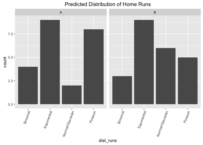 comment on viz: This looks good as a facetted bar graph as it makes it easy to compare across groups (e.g. count of viz A exponential vs count of viz B exponential). The viz shows that for both participants strongly favored the underyling data to be coming from an expontential distribution and the spreads between the distributions looks largely the same between the two visualizations.
comment on test: We fail to reject the null hypothesis that the proportion of chosen distributions is different between the tests.
set.seed(15)

d_count <- d %>%
  spread(dist_runs, count) %>%
  ungroup() %>%
  select(-viz) %>%
  data.frame()

# we do not reject the null that they are independenc

# null hypothesis:
# the relative proportions of of selected distributions is the same whether
# or not you are looking at viz A or viz B

rownames(d_count) <- c("A", "B")
d_count
## Binomial Exponential Normal.Gaussian Poisson
## A 4 9 2 8
## B 3 9 6 5
fisher.test(d_count)##
## Fisher's Exact Test for Count Data
##
## data: d_count
## p-value = 0.4548
## alternative hypothesis: two.sided
## fail to reject null. Continuous
From this visualization, estimate the average number of intentional walks for a player:
testing method t-test (two sided) due to having n>20 for large sample theory to hold.
hypotheses: H0: the mean estimated average # of intentional walks is the same between Viz A and viz B. H1: The mean estimated average # of intentional walks is difference between the two visualizations
q <- viz %>%
select(viz, q_int_walks) %>%
filter(!is.na(q_int_walks))
p1 <- ggplot(q, aes(x=q_int_walks)) + geom_density(aes(color=viz))
p2 <- ggplot(q, aes(x=viz, y=q_int_walks)) + geom_boxplot(outlier.color="red") +
geom_jitter(width=0.2, color="blue")
grid.arrange(p1, p2, ncol=2)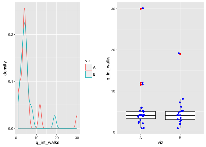 comment on viz: The box plot shows important variables that (median, upper and lower IQR) that make it easy to assess whether or not the bulk of the data is similar between the two. In this case, the data looks largely the same. The glued together density plot confirms that the data basically overlaps except for a few outliers.
comment on test: We fail to reject the null that the estimated mean is different between the two visualizations (e.g. they are both equallyequally bad at determining the average # of intentional walks, as the means are the same). In reality, the mean # of walks is actually 1 so they are both fairly off --infact running a one-sample t-test against a theoretical mean of 1 we reject the null hypothesis and accept that the sample mean is significantly different from the theoretical mean.
set.seed(15)
(sum_viz(q, "q_int_walks"))
## # A tibble: 2 × 4
## viz mean sd median
## <fctr> <dbl> <dbl> <dbl>
## 1 A 5.586957 5.953708 4
## 2 B 4.875000 3.730652 4
t.test(x=q$q_int_walks[q$viz=="A"],
       y=q$q_int_walks[q$viz=="B"],
       paired = FALSE,
       alternative = "two.sided",
       var.equal=TRUE)
##
## Two Sample t-test
##
## data: q$q_int_walks[q$viz == "A"] and q$q_int_walks[q$viz == "B"]
## t = 0.46141, df = 41, p-value = 0.6469
## alternative hypothesis: true difference in means is not equal to 0
## 95 percent confidence interval:
## -2.404213 3.828126
## sample estimates:
## mean of x mean of y
## 5.586957 4.875000
From this visualization, estimate the number of intentional walks that are outliers:
testing method t-test (two sided)
hypotheses: H0: the mean estimated average # of intentional walks that are outliers is the same between Viz A and viz B. H1: The mean estimated average # of intentional walks that are outliers is different between the two visualizations
p1 <- ggplot(viz, aes(x=q_walk_out)) + geom_density(aes(color=viz))
p2 <- ggplot(viz, aes(x=viz, y=q_walk_out)) + geom_boxplot(outlier.color="red") +
  geom_jitter(width=0.2, color="blue")

grid.arrange(p1, p2, ncol=2)
## Warning: Removed 2 rows containing non-finite values (stat_density).
## Warning: Removed 2 rows containing non-finite values (stat_boxplot).
## Warning: Removed 2 rows containing missing values (geom_point).
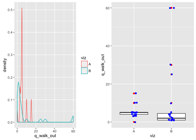
comment on viz: The box plot shows important variables that (median, upper and lower IQR) that make it easy to assess whether or not the bulk of the data is similar between the two. In this case, the data looks like it could be the same though there is significantly more variation in Viz b (more clearly shown on the density plot).
There are a number of outliers that may want to be looked into --however, due to the small sample size I am not pruning them.
comment on test: We fail to reject the null that the estimated mean is different between the two visualizations, and they are both equally good or bad for visually determining the average # of intentional walks.
set.seed(15)
(sum_viz(viz, "q_walk_out"))
## # A tibble: 2 × 4
## viz mean sd median
## <fctr> <dbl> <dbl> <dbl>
## 1 A 5.761905 3.726993 5
## 2 B 9.586957 17.599491 2
t.test(x=viz$q_walk_out[viz$viz=="A"],
       y=viz$q_walk_out[viz$viz=="B"],
       paired = FALSE,
       alternative = "two.sided",
       var.equal=FALSE)
##
## Welch Two Sample t-test
##
## data: viz$q_walk_out[viz$viz == "A"] and viz$q_walk_out[viz$viz == "B"]
## t = -1.0176, df = 24.15, p-value = 0.3189
## alternative hypothesis: true difference in means is not equal to 0
## 95 percent confidence interval:
## -11.580261 3.930158
## sample estimates:
## mean of x mean of y
## 5.761905 9.586957
# note: difference in medians is p-value 0.0094
# median_test(q_walk_out~viz, data=viz,
#                   distribution=approximate(B=10000),
#                   alternative ="greater")
From this visualization, estimate the number of home runs that are outliers:
testing method t-test (one-sided), others, it gets complicated.
hypotheses: H0: the mean estimated average # of home runs that are outliers for Viz A is less than or qual to Viz B. H1: Viz A predicts a higher estimated average # of home runs that are outliers than viz B.
Note: the null above is also checked for MEDIANS, rather than means.
p1 <- ggplot(viz, aes(x=q_run_out)) + geom_density(aes(color=viz))
p2 <- ggplot(viz, aes(x=viz, y=q_run_out)) + geom_boxplot(outlier.color="red") +
  geom_jitter(width=0.2, color="blue")

grid.arrange(p1, p2, ncol=2)
## Warning: Removed 1 rows containing non-finite values (stat_density).
## Warning: Removed 1 rows containing non-finite values (stat_boxplot).
## Warning: Removed 1 rows containing missing values (geom_point).
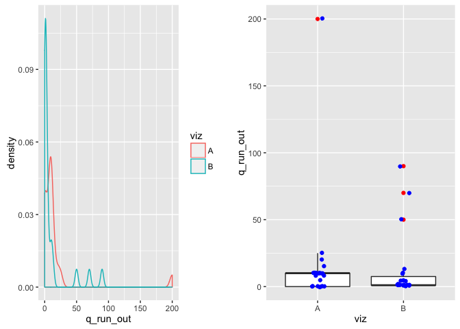
comment on viz: The boxplots look the same however there is an extremely large outlier in Viz A that will likely affect any sort of mean test.
comment on test: We fail to reject the null that the estimated mean is different between the two visualizations. Viz A has a mean of ~16 and viz B has a mean of ~11.
set.seed(15)
(sum_viz(viz, "q_run_out"))
## # A tibble: 2 × 4
## viz mean sd median
## <fctr> <dbl> <dbl> <dbl>
## 1 A 16.40909 41.56425 10
## 2 B 11.73913 24.09492 1
t.test(x=viz$q_run_out[viz$viz=="A"],
       y=viz$q_run_out[viz$viz=="B"],
       paired = FALSE,
       alternative = "less",
       var.equal=TRUE)
##
## Two Sample t-test
##
## data: viz$q_run_out[viz$viz == "A"] and viz$q_run_out[viz$viz == "B"]
## t = 0.46365, df = 43, p-value = 0.6774
## alternative hypothesis: true difference in means is less than 0
## 95 percent confidence interval:
## -Inf 21.60203
## sample estimates:
## mean of x mean of y
## 16.40909 11.73913
However the medians tell a very different story due to the outlier in Viz A. In which case, if looking at the medians, we reject the null that they are the same and accept the alternative that the median estimated average # of home runs that are outliers is higher for Viz A than Viz B.
set.seed(15)
# check medians via coin package
median_test(q_run_out~viz, data=viz,
                  distribution=approximate(B=10000),
            alternative="greater")
##
## Approximative Two-Sample Brown-Mood Median Test
##
## data: q_run_out by viz (A, B)
## Z = 2.5039, p-value = 0.0111
## alternative hypothesis: true mu is greater than 0
From this visualization, estimate the most frequent number of intentional walks observed:
testing method t-test (one-sided)
hypotheses: H0: the mean mean # of estimated intentional walks for Viz A is greater than or equal to Viz B. H1: Viz A predicts a lower # of estimated intentional walks viz B.
p1 <- ggplot(viz, aes(x=q_walk_freq)) + geom_density(aes(color=viz))
p2 <- ggplot(viz, aes(x=viz, y=q_walk_freq)) + geom_boxplot(outlier.color="red") +
  geom_jitter(width=0.2, color="blue")

grid.arrange(p1, p2, ncol=2)
## Warning: Removed 4 rows containing non-finite values (stat_density).
## Warning: Removed 4 rows containing non-finite values (stat_boxplot).
## Warning: Removed 4 rows containing missing values (geom_point).

comment on test: We fail to reject the null that viz A predicts fewer # of intentional walks.
set.seed(15)
(sum_viz(viz, "q_walk_freq"))
## # A tibble: 2 × 4
## viz mean sd median
## <fctr> <dbl> <dbl> <dbl>
## 1 A 2.600000 4.222745 2
## 2 B 4.068182 6.565232 3
t.test(x=viz$q_walk_freq[viz$viz=="A"],
       y=viz$q_walk_freq[viz$viz=="B"],
       paired = FALSE,
       alternative = "less",
       var.equal=TRUE)
##
## Two Sample t-test
##
## data: viz$q_walk_freq[viz$viz == "A"] and viz$q_walk_freq[viz$viz == "B"]
## t = -0.85214, df = 40, p-value = 0.1996
## alternative hypothesis: true difference in means is less than 0
## 95 percent confidence interval:
## -Inf 1.432987
## sample estimates:
## mean of x mean of y
## 2.600000 4.068182
From this visualization, estimate the most frequent number of home runs observed:
testing method t-test (one-sided)
hypotheses: H0: the mean # of most frequent numer of home runs predicted by Viz A is greater than or equal to Viz B. H1: Viz A predicts a lower mean # of estimated intentional walks viz B.
p1 <- ggplot(viz, aes(x=q_runs_freq)) + geom_density(aes(color=viz))
p2 <- ggplot(viz, aes(x=viz, y=q_runs_freq)) + geom_boxplot(outlier.color="red") +
  geom_jitter(width=0.2, color="blue")

grid.arrange(p1, p2, ncol=2)
## Warning: Removed 2 rows containing non-finite values (stat_density).
## Warning: Removed 2 rows containing non-finite values (stat_boxplot).
## Warning: Removed 2 rows containing missing values (geom_point).

set.seed(15)
(sum_viz(viz, "q_runs_freq"))
## # A tibble: 2 × 4
## viz mean sd median
## <fctr> <dbl> <dbl> <dbl>
## 1 A 4.590909 4.817222 4
## 2 B 13.409091 11.282769 10
t.test(x=viz$q_runs_freq[viz$viz=="A"],
       y=viz$q_runs_freq[viz$viz=="B"],
       paired = FALSE,
       alternative = "less",
       var.equal=FALSE)
##
## Welch Two Sample t-test
##
## data: viz$q_runs_freq[viz$viz == "A"] and viz$q_runs_freq[viz$viz == "B"]
## t = -3.3714, df = 28.41, p-value = 0.001086
## alternative hypothesis: true difference in means is less than 0
## 95 percent confidence interval:
## -Inf -4.37095
## sample estimates:
## mean of x mean of y
## 4.590909 13.409091
comment on test: we reject the null hypothesis and accept the alternative that participants picked a lower # for the most frequent # of home runs in viz A than viz B.
From this visualization, estimate the smallest number of intentional walks observed for any player
testing method t-test (one-sided)
hypotheses: H0: the mean # of the estimated smallest # of intentional walks predicted by Viz A is less than or equal to Viz B. H1: Viz A predicts a higher mean # for the smallest number of intentional walks.
p1 <- ggplot(viz, aes(x=q_walk_small)) + geom_density(aes(color=viz))
p2 <- ggplot(viz, aes(x=viz, y=q_walk_small)) + geom_boxplot(outlier.color="red") +
  geom_jitter(width=0.2, color="blue")

grid.arrange(p1, p2, ncol=2)
## Warning: Removed 3 rows containing non-finite values (stat_density).
## Warning: Removed 3 rows containing non-finite values (stat_boxplot).
## Warning: Removed 3 rows containing missing values (geom_point).

comment on test: we reject the null and accept the alternative that participants predicted a larger mean # for the small # of intentional walks using viz A.
set.seed(15)

(sum_viz(viz, "q_runs_freq"))
## # A tibble: 2 × 4
## viz mean sd median
## <fctr> <dbl> <dbl> <dbl>
## 1 A 4.590909 4.817222 4
## 2 B 13.409091 11.282769 10
t.test(x=viz$q_walk_small[viz$viz=="A"],
       y=viz$q_walk_small[viz$viz=="B"],
       paired = FALSE,
       alternative = "greater",
       var.equal=FALSE)
##
## Welch Two Sample t-test
##
## data: viz$q_walk_small[viz$viz == "A"] and viz$q_walk_small[viz$viz == "B"]
## t = 2.1495, df = 21.064, p-value = 0.02168
## alternative hypothesis: true difference in means is greater than 0
## 95 percent confidence interval:
## 0.5257742 Inf
## sample estimates:
## mean of x mean of y
## 2.68181818 0.04761905
From this visualization, estimate the smallest number of home runs observed for any player
testing method t-test (one-sided),
hypotheses: H0: the mean # of the estimated smallest # of home runs predicted by Viz A is less than or equal to Viz B. H1: Viz A predicts a higher # for the smallest number of home runs walks.
p1 <- ggplot(viz, aes(x=q_run_small)) + geom_density(aes(color=viz))
p2 <- ggplot(viz, aes(x=viz, y=q_run_small)) + geom_boxplot(outlier.color="red") +
  geom_jitter(width=0.2, color="blue")

grid.arrange(p1, p2, ncol=2)
## Warning: Removed 1 rows containing non-finite values (stat_density).
## Warning: Removed 1 rows containing non-finite values (stat_boxplot).
## Warning: Removed 1 rows containing missing values (geom_point).

comment on test: we reject the null and accept the alternative that participants predicted a larger mean # for the smallest # of home runs using viz A.
set.seed(15)
(sum_viz(viz, "q_run_small"))
## # A tibble: 2 × 4
## viz mean sd median
## <fctr> <dbl> <dbl> <dbl>
## 1 A 4.0000000 5.6061191 3.5
## 2 B 0.2304348 0.7344972 0.0
t.test(x=viz$q_run_small[viz$viz=="A"],
       y=viz$q_run_small[viz$viz=="B"],
       paired = FALSE,
       alternative = "greater",
       var.equal=FALSE)
##
## Welch Two Sample t-test
##
## data: viz$q_run_small[viz$viz == "A"] and viz$q_run_small[viz$viz == "B"]
## t = 3.1283, df = 21.69, p-value = 0.002474
## alternative hypothesis: true difference in means is greater than 0
## 95 percent confidence interval:
## 1.699104 Inf
## sample estimates:
## mean of x mean of y
## 4.0000000 0.2304348
Summary
#all results

(results <- tibble(
  question =c("q1", "q2", "q3", "q4", "q5", "q6", "q7", "q8", "q9", "q10", "q11", "q12"),
  method = c("MW", "MW", "MW", "Fisher", "Fisher", "t", "t", "multiple", "t", "t", "t", "t"),
  p_value = c(8.698e-05, 0.00426, 0.46, 0.1686, 0.4548, 0.6469, 0.3189, 0.0111, 0.1996, 0.001086, 0.02168,0.002474)) %>%
   mutate(null = ifelse(p_value <= 0.05, "REJECT", "FDR")))
## # A tibble: 12 × 4
## question method p_value null
## <chr> <chr> <dbl> <chr>
## 1 q1 MW 8.698e-05 REJECT
## 2 q2 MW 4.260e-03 REJECT
## 3 q3 MW 4.600e-01 FDR
## 4 q4 Fisher 1.686e-01 FDR
## 5 q5 Fisher 4.548e-01 FDR
## 6 q6 t 6.469e-01 FDR
## 7 q7 t 3.189e-01 FDR
## 8 q8 multiple 1.110e-02 REJECT
## 9 q9 t 1.996e-01 FDR
## 10 q10 t 1.086e-03 REJECT
## 11 q11 t 2.168e-02 REJECT
## 12 q12 t 2.474e-03 REJECT
# significant results
(results %>% filter(p_value <= 0.05))
## # A tibble: 6 × 4
## question method p_value null
## <chr> <chr> <dbl> <chr>
## 1 q1 MW 8.698e-05 REJECT
## 2 q2 MW 4.260e-03 REJECT
## 3 q8 multiple 1.110e-02 REJECT
## 4 q10 t 1.086e-03 REJECT
## 5 q11 t 2.168e-02 REJECT
## 6 q12 t 2.474e-03 REJECT
## testing bonferroni

(results %>%
   mutate(p_value = p.adjust(results$p_value, method="bonferroni")) %>%
  filter(p_value <= 0.05))
## # A tibble: 3 × 4
## question method p_value null
## <chr> <chr> <dbl> <chr>
## 1 q1 MW 0.00104376 REJECT
## 2 q10 t 0.01303200 REJECT
## 3 q12 t 0.02968800 REJECT
## testing BH

(results %>%
   mutate(p_value = p.adjust(results$p_value, method="BH")) %>%
  filter(p_value <= 0.05))
## # A tibble: 6 × 4
## question method p_value null
## <chr> <chr> <dbl> <chr>
## 1 q1 MW 0.00104376 REJECT
## 2 q2 MW 0.01278000 REJECT
## 3 q8 multiple 0.02664000 REJECT
## 4 q10 t 0.00651600 REJECT
## 5 q11 t 0.04336000 REJECT
## 6 q12 t 0.00989600 REJECT