DSCI 531 Quiz 1
Time: 30 minutes
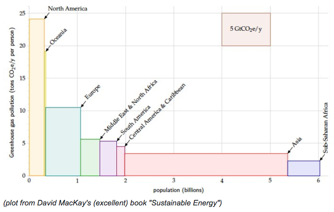
Introduction to visualization, marks, and channels, select and justify a data abstraction to use for a given task, and table data part
answer goes here
1aii. State if any attributes are redundantly coded with morethan one channel.
rubric={quiz:3}
answer goes here
1aiii. Specify two abstract tasks for which this visual encoding would be effective.
rubric={quiz:3}
answer goes here
1aiv. Describe the maximum scale for which a plot of this type would be effective (in terms of the number of items, the number of attributes, and the number of distinct levels for the attributes).
rubric={quiz:5}
1(b)
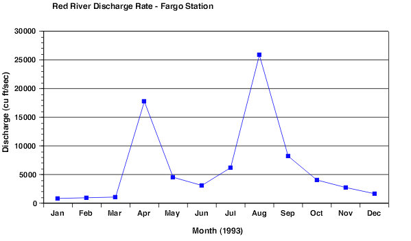 Source: https://www.ncsu.edu/labwrite/res/gh/gh-linegraph.html
1bi. State which mark type and which visual channels are being used to visually encode which attributes.
rubric={quiz:5}
answer goes here
1bii. State if any attributes are redundantly coded with morethan one channel.
rubric={quiz:3}
answer goes here
1biii. Specify two abstract tasks for which this visual encoding would be effective.
rubric={quiz:3}
answer goes here
1biv. Describe the maximum scale for which a plot of this type would be effective (in terms of the number of items, the number of attributes, and the number of distinct levels for the attributes).
rubric={quiz:5}
Part 2 - Redesign plots to address shortcomings
Review the plot below and answer the questions that follow:
# some set-up code to load libraries and data
import pandas as pd
import matplotlib.pyplot as plt
% matplotlib inline
chopstick = pd.read_csv("http://blog.yhat.com/static/misc/data/chopstick-effectiveness.csv")
chopstick.head()
chop_scatter = chopstick.plot.scatter(x = 'Chopstick.Length', y='Food.Pinching.Effeciency', color = "black" )
plt.xlabel('Chopstick length (mm)')
plt.ylabel('Food pinching efficiency')
chop_scatter.set_ylim(25, 50)
chop_scatter.set_xlim(0, 400)
plt.show(chop_scatter)
2a. identify at least one shortcoming of this plot and propose a solution in words that would make it more effective
rubric={quiz:5}
answer goes here
2b. Re-implement the plot below, fixing the problem you identified
rubric={quiz:4}
# answer goes here
Part 3 - Critique channel usage
Review the plot below and answer the questions that follow:
mtcars = pd.read_csv("mtcars.csv")
mtcars.head()
import matplotlib.patches as patches

fig1 = plt.figure()
ax1 = fig1.add_subplot(111)
ax1.set_xlim(25,300)
ax1.set_ylim(0,45)

for i in range(0,mtcars.shape[0]):
    ax1.add_patch(
        patches.Ellipse(
            (mtcars.hp.iloc[i], mtcars.mpg.iloc[i] ), # (x,y) position
            mtcars.disp.iloc[i]/10, # width
            mtcars.gear.iloc[i]**2, # height
        )
    )

plt.xlabel("horsepower")
plt.ylabel("miles per gallon")
ax1.annotate('bubble width = diplacement/10', xy=(150, 40),xytext=(150, 40))
ax1.annotate('bubble heigth = $gear^{2}$', xy=(150, 38),xytext=(150, 38))
plt.show(fig1)
3a. In 2-3 sentences, critique this plot in terms of integral vs separable channels.
rubric={quiz:6}
answer goes here
3b. Propose an alternate visual encoding that is more effective.
rubric={quiz:4}
answer goes here
3c. Re-implement the plot below to make the visual encoding more effective (as you suggested in 3b).
rubric={quiz:3}
# answer goes here
Part 4 -Visual popout
Which of these visual encodings supports popout? Answer True or False for each:
4a. position and color
rubric={quiz:1}
answer goes here
4b. orientation and color
rubric={quiz:1}
answer goes here
4c. width and height
answer goes here
4d. color and shape
rubric={quiz:1}
answer goes here
4e. position and color
answer goes here
4f. parallelism
rubric={quiz:1}
answer goes here
4g. color
rubric={quiz:1}
answer goes here
4h. orientation
rubric={quiz:1}
answer goes here