Dimensionality Reduction for Documents with Nearest Neighbor Queries
Abstract | Paper | Figures | Software | Data
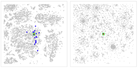
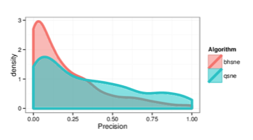
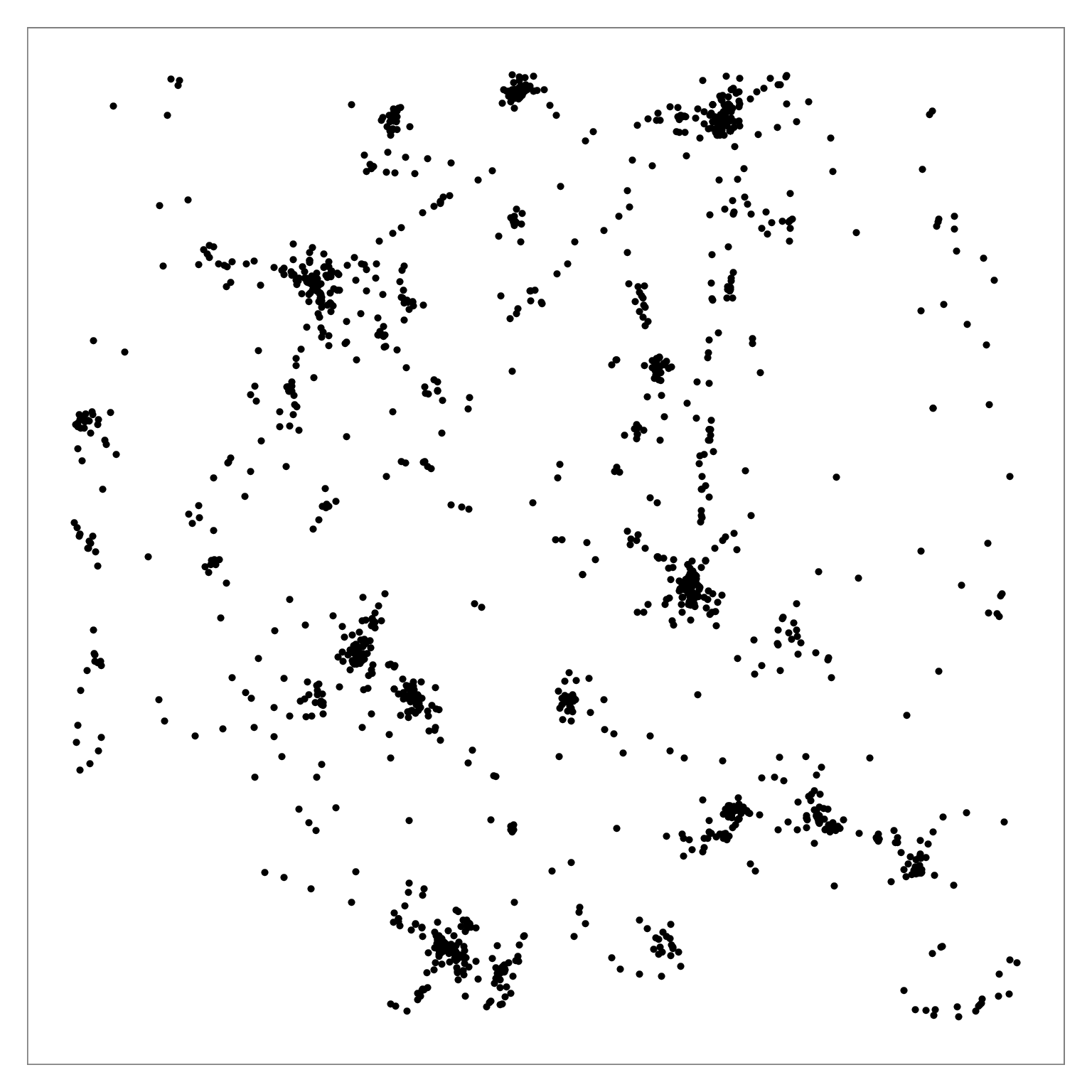
Figure comparing distribution of true nearest neighbors between BH-SNE (left) and Q-SNE (right).
Abstract
Document collections are often stored as sets of sparse, high-dimensional feature vectors. Performing dimensionality reduction (DR) on such high-dimensional datasets for the purposes of visualization presents algorithmic and qualitative challenges for existing DR techniques. We propose the Q-SNE algorithm for dimensionality reduction of document data, combining the scalable probability-based layout approach of BH-SNE with an improved component to calculate approximate nearest neighbors, using the query-based APQ approach that exploits an impact-ordered inverted file. We provide thorough experimental evidence that Q-SNE yields substantial quality improvements for layouts of large document collections with commensurate speed. Our experiments were conducted with six real-world benchmark datasets that range up to millions of documents and terms, and compare against three alternatives for nearest neighbor search and five alternatives for dimensionality reduction.Paper
High-Resolution Figures
Click on a Figure to open in a new tab.
Fig. 1 Log-Log plot of NN algorithm runtimes against dataset size, for computing the 30 approximate nearest neighbors. APQ (pink curve) is substantially faster than LSH, VPTree, or the hybrid PCA-VPTree for large datasets.
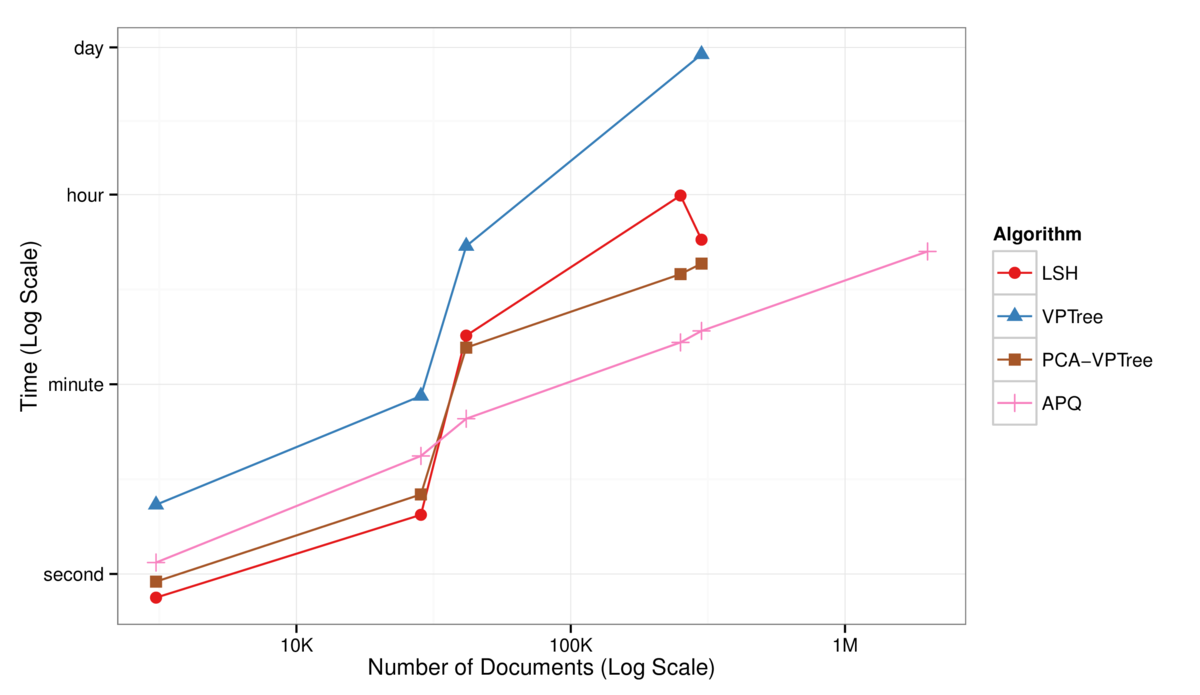
Figure 2: Precision-recall curves comparing the quality of the approximation for the 30 nearest neighbors across the four algorithms. APQ (pink curve) is
substantially better than the alternatives for all of the datasets, with the exception of the tiny warlogs dataset where VPTree matches its performance. Top left: warlogs
(N=3K). Top middle: metacombine (N=28K). Top right: textfiles (N=42K). Bottom left: cables (N=251K). Bottom middle: nytimes (N=300K). Bottom right: pubmed (N=2M).
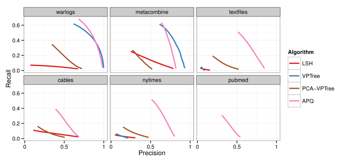
Figure 3: Log-Log plot of the time to complete the full DR layout computation as a function of the number of documents in the dataset. The BH-SNE (brown) and Q-SNE
(pink) timings are identical for the datasets that both can handle. PCA (red) is fast, but poor quality.
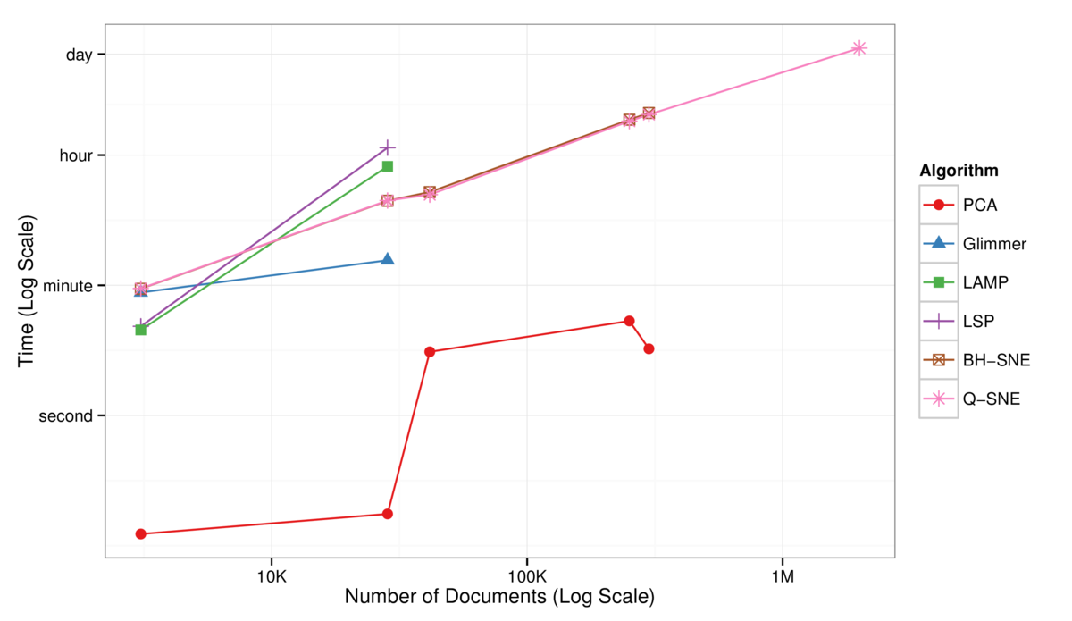
Figure 4: Precision-recall curves comparing for DR layouts across the six algorithms. Q-SNE (pink) yields substantially better quality than the alternatives, except for
the tiny warlogs dataset where BH-SNE (brown) nearly matches its performance. Curves are absent for algorithms that could not scale to the larger datasets; for these,
BH-SNE yields intermediate quality, substantially better than the low-quality PCA performance (red). Top left: warlogs (N=3K). Top middle: metacombine (N=28K). Top right:
textfiles (N=42K). Bottom left: cables (N=251K). Bottom middle: nytimes (N=300K). Bottom right: pubmed (N=2M).

Figure 5: 2D layouts for the tiny warlogs (N=3K) dataset for all six DR algorithms plus a true baseline tested with cluster labeling from Ward's method (k=8). The
qualitative results match the quantitative analysis with PR curves in Figure 4: the layout quality for PCA, LSP, LAMP, and Glimmmer on the top row is poor, with no
visible cluster structure, as opposed to the higher-quality layouts for BH-SNE, Q-SNE, and True-SNE which correspond well to derived clusters.
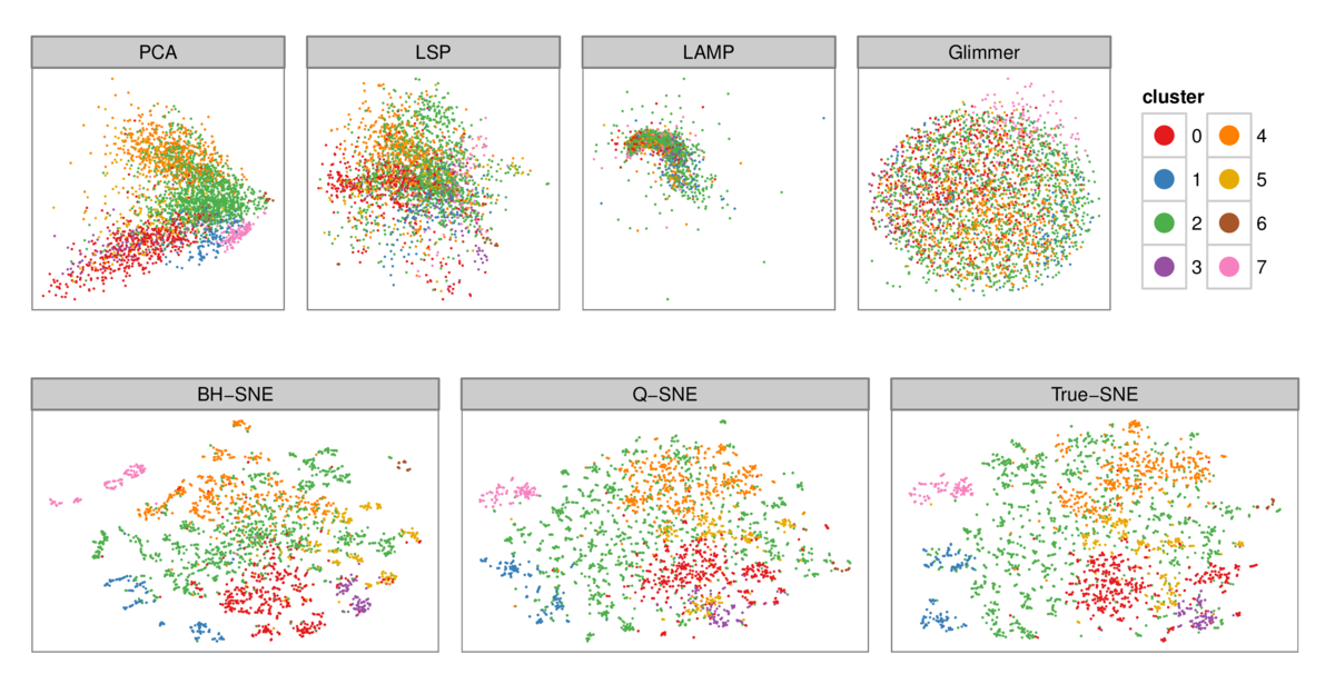
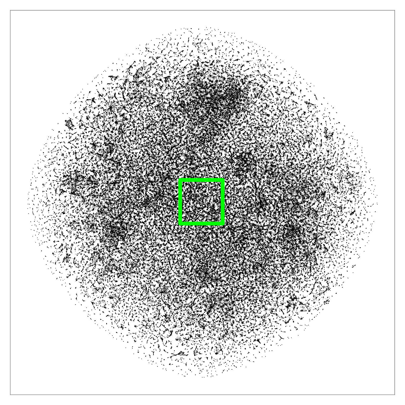
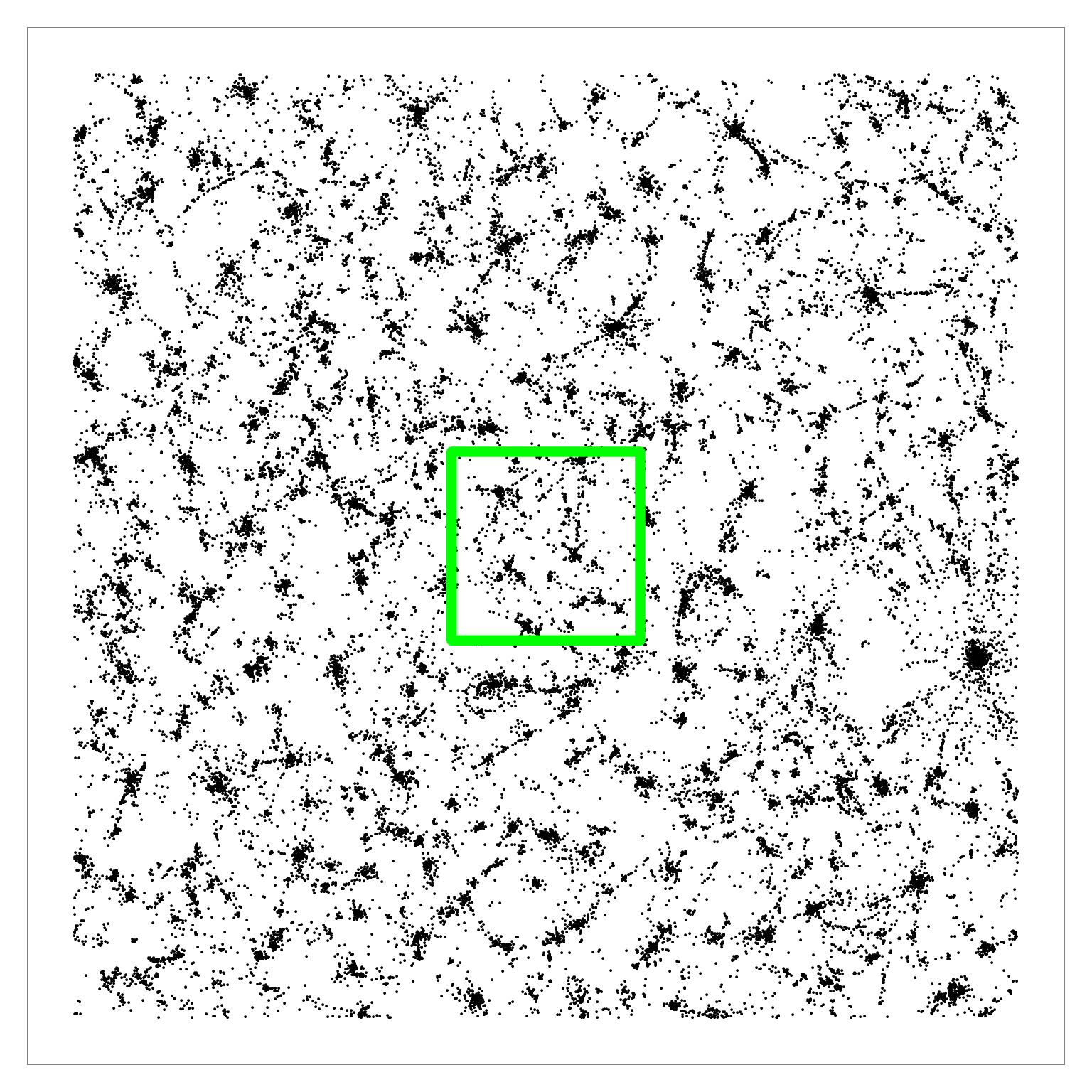
Figure 6: Q-SNE layout of the pubmed dataset (N=2M). Left: Overview. Middle: Partial zoom. Right: Full zoom. The layout contains some large-scale cluster structure visible
in the overview, and many smaller clusters that are hard to distinguish at that scale. The cluster structure is more evident after zooming.
|
|
|
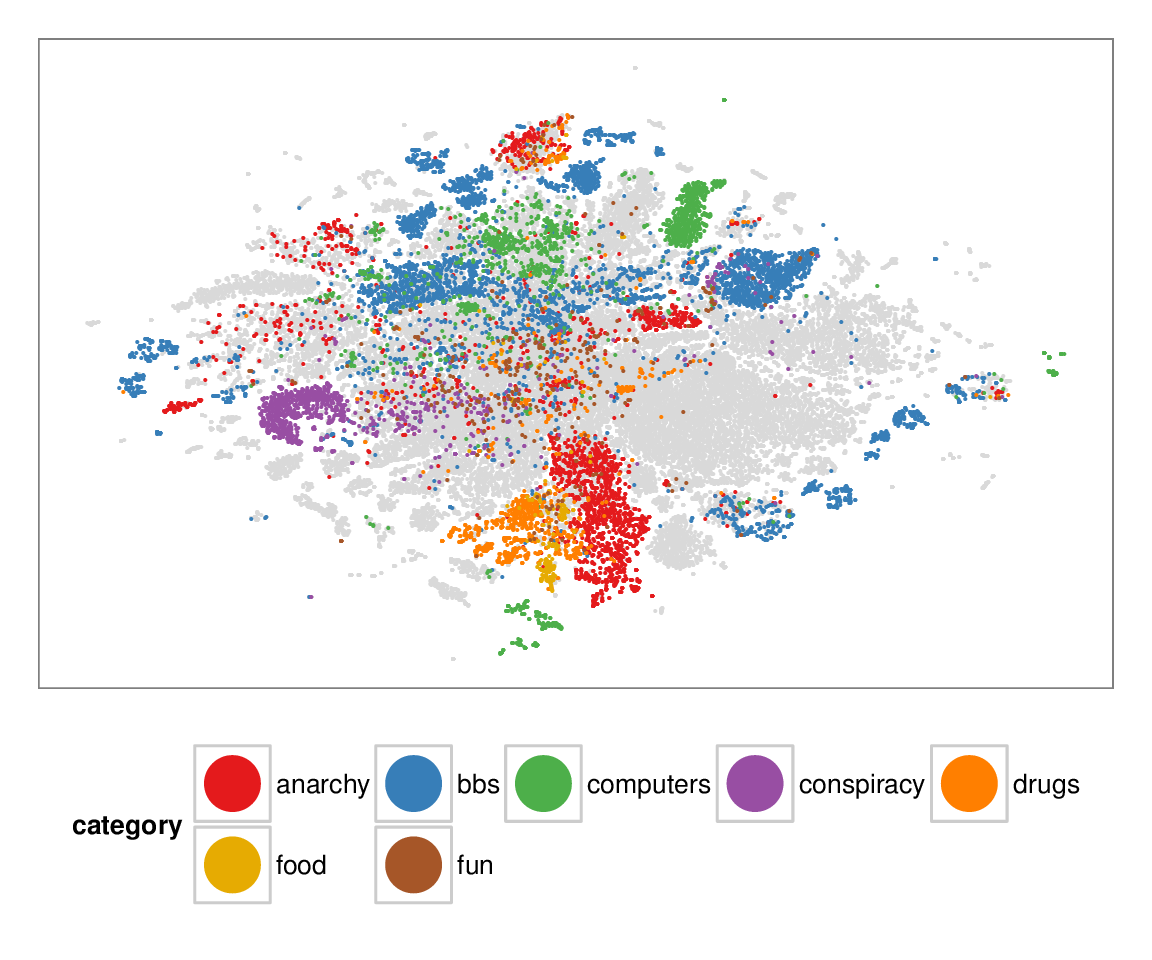
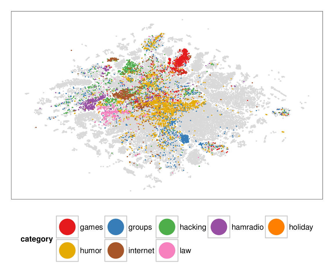
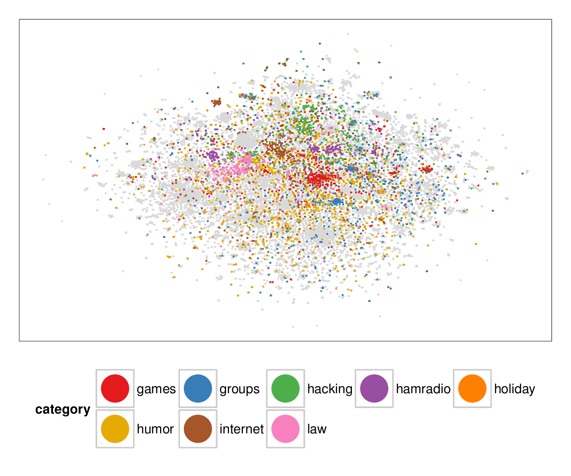
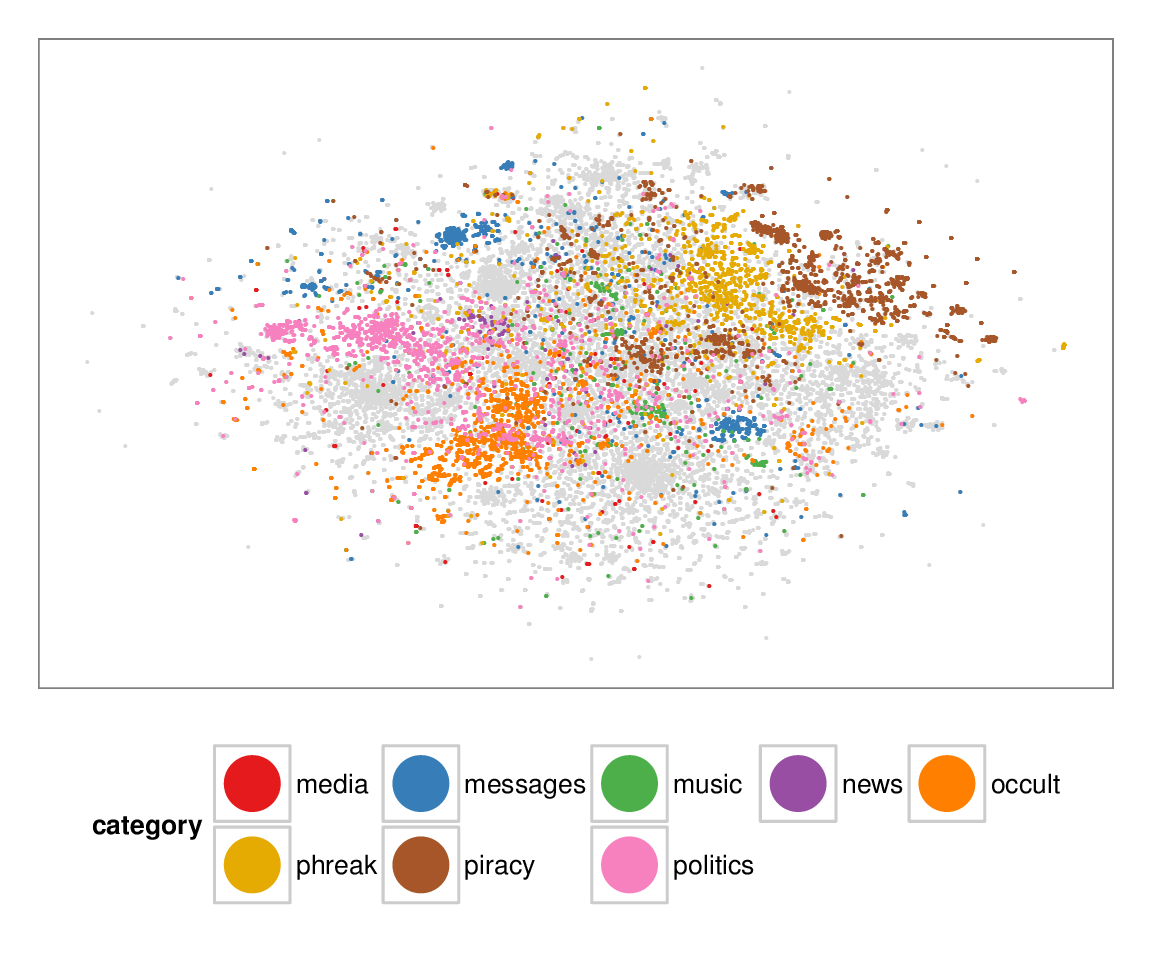
Figure 7: Layouts of the textfiles (N=42K) dataset, colored according to manually categorized ground truth. Left column: BH-SNE. Right column: Q-SNE. Visual document
clusters correspond well to the given ground truth for both.
| BH-SNE | Q-SNE |
|

|
|
|

|
|
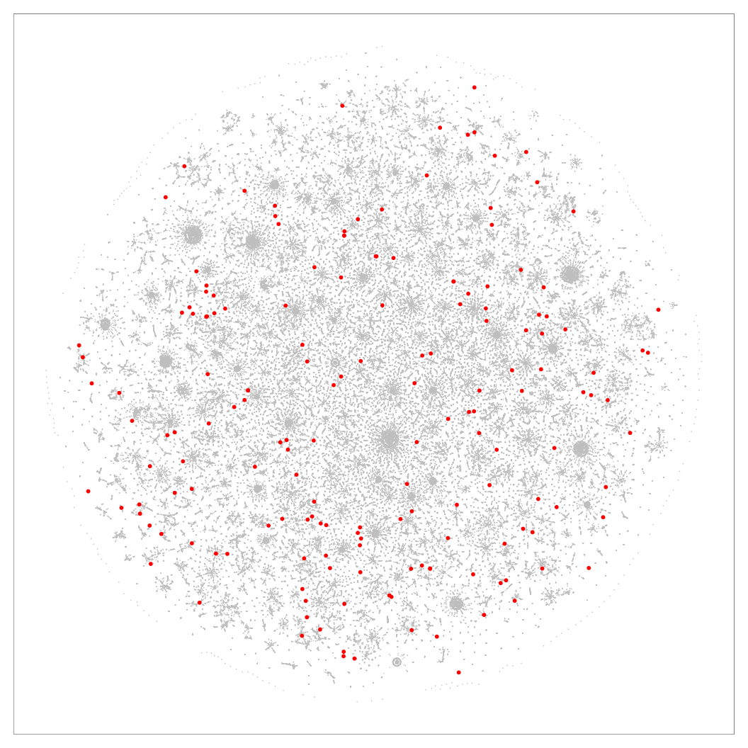
Figure 8: 2D layouts for the cables (N=251K) dataset, with red dots marking the location of samples that had higher precision in Q-SNE than BH-SNE. Left: BH-SNE. Right:
Q-SNE.

|
|
Figure 9: Kernel density estimates comparing precision values for BH-SNE and Q-SNE, for the cables datasets with the k = 15 retrieved documents and r = 30 relevant
documents.
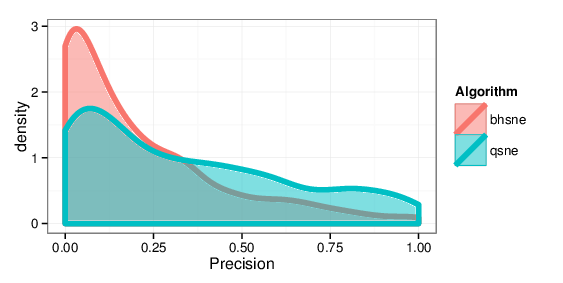
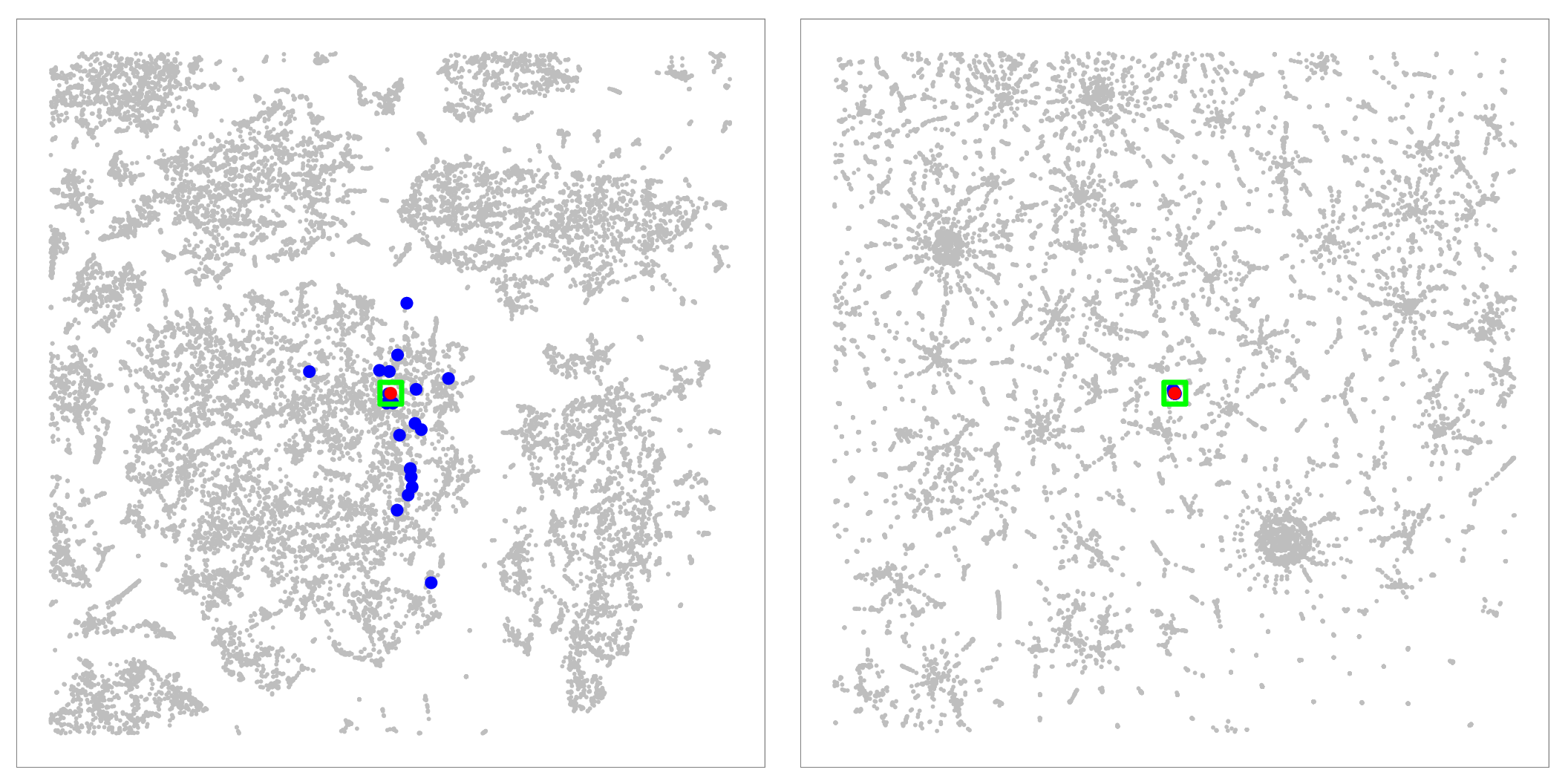
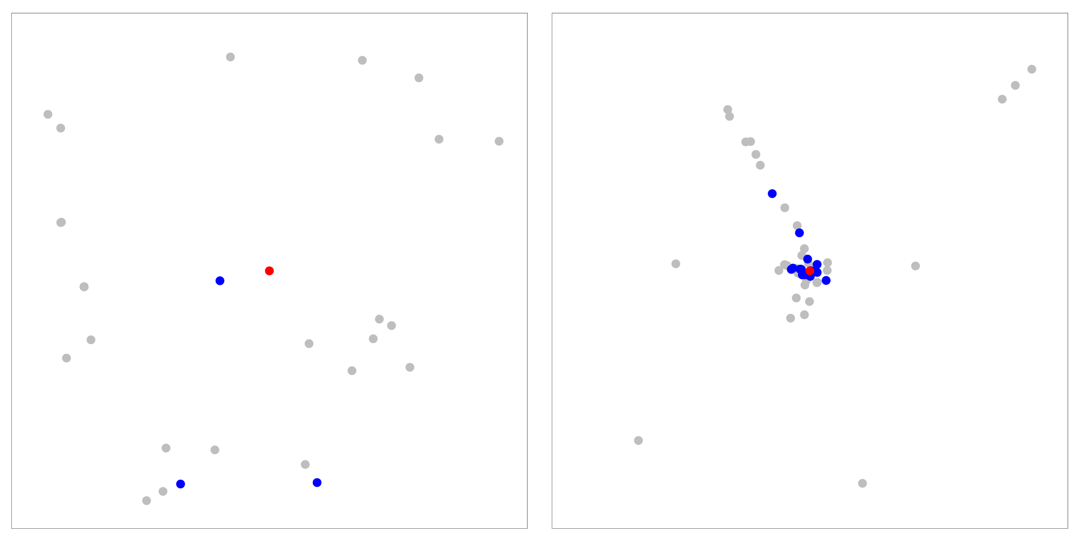
Figure 10: Analyzing nearest neighbors (blue) for selected point (red), for cables. Left column: BH-SNE. Right column: Q-SNE. Top: overview, with 99 NN. Middle row:
partial zoom, with closest 20 NN. Bottom row: full zoom.

|
|
|
Software
APQ and QSNE source and documentation. → (GitHub repository)Data
warlogs TFIDF term-vectors. → (BZip2 archive 1MB) metacombine TFIDF term-vectors. → (BZip2 archive 871KB) textfiles TFIDF term-vectors. → (BZip2 archive 149MB) cables TFIDF term-vectors. → (BZip2 archive 318MB) nytimes TFIDF term-vectors. → (BZip2 archive 524MB) pubmed TFIDF term-vectors. → (BZip2 archive 4GB) Stephen Ingram Last modified: Jul 12, 2014