
About ValueCharts
ValueCharts is a set of visualizations and interactive techniques intended to support decision-makers in preferential choice, which is the process of selecting the best option out of a potentially large set of alternatives based on multiple objectives. Examples include selecting a house to buy or identifying a site for a new airport.
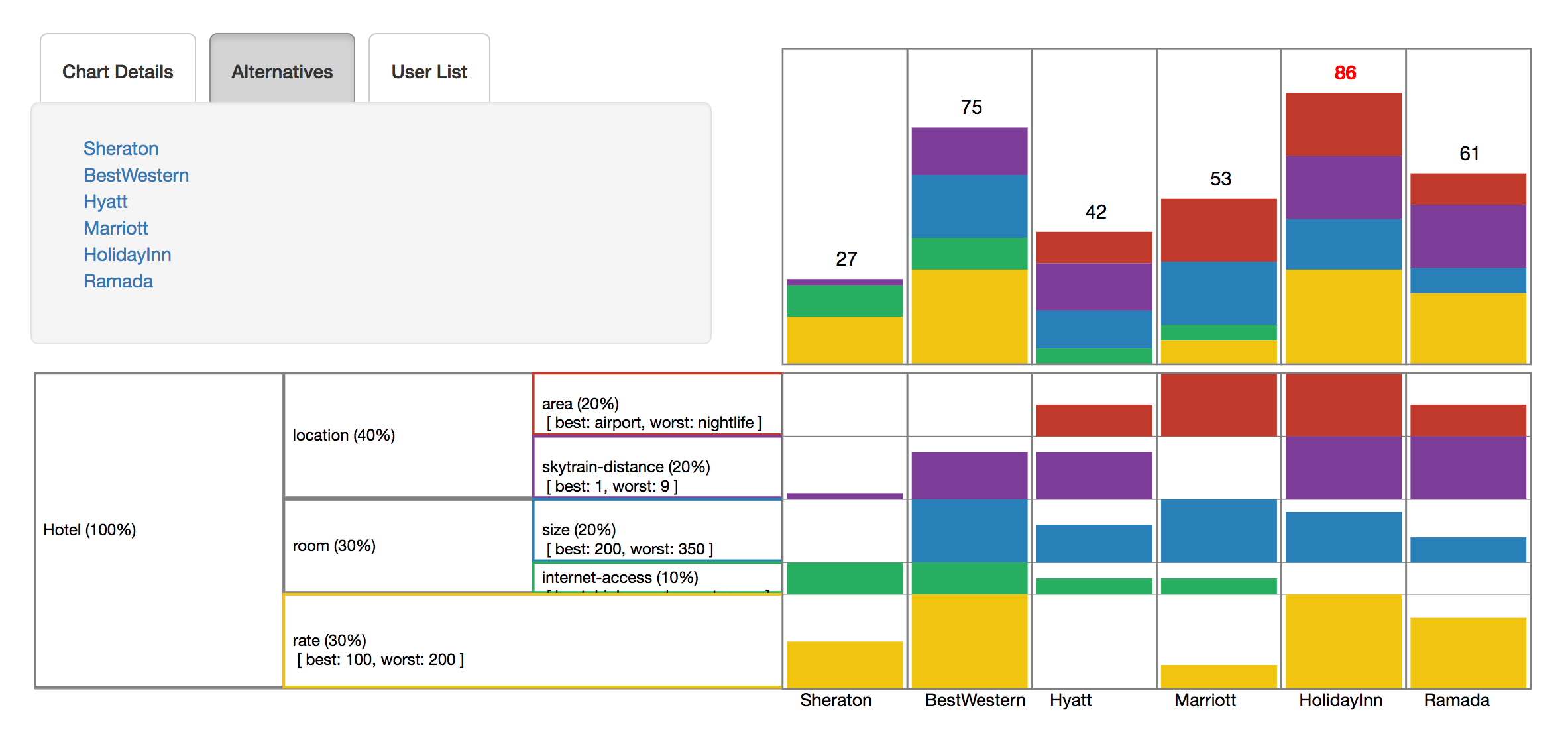
|
The above example shows a ValueChart for choosing a hotel to stay at out of ten available alternatives. Here, the objectives (area, skytrain distance, internet access, etc.) are arranged hierarchically in the bottom-left quadrant and coded by colour. The width of each objective row represents the weight (i.e. importance) assigned to that objective by the user. The bottom-right quadrant shows how each alternative fares with respect to each objective, which is encoded by bar height. The top-right quadrant stacks the objective-specific scores to show the total score for each alternative.
Interactive Features: ValueCharts provides a set of interactive techniques to support inspection and understanding of preferences. These techniques include sorting alternative, looking up details for each alternative, and performing sensitivity analysis by adjusting the objective weights.
Group ValueCharts
Sometimes, a group of individuals must collectively choose the best option for all of them. This can be challenging if group members have differences in values and preferences. In order to reach a satisfactory decision, the group members must be able to discuss their differences and negotiate trade-offs effectively.To support decision makers through this process, we extended ValueCharts to Group ValueCharts, which allows multiple users' preferences to be inspected at once. Preliminary evidence suggests that Group ValueCharts can improve the decision outcome by encouraging discussion, promoting transparency, and revealing points of contention [1].
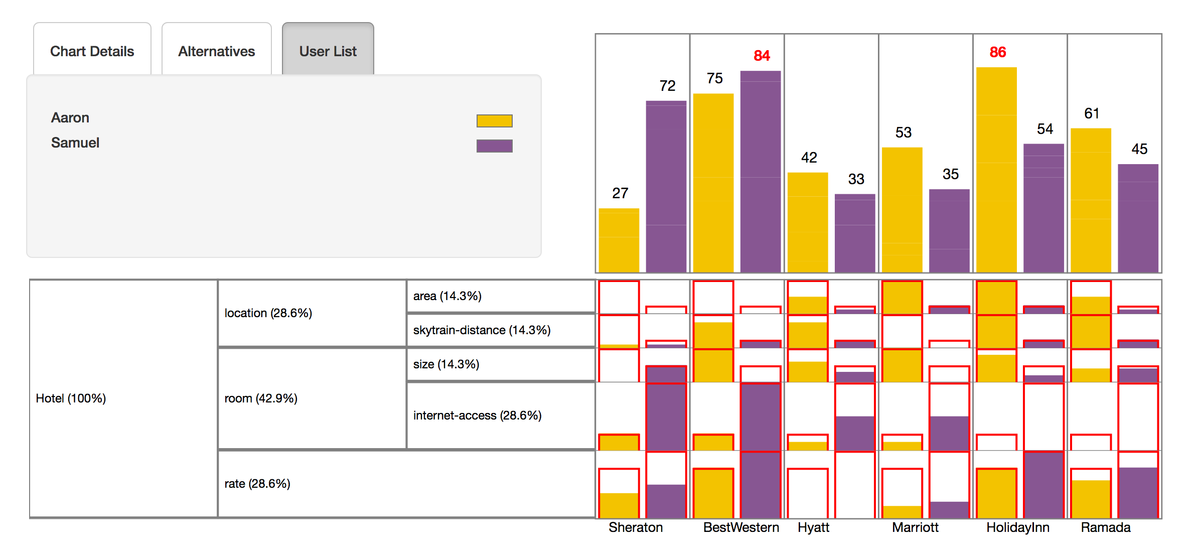
|
The above example shows a ValueChart for the same problem as before, only this time, there are two friends involved in choosing a hotel. Here, the bottom-left quadrant shows the objectives hierarchy as before, except the widths now represent the average weight assigned to that objective.
The bottom-right quadrant shows how each alternative fares for each user with respect to each objective. Color is used to code users rather than objectives. The red outlines show the relative weights assigned by each user, and the fill shows the user's satisfaction with the outcome on that objective. The top-right quadrant stacks the objective-specific scores to show the total score of each alternative for each user.
ValueCharts and Group ValueCharts are now implemented as part of a web application that integrates several stages of the preferential choice process, including chart creation and management, chart joining, and chart inspection.
Ongoing Work
We are currently engaged in the following research and development activities for ValueCharts:- Continuously improving our web application to seamlessly integrate all stages of the preferential choice process.
- Evaluating how well (Group) ValueCharts supports basic analytical tasks and encourages positive group dynamics.
- Researching ways to improve (Group) ValueCharts with added or alternate encodings and interactions.
Web Application
ValueCharts is currently deployed as an Angular 2 web application. For a quick overview, simply join as a temporary user and select one of the demo charts from the Home page. Technical details about the implementation can be found on the wiki. The current version of ValueCharts can be downloaded from https://github.com/ValueChart/WebValueCharts. Older versions of ValueCharts are available at https://github.com/ValueChart.
Papers
[1] S. Bajracharya, G. Carenini, B.C. Chamberlain, K. Chen, D. Poole, H. Taheri, and G. Oberg, Interactive Visualization for Group Decision-Analysis. Unpublished manuscript, Department of Computer Science, University of British Columbia, Vancouver, Canada, 2016.
[2] B.C. Chamberlain, G. Carenini, G. Oberg, D. Poole, and H. Taheri, A Decision Support System for the Design and Evaluation of Sustainable Wastewater Solutions. In IEEE Transactions on Computers, Special Issues on Computational Sustainability, 2013. [pdf]
[3] J. Bautista and G. Carenini, An Empirical Evaluation of Interactive Visualization Techniques for Preferential Choice. In Proceedings of the International Working Conference on Advanced Visual Interfaces (AVI 2008), Naples, Italy, 2008. [pdf]
[4] J. Bautista and G. Carenini, An Integrated TaskBased Framework for the Design and Evaluation of Visualizations to Support Preferential Choice. In Proceedings of Advanced Visual Interfaces (AVI 2006), Venice, Italy, May 25-28, 2006. [pdf]
[5] G. Carenini and J. Lloyd, ValueCharts: Analyzing Linear Models Expressing Preferences and Evaluations. In Proceedings of Advanced Visual Interfaces (AVI 2004), Gallipoli, Italy, May 25-28, 2004. [pdf]
Contact
If you have any questions please contact us:
Giuseppe Carenini
Associate Professor, Computer Science Department Department of Computer Science, #105, University of British Columbia 2366 Main Mall Vancouver, B.C. Canada V6T 1Z4 Phone: (604) 822-5109 Fax: (604) 822-5485 email: carenini[AT]cs.ubc.ca< back to IUI | Demo Home | ATUAV | ValueCharts | EMDAT