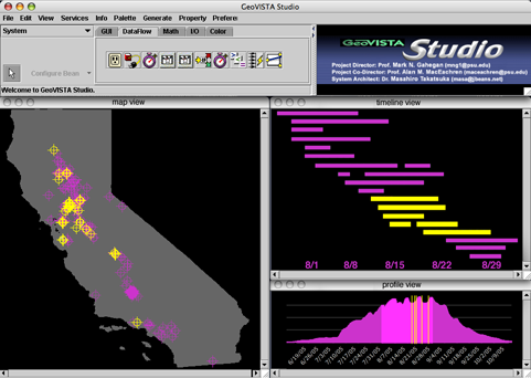
A mockup of the visualization environment, showing the map view, timeline view, and profile context view. Control buttons are not shown. (Click for full-sized image)
Alan McConchie - almccon@ofb.net
October 27, 2006
This visualization project will be used to support Exploratory Data Analysis in a model of West Nile virus (WNV) transmission. The model is DYCAST, the Dynamic Continuous-Area Space-Time system. The DYCAST system identifies non-random clustering of dead bird reports by the public, and produces a continuous surface of human risk of WNV infection. For the purposes of this visualization project, the DYCAST model will be treated as a black-box that produces a daily raster of WNV risk.
The task is to assist domain experts in exploring the relationship between human WNV cases and the preceding space-time distribution of high-risk areas. Currently the system has an ability to determine an overall relationship, averaged between all human cases, but no way to explore relationships within subsets of the data. My working assumption is that the lag time between elevated risk and human onset may vary significantly, either in different areas or at different times in the season. Understanding these differences in lag could lead to deeper understanding of how WNV may be influenced by underlying environmental conditions, and improve our techniques for modeling and predicting the spread of the disease.
The dataset for this problem consists of two parts:
I have three years of daily rasters (excluding the winter months = approximately 540 rasters) covering the entire state of California (1421 x 1512 pixels). The value of each cell is between 1 and 0, representing decreasing likelihood that dead bird activity in that cell is caused by random chance (or increasing likelihood that the area is at risk to humans). For analysis purposes, this value is usually classified into a binary risk/no-risk value based on some fixed certainty cutoff.
I have been working on this WNV surveillance project for over a year as an RA, so I am familiar with WNV and the DYCAST system. I am also familiar with this dataset, and I suspect there are interesting features in the data that cannot be well described with existing approaches.
Also, I have been working closely with a public health biologist in California who is responsible for the dead bird surveillance program and has a deep understanding of WNV. He will assist in the evaluation of the final product.
Problems with the previous approach
Previously, our best technique for gaining an overall view of WNV activity was to create an animation of the risk rasters. Overlaying the human cases gives a general sense of cause-and-effect, but detailed estimations of the lag between risk and human onset requires the viewer to keep too much information in memory. My initial idea for improvement was to visualize the data in 3D, plotting time in the third spatial dimension. This would offer an overall view of data, and perhaps allow visual comparison between lag in different areas, but clutter would still be a problem, and it would remain difficult to determine the exact history of a single human case out of the middle of a large cloud of risk.
Human case timeline view
This visualization project will focus on a derived variable for each human that best represents what we are interested in comparing: the unique history of each human WNV case. More precisely, it is the temporal pattern of risk in the raster cell that the human case occurs in, starting from the beginning of the season to the date of human WNV onset. This is not a single value, but rather a time series of binary risk/no-risk values.
The visualization environment will provide multiple linked views of these time series. In the first primary view, users will be able to view these separate risk histories stacked together in a list form. The x axis will be a shared time dimension, and the risk timelines will be stacked vertically on the y axis.
The cases will be sorted interactively based on a variety of simple criteria (such as date human onset, date of first identification of risk, duration of risk, etc). Initially I will provide a set of predetermined sort criteria, but I intend to provide flexibility in the code for a wider range of criteria. Ideally, the user could determine their own sorting and similarity metrics.
These histories can be juxtaposed in the time dimension in two ways: either aligned according to real calendar time, or shifted so that the date of human onset is lined up for each case.
Map view
The second primary view will be a map view, showing the point locations of the human WNV cases, displayed on a basemap of the area of interest. This map will be linked to the timeline view, so that selecting and brushing in the map view will highlight the linked human case histories, and vice versa. Coloring of the human cases is either by a color-ramp linked to the current human ordering in the timeline view, or user-defined classification into a small number of classes.
Both the map view and the timeline view will be zoomable and scrollable.
Profile view
A third supplementary view will show the total number of raster cells that are at risk for each date, covering the entire study area. This will provide context for the other views, so the user can identify the location of the selected human case(s) in the overall continuum of the WNV outbreak.
This view will not be scrollable or zoomable, in order to maintain a global perspective.
Mockup

A mockup of the visualization environment, showing
the map view, timeline view, and profile context view. Control buttons
are not shown. (Click for full-sized image)
Clustering of similar human case histories
A final enhancement, time permitting, will be automated clustering of histories according to similarity, inspired by van Wijk's calendar cluster view paper. Because these individual histories are simply strings of boolean risk/no-risk values, it will not be difficult to try a variety of similarity metrics. A simple count of bit-for-bit matches is the obvious starting point, but some mechanism for comparing patterns that are shifted in time will be necessary. As the system becomes further developed and some further exploration is possible, then it will be easier to determine what kind of similarity is important, and which fields of study may provide useful techniques and metaphors.
One possibility is to use the Levenshtein edit distance for comparing similarity between two strings. Other possible techniques may be found in genomics, since matching techniques in that field also must identify similarities within linear sequences where patterns may be shifted in whole or in part along that sequence.
During or following the West Nile virus season, a public health biologist wants to assess how accurately their risk model predicted human cases before onset. Loading the dataset into the visualizer, the biologist can quickly see which humans were best predicted by the risk model (humans where risk was first identified several days or weeks before onset, and/or humans where risk was sustained for several days before onset).
In a simple case, the user might group humans into two classes, those that had at least one raster cell of risk in the days leaving up to onset, and those that had none. In the map view, the user will quickly see if some areas are better predicted than others. The biologist can make inferences about the reason for success or failure based on knowledge of the underlying environment. For example, there is less dead bird reporting in rural areas, so the risk modeling is probably less effective there. However, if a cluster of human cases is missed in the center of an urban area, then perhaps dead bird reporting is also influenced by socio-economic factors, or the disease may be spreading by means other than dead birds.
The biologist can examine the data further by choosing various ways of sorting the human case timelines. By checking the map view as s/he explores different ways of classifying the human cases, the user may notice certain classifications appear to correlate together spatially. For example, the user may notice that humans that showed risk over 30 days in advance appear to be overrepresented in a particular area. S/he can then drag a selection box around that area in the map view, and see those cases highlighted in the timeline view. S/he can then see the nature of the outliers in this area (those that were at risk less than 30 days) and see how they relate to this pattern. If this relationship seems strong, then again the biologist can look for correlations with other datasets that might explain this difference, whether it is a problem with the model, or something related to underlying phenomena.
I intend to use GeoVista Studio as the framework to manage the linked views and provide the mapping component. GeoVista Studio is an extensible JavaBeans-based geovisualization environment. For this project, I will develop the parts of the timeline view and profile view in Java. These will interface with lower-level command-line utilities written in Perl or based on the open source GDAL/OGR utilities for geoprocessing.
Week ending Friday November 3:
Week ending Friday November 10:
Update presentations Tue Nov 14, Thu Nov 16
Week ending Friday November 17:
Week ending Friday November 24:
Week ending Friday December 1:
Week ending Friday December 8:
Week ending Thursday December 14:
Final presentation Thursday December 14
Gahegan et al, GeoVista Studio. Computers and Geosciences, 2002
Theophilides et al, The Dynamic Continuous-Area Space-Time System. American Journal of Epidemiology, 2003
van Wijk and van Selow, Cluster and Calendar based Visualization of Time Series Data. Proc InfoVis 1999
Symanzik, Jurgen, et al, Visualizing the Spread of West Nile Virus. Interface 2004 (However, this is only at much larger scales, and does not consider human cases at all.)