An Innovative Food Web Display
CPSC 533C Project Proposal
November 4, 2005
Zhangbo(Zephyr) Liu zephyr@cs.ubc.ca
Brief Description
This project ties in with one of the projects I'm doing for CPSC 544-Human-Computer Interaction course. Our project will involve prototyping, evaluating, redesigning and implementing a food web visualization diagram within a complex ecological modeling software suite called Ecopath with Ecosim (EwE). We'll redesign the system together and then I'll do the implementation work while the other two members, Sherman Lai and Paul Ralph, concentrate on evaluation.
Setting and Problem
One of the functions of Ecopath involves showing trophic relationships (essentially what eats what and in what amounts, in an ecosystem) using food web diagrams. Figure 1 shows the kind of food web diagram that might be shown in an elementary school science class. Although this diagram is easy to read, it lacks detail. First, it shows groups of organisms at inconsistent and generally coarse levels of granularity. Second, it shows only what each organism eats and not how much. Third, it does not show cannibalistic relationships.
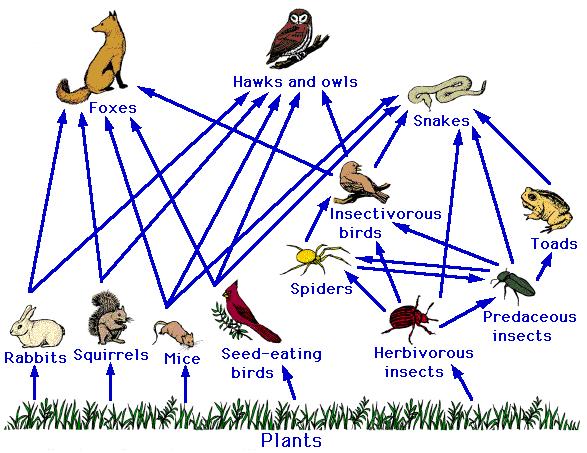
Figure 1: A Simple Food Web ¨C a small and basic food web diagram which does not show granularity, amount of interaction, and possible cannibalism
Compare this with the Ecopath diagram shown in Figure 2. For a target ecosystem at a particular time, the Ecopath food web diagram shows:
- What each organism eats (and how much)
- The level of harvest (amount taken by humans)
- The level of respiration (organisms that die of old-age, disease, starvation, etc.)
- The total biomass of each organism
- Each organism's trophic level (position in the food chain).
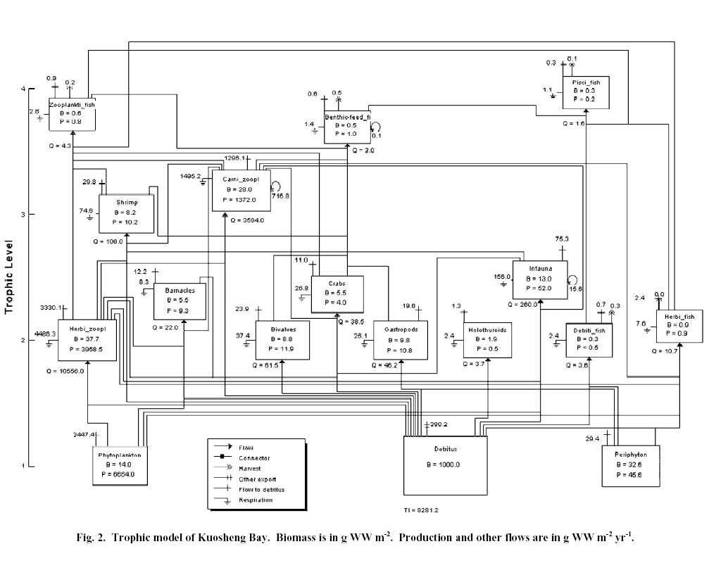
Figure 2: Ecopath Food Web Diagram ¨C demonstrates a more complicated food web diagram showing all the necessary information
Users have complained that beyond approximately 20 groups the display becomes incomprehensible. Figure 2 shows a 17-group food web. Due to the number of organisms and even groups of organisms in real-life ecosystems, models can have upwards of 200 groups. It seems clear that the capacity to display a more complex food web intelligibly would be a beneficial improvement to Ecopath.
Analysis
Ecopath's target users are scientists who publish papers describing ecosystems, more specifically trophic interactions. These scientists use Ecopath's food web diagrams to take a snapshot of the ecosystem for inclusion in their papers. Our goal then, is to increase the number of organism groups that can be clearly displayed on a printable diagram generated by Ecopath.
The necessary condition of representation on a two-dimensional medium, i.e. paper, constrains the useful depiction of a food web diagram in a variety of ways:
- The diagram cannot exceed a set size: the size of paper on which the publication is printed (often 8.5"x11").
- The diagram must be readable at a normal print resolution (preferably without a magnifying glass!).
- Since we need to get a printable diagram, solution concerns distortion of space, such as fisheye views [Furnas, 1986] or Hyperbolic tree [Lamping et al., 1995], is not appropriate.
Three basic approaches can be applied to a food web diagram made unreadable by the amount of information displayed:
- Display fewer groups
- Display less information about each group
- Display the information in a more compact, but still readable way.
Given that users complain about not being able to display enough groups, we infer that displaying fewer groups is not a practical option. That is, unless we display groups at varying levels of abstraction. The second option is dubious, but we will inquire about it during the task analysis. The third option is likely the most desirable approach.
Most of the time, food webs have more organisms, both in total number and number of species, at the bottom than at the top. For example, the number of different birds that eat insects is much lower than the number of different insects eaten by birds. This causes food web diagrams to become more congested at the bottom than at the top. To fit more into the diagram, better use must be made of the remaining room at the top. However, the vertical distribution of groups in the diagram indicates trophic levels; thus, indiscriminately moving low-trophic-level groups to the top of the diagram would likely cause confusion and reduce utility.
Proposed Solutions
We propose to improve the readability of the diagram by restructuring the tree-type display into a circular display [Bertin, 83] . The center of the circle would represent the highest trophic level with concentric circles indicating progressively lower levels. This should allow displays of larger food webs in the same area.
We have in mind several further modifications that might increase the utility of the food web diagram (listed below). We expect more ideas to arise from discussions with users. Clearly, implementing all of these ideas is far beyond what is doable in the time constraints of this project; therefore, we will only implement the modifications that appear the most promising from the users' perspective. This could be one complex modification, or several simpler modifications.
- Color of node indicates biomass value
- Thickness, opacity, style or color of line indicates strength of trophic relationship
- Automated distribution of nodes such that strongly-related nodes are closer to each other
- Adaptable highlighting individual groups or relationships
- Zooming and panning
A Scenario of Use
Here we present a scenario of use of our implementation. First, when the users run the program, it will extract data from a given data file and provide the initial circular layout shown as Figure 3.
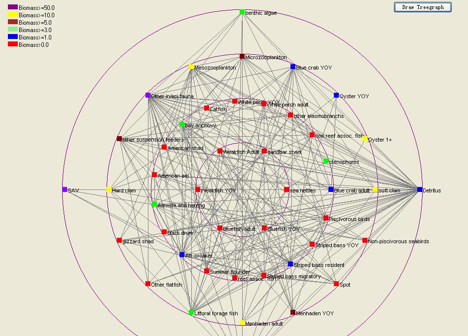
Figure 3: Circular graph
Groups are arranged on concentric rings. Each ring represents a specific trophic level. When users click on one group (node), a pop-up window may show all existed information of this group such as name, biomass and trophic level. At the same time, all interactions between the selected group and other groups will be highlighted and the strength of trophic relationship is indicated by the thickness of the lines. See Figure 4
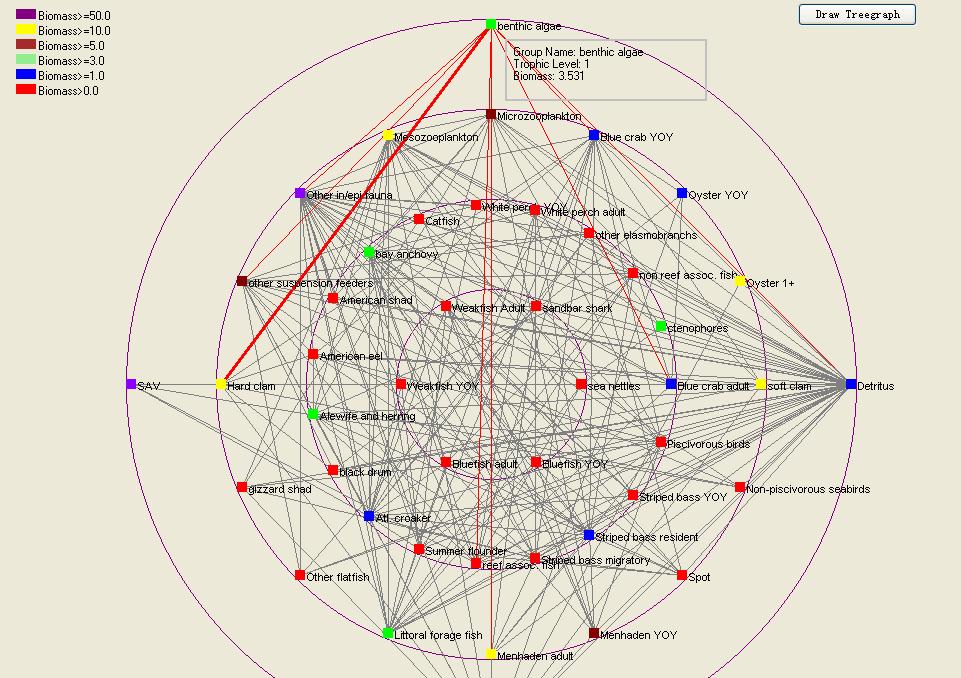
Figure 4: More information are shown when specific group is selected
Given that some users still prefer tree graph, we provide a button on the top right of the screen. Users can freely transfer to tree graph by clicking this button and make a compare. See Figure 5.
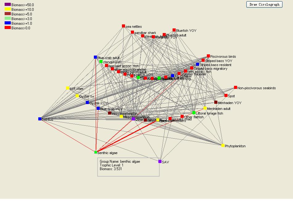
Figure 5: Tree-like graph
Proposed Implementation Approach
We will implement the interface using Microsoft Visual Basic.Net 2005 beta. It will run on Windows systems. We will start from scratch on the implementation and it will be integrated into current version of EwE.
Milestones
| Before Nov. 4th | Early prototyping, user interview and analysis |
| Proposal submitted | |
| Nov. 16th | |
| Dec. 10th | Beta 2 released, start on writing report |
| Dec. 18th | Report finished |
| Dec. 19th | Final presentation |
Referrences:
[Bertin, 83] Bertin, J. (1983) Semiology of Graphics, Diagrams, Networks, Maps, University of Wisconsin Press, Madison, WI.
[Furnas , 1986] Generalized fisheye views. In Proceedings of CHI'86, 16-23.
[Lamping et al., 1995] Lamping, J., Rao, R., Pirolli; P. (1995) A focus+context technique based on hyperbolic geometry for visualizing large hierarchies Conference proceedings on Humanfactors in computing systems, 1995, 401-408.