Final Project Proposal - ShadyStats
533C: Information Visualization
November 4, 2005
{mcora} @ cs ubc ca
Domain
In this time of blazing fast graphics hardware, surround sound processors, and oversaturated gaming industry, a video game’s AI and gameplay are playing larger and larger roles setting it apart from the rest. Statistical analysis is almost a given when designing a tuneable AI system. Stats should be gathered throughout the development cycle: both during experimentation with different algorithms and gameplay mechanisms, and during feature development and final bug fixing. An info visualization tool to facilitate the interpretation of these statistics can only have a positive effect on the final quality of the game.
Dataset
The dataset used was generated from Nintendo’s Mario Super Strikers, a 5-on-5 over-the-top arcade soccer game to be released on December 5th - go play it, it's fun! :)
It includes statistics from about 2400 AI vs. AI games played at six different dates over the span of the last 2 months of development, consisting of 15 metrics (dimensions), times 2 for Home/Away. That would make 2400 games * 15 * 2 = 72,000 numbers, a pretty modest dataset, but still large enough to overwhelm an Excel spreadsheet:
I have designed and implemented the AI system which generated the dataset during this past year, so I have a fair bit of expertise with the domain, however, I have never done any sort of statistical analysis (and even less multidimensional analysis).
Tasks
The tool proposed should aid in the statistical analysis of multi-dimensional data gathered by the AI, with the following goals in mind:
- Clearly show correlations between different metrics (ie. # of shots should hopefully be positively correlated to # of goals).
- Help detect bugs by highlighting outliers and abnormal differences between selected dimensions. For example there may exist subtle bugs in the formation and positioning code and/or tuning parameters that can lead to differences between the Home and Away teams, giving one an unfair advantage over the other. A lot of times, these differences are not caught by play-testers, or their causes are hard to pinpoint.
- Help with tuning a balanced progression through difficulty levels by mapping it to the different metrics. AI skill tuning continues to be a difficult challenge that a large number of games fail on, especially since tuning and balancing is often left to the very end of a mad, deadline driven development cycle (not always though). Anything that would hasten this process would improve the quality of the final product.
- Mapping the data to the time it was recorded should provide an interesting visual history of the AI implementation and tuning. In addition, bugs and undesired behavior would be easy to spot as soon as they are introduced, with a “base-line locking” feature: the interface would allow the user to save a snapshot of good statistics, against which future data samples can be compared, highlighting any differences.
- Aid communication with the publisher throughout the lifecycle of the project. This is a more nebulous goal of presenting an alternate method for information flow, especially across language barriers.
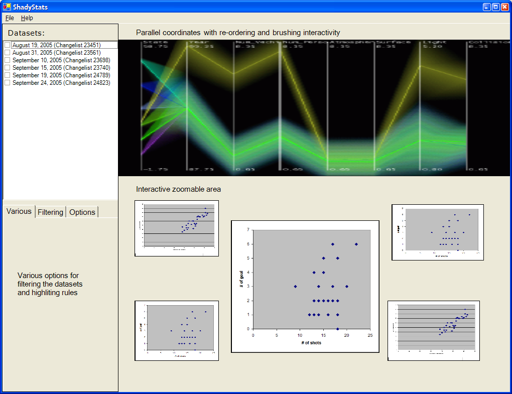
The Tool: ShadyStats
The tool would load the dataset and make use of a variety of multidimensional visualization methods. Some specific implementation goals are:
- use parallel coordinates, tiled scatter plots, brushing/linking, filtering/dynamic queries
- interactive reordering and selection of dimensions, generating scatter plots on demand
- maintain a history of datasets for easy comparison throughout development
- highlite significant differences between datasets through some yet to be determined method
- aggregate related data into hierarchical parallel coordinates (the fancy shading method)
- automatic grouping/reordering of dimensions that seem to be correlated
- contextual zooming of individual scatter plots of interest
ShadyStats shall be written in Java because of the availability of information visualization libraries. The ones I will most likely use or at least try out are: InfoVis Toolkit, Prefuse, and ILOG, using the Eclipse IDE (which I have never used before).
Following is a super rough layout of the proposed tool. The sample parallel coordinate image was taken from Hierarchical Parallel Coordinates for Visualizing Large Multivariate Data Sets Ying-Huey Fua, Matthew O. Ward, and Elke A. Rundensteiner, IEEE Visualization '99. I will attempt to implement some of the techniques described in this paper, to reduce the clutter associated with parallel graphs.
Usage Scenario
The AI programmer has made some recent changes to formation positioning and passing code. A good baseline tuning has been established a week prior and stats were gathered. He wants to see if his recent changes could have introduced any imbalances when compared to the baseline.
The ShadyStats maintains a history of previous datasets, so the baseline is already in the list. The new dataset is loaded, and selected from the Datasets checklist along with the baseline dataset. Filtering and highliting options are set for emphasizing differences between datasets (rather than comparing between different dimensions). The baseline is displayed as green, and the new dataset as red (actual colours to be determined).
Things look alright at the lower difficulty levels, however the new passing code caused them to pass more times at the higher difficulty levels when compared to the baseline, apparent when aggregating the parallel coordinates based on difficulty level. Another apparent change is that the other team's pass intercepts shot up also, reducing the effectiveness of the offensive gameplay. The user selects the # of passes, and pass intercepts dimensions and creates a scatterplot to get a better view of the relationship.
Milestones
M1 - November 13 |
|
M2 - November 20 |
|
M3 - November 27 |
|
M4 - December 4 |
|
M5 - December 11 |
|
M6 - December 18 |
|