Project Proposal:
BinX - Dynamic binning and scaling of time series
CS533 Information Visualization
Lior Berry
berry@cs.ubc.ca
March 1st 2004
Background and domain
Time series can be found almost in every field of study, being a substantial
kind of data. Therefore, understanding and analyzing time series is a fundamental
task in data analysis. However, humans will often fail when analyzing a large time
series or when there is a need to compare two or more time series, due to the amount
of data involved and the different time scales it is encoded in. These often require multiple views (for each series and for each time scale) leading to disorientation or requiring the use of mathematical transformations (such as Fourier / Wavelet transforms) that move the problem to the unnatural frequency domain.
The goal of BinX is to provide dynamic visualization and manipulation of time series, enabling a human to gain better understanding, without requiring many views or applying complex transformations.
Task
Comparing two time series (or comparing two attributes of a single time series) is a challenging task, I would like to support. This task requires both the understanding of each time series separately by identifying local and global patterns, trends or singular points and using those to deduce the relations between the two time series.
Dataset
The data I would like to first explore with BinX are economic time series. Often there are relations between economical indicators (such as currency exchange rates)
which are hard to track by merely observing the detailed original time series.
The initial dataset will be currency exchange rates from the bank of Israel or fxhistory. It specifies the daily exchange rate of different coins (I will focus on comparing the USD / EURO/ English Pound/ Canadian dollar during a time frame of one year or of several years)
Proposed solution
A powerful way to handle large time series is by binning the data into time intervals (aggregating or averaging over days, weeks, months, etc) to create different viewing scales (note that this is not simple zooming, since the viewed information is actually changed upon bin size change). The bins can be displayed using the aggregated values per bin in bar/dot charts or other techniques.
Dynamic bin size / scale: The tool will allow the user to dynamically and smoothly change bin size (1 day bins, 2 day bins, etc.), immediately updating the view under the new binning. Spatial positioning of the displayed time series will encode its bin size / scale. Thus a user can get different views on the data without getting lost in a vast amount of charts.
Bin information: The tool can visually encode additional information for bins such as statistical information (median, standard deviation, minimum and maximum). Another possible type of information that supports analysis is marking similarity between bins (based on bin clustering). These will provide hints for the user on the nature of the binned data (obviously some information is lost when moving to bins).
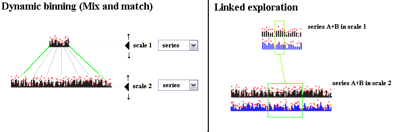
Mix and match: The tool will support the viewing of two scales (bin sizes) at the same time. In each scale one of the time series or both can be shown, supporting different techniques for comparison and analysis.
Linked exploration: Marking a time segment in one scale will result in the marking of the corresponding segment in the other scale. This link will be maintained and updated when changing scales or when shifting / resizing the mark for improved orientation. This technique can also be used to support navigation when the finer scale cannot be fully displayed on the screen (due to size limitations), using the coarse scale as a context.
Visual display: There are two options for visualizing the time series I would like to consider:
- Trapezoidal display: Time series are placed along a horizontal line. The scale is controlled by shifting the series vertically (see above figure, left side)
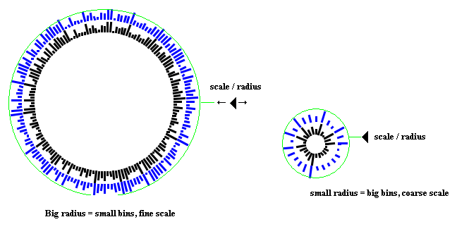
- Radial display: Time series are placed along the circumference of a circle
and the scaling is controlled by changing the radius length. The radial display may better suite time series with cyclic patterns (a possible extension is using a spiral / concentric circles to display the data, while still allowing dynamic binning)
Typical scenario of use
A user, trying to compare two time series, will first use a coarse scale (large bins) to display the two time series and gain an overall look. He can search for interesting time intervals or cross - relations (dynamically changing the scale by dragging the displayed series to expose more details as needed and relying on the visual cues on the bins). The user can then link an additional finer time scale, displaying the two time series. When highlighting time intervals on one scale, the corresponding time interval will be highlighted on the second scale for further inspection. The user can continue exploring different scales, while the link is kept updated. Using BinX one can quickly isolate time intervals which are worth a closer look. This can then be done with other visualization / query tools.
Proposed implementation approach
- I intend to use Java2D and Swing for the implementation (at least for the initial prototype level)
- The Piccolo toolkit is also worth consideration for enhanced interaction
- Another option is C++
Personal expertise
I have no specific expertise regarding time series and their visualization, apart from occasional Excel work. I did work a bit with wavelet transforms and would like to explore solutions which remain in the time domain.
Milestones
- Preparation of test data
- Prototype of visualizations and basic interactions (dynamic change of bin size)
- Finalizing the visualization paradigm
- Linked navigation implementation
- Implementing bin similarity display, based on clustering (+ consideration of displaying other indicators)