|
Scientific American (December 2003) p40 Doyle, Rodger. "Measuring Modernity" 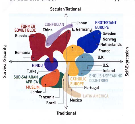 This image is a 2D graph describing two key properties of a modern society according to the paper. The horizontal axis depicts a range between "Survival/Security" and "Self-Expression". The vertical axis depicts a range between "Traditional" and "Secular/Rational". This paper defines a modern society to be one that promotes self-expression and secular beliefs. While societies that focus on survival, security and traditional beliefs are the least modern. Thus, societies represented in the top right quadrant of this graph are considered the most modern and, oppositely, societies depicted in the bottom left quadrant are the least modern. For example, Protestant Europe is considered modern with Sweden being the most modern. When analyzing this image, I focussed mainly on clarity and relevance. This image uses distinct colors for each major culture group. The colours seemed to have been chosen with no intent for qualitative nor quantitative comparison; they were chosen only to distinguish between groups. This decision was wise since using a gradient color scheme would have caused similar or close culture groups to be difficult to differentiate between. Furthermore, since this image is a graph there is no need to include another method of comparison; it would only serve to add confusion to the data. Under the topic of relevance, this graph works strongly with the paper. The examples in the paper are all found on the diagram, thus reinforcing key arguments. However, one suggestion that may decrease misunderstanding is an indication that the upper right and lower left quadrants are the extremes of the paper representing modern and otherwise. Scientific American (December 2003) p90 Spudis, Paul D. "The New Moon" 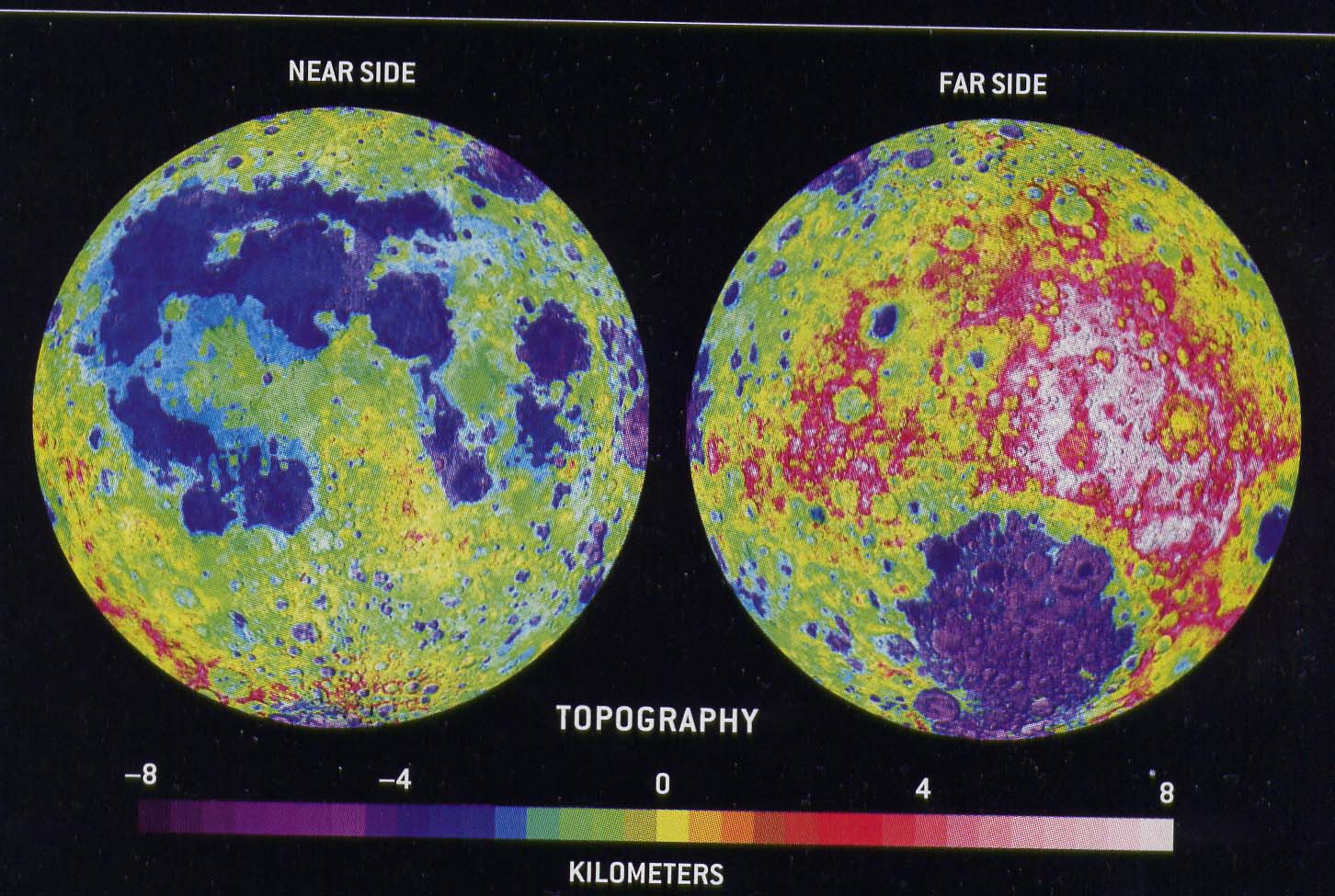 This image is a 2D topographical representation of the two halves of the moon. The property represented in the image is spot heights measured by the Lunar Prospector, a satellite. This image uses a legend using changes in hues to represent a change in topography. The colours range from dark purple to red then to white. This image's legend gives a false bias to certain colors. For example, the areas between -2 and 1 km use all but 2 hues. Understandably, this results in a more colourful and animated image. However, there is a loss of information to the reader. Peaks and troughs are hard to detect, especially those found in extremely low or high elevations. Areas near the surface average height are over accentuated with overly diverse use of colours. This image could have portrayed its data in a stronger fashion had its legend used hues in a less biased method. |
Last Modified: