ASSIGNMENT 1
(by Christian Chita)
Table of Contents:
1. Good Example of Visualization
1. a. Story Behind the Picture:
1. b. Critique:
2. Bad Example of Visualization
2. a. Story Behind the Picture:
2. b. Critique:
3. References:
1. Good Example of Visualization:
1.a. Story Behind the Picture:
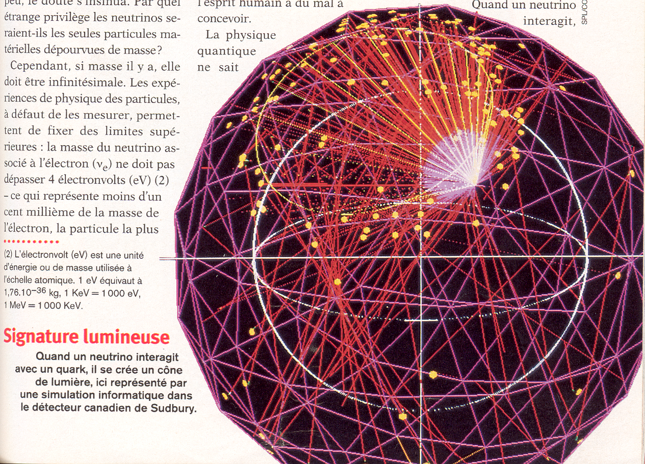
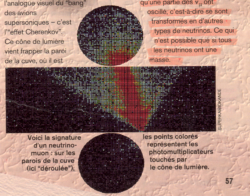
The picture illustrates a visualization of the Cherenkov effect: when a neutrino-electron (or neutrino-muon) enters a reaction with the quark of a hydrogen (or oxygen) nucleus, the result is an electron and a muon [1]. The muon is ejected at a speed far superior to the speed of light in H2O, and it produces a cone of blue light -- analog with the "bang" of supersonic aircraft (click here for more _visual_ info).
1.b. Critique:
The main reason for which I think this is a good example, would be the very nature of the particle been visualized: for example, given that neutrinos do not have electrical charge, the "bubble chamber" can only show secondary particles resulting from the collision of a neutrino with a proton.
Thus, the model available as input data looks like this:
From this 2D picture, the team of {physicians|software developers} needs to infer trajectories, impact points, and 3D shapes created by the emerging rays of light, among other things. This means that infering the final image is the result of an exercise extending far beyond a simple data-points mapping, and its value relies on its ability to acurately extend to 3D a model previously available in 2D only.
2. Bad Example of Visualization:
2.a. Story Behind the Picture:
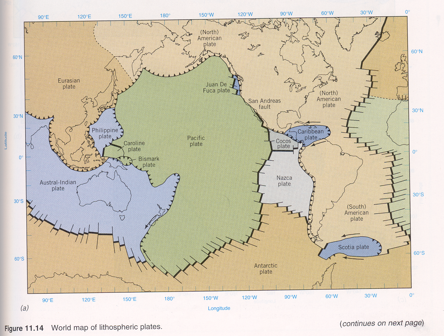
"Plate tectonics" is the theory explaining the formation, boundary interaction, and relative movement of litospheric plates [2]. The picture illustrates "the global system of [the six] lithospheric plates", and their boundaries.
2.b. Critique:
a) Clearly, there are more than 6 plates in the picture. The image fails to provide a visual cue as to which plates are "great plates", which are "lesser plates", and which are "subplates".
Furthermore, despite the text making this distinction, on the figure they are all called "plate" (like in X plate, or Y plate).
b) Even though the figure has four components (see the "continues on next page" note), only one of them features the legend required to understand the boundaries (that picture is shown bellow).
This is especially important, since a major part of this text section deals with identifying and explaining the different types of plate-borders.
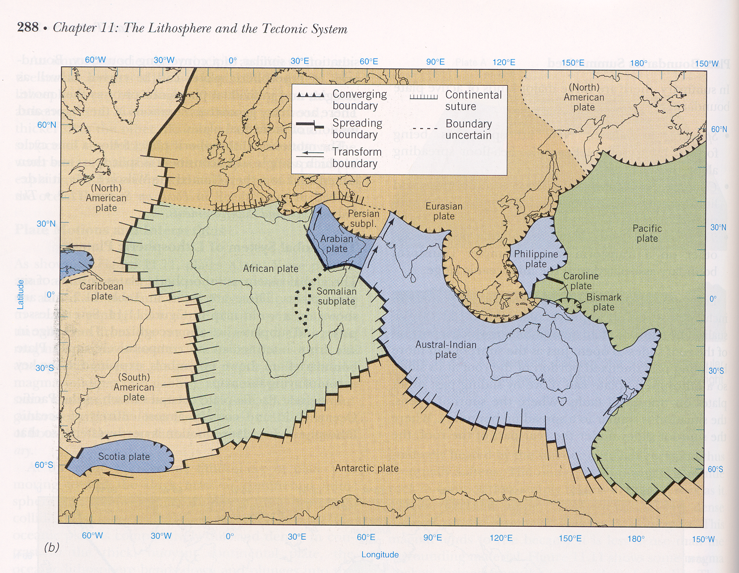
c) Even with the legend, one struggles with the following inconsistency: on the legend box, the Spreading Boundary is shown to have longer "teeth" in the horizontal direction.
However, on the actual figures, the vertical teeth are longer (than the horizontal ones). For me at least, this was confusing and counter-intuitive.
d) Given the scope of this section, and the other concepts introduced in this section, I find the addtion of the longitude and latitude values as useless:
- first, at this scale, the values are irrelevant (i.e. all I can see is that 0 degrees longitude is somewhere in the African plate)
- second, I do not need this information to analyze this picture -- it is a visual overload item
3. References:
[1] Science et Vie, No 971, aout 1998, pages 52-59
[2] Strahler, A., and Strahler, A. Physical Geography - Sceince and Systems of the Human Environment. 1997, John Wiley & Sons, New York, NY, pages 285-289)