CPSC 533C
Assignment 1
“Bad” visualization
Taken from the NASA website
A "HOT TOWER" ABOVE THE EYE CAN MAKE HURRICANES STRONGER
(http://www.gsfc.nasa.gov/topstory/2004/0112towerclouds.html)
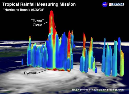
The diagram shows a hot tower inside a cyclone, based on actual satellite information. Such a hot tower is a rain cloud reaching the lowest layer of the atmosphere and its detection can predict the intensity of the cyclone.
Critique:
The color scheme is unclear (no specification in the article or the diagram). The reader can only guess that these represent temperature, yet both the temperature scale and the spatial scale are unspecified. Moreover, there is an attempt to place the “3D” data on top of an actual image of the earth. The relation between the diagram and the image is not clear (is this an accurate spatial mapping or only an illustration?), as well as the actual shape of the tower (perhaps a projection of it on the earth surface can assist).
“Good” visualization
Taken from Science Magazine
“Slow But Not Quite Silent” Timothy I. Melbourne and Frank H. Webb
Science 2003 June 20; 300: 1886-1887
http://www.sciencemag.org/cgi/content/full/300/5627/1886
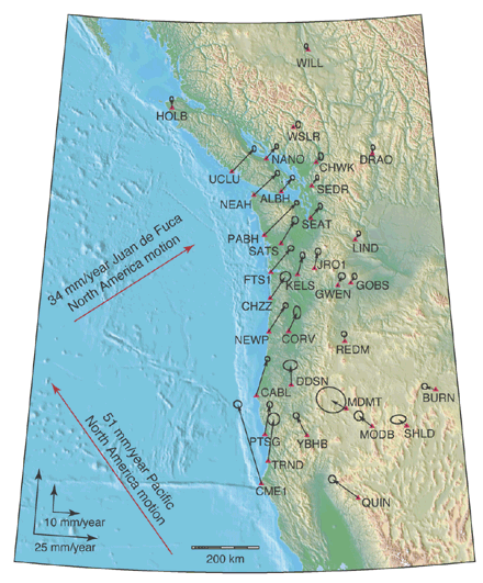
Interseismic deformation from subduction of the Juan
de Fuca plate.
The Cascadia subduction zone off the western coast of North America, with its periodic and predictable slow earthquakes (as demonstrated by the deformation vectors in the illustration), was used to test the relation between slow earthquakes and a related non-volcanic tremor in deep layers.
Critique:
The vectors shown clearly provide the zone, direction and an accurate “size” of the deformation, so that all the relevant seismic activity in the region is accesible through a single global view. Furthermore, the illustration clearly shows where do the deformations occur on top of an actual map. It also provides abbreviated city names (red triangles) allowing for simple orientation.