Figure 1: Overview of the proposed interface
In particular, political and economic issues have long occupied a prominent place in our daily lives. During the last few decades, as political competitions have intensified and politicians have become more worried about the voters' perception of them, surveys have become a very important vehicle to discerning public opinion. Politics is only one of the areas where survey administration and analysis is highly important. Economic indicators, health care policies, even network programming, are often heavily affected by the answers to the relevant questions by the surveyed subset of the population.
Statistical analysis is often used to calculate the pair-wise and higher-dimensional correlation and regression between a number of variables. This requires tedious calculations, which are made easier by batch statistical analysis tool kits. However, while these tools are able to perform the calculations flawlessly, I haven't found any that can efficiently organize all of this correlation data for overview by the user. The results for each computation would be displayed separately, or have to be aggregated into a table for comparison, requiring the user to then go back to the data and perform further calculations if a relationship of interest is found.
The main task this tool aims to support the exploration of relationships, and in particular the degree of correlation between the various questions on a survey. The task requires the understanding of each question and its dataset separately, as well as in the larger context of relationships with the answers to all (or some of) the other questions. The goal of the proposed tool is to provide visual cues as to the trends within the data, while allowing the user to select the criteria to narrow down the search across a number of independent dimensions. It should also allow the user to bring together all the information relevant to survey exploration, such as the background information on the survey, the phrasing of the actual questions and answer choices, as well as the gathered data.
Depending on the particular task they are faced with, users could concentrate on looking for either outliers or general trends within the data. I propose to omit the question of outliers for the time being, and concentrate on helping the user discover the various higher-level trends.
The NES website releases, for most years, both pre- and post-election surveys. For some years, they claim that nearly 75% of the material on the questionnaires is in common. It would be nice to be able to explore the responses to the same question in both pre- and post-election survey for a given year. However, having not explored the data in too much details, I am not sure whether there is an easy way to automatically determine the corresponding questions.
Another option is the Behavioral Risk Factor Surveillance System from the National Center for Chronic Disease Prevention and Health Promotion. I would plan on using this if the NES data is somehow unsuitable. However, after exploring the raw data files available from the NES, I don't foresee and problems. The one advantage the BRFSS survey has is the amount of data - on the order of hundreds of thousands, as compared to a few thousand for the NES data.
The questionnaires in both databases have on the order of 50-200 questions. The NES datasets have on the order of 1,000 respondents, while the BRFSS datasets have on the order of 100,000. One viable alternative is to test out the system with the smaller NES dataset, and then move on to the larger dataset if time permits [see milestones]. This would also have the added benefit of demonstrating that the tool scales, or revealing any potential problems with scaling.
Proposed solution
My proposal for the display of survey questions and their correlations was inspired, in large part, by TextArc, a text visualization engine. To enable the user to make decisions about meaningful relationships between survey questions, the ability to rapidly browse through results of multiple comparisons, between various numbers of questions, is necessary. Visualization is a much better way of presenting this data than simple spreadsheet-like displays.
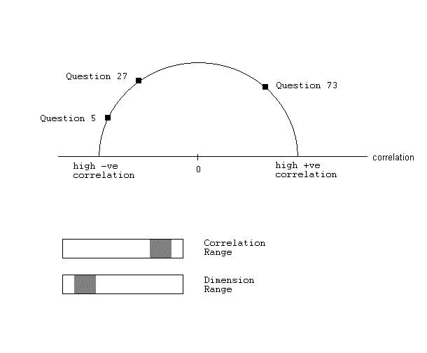
The basics of the survey visualization technique I propose is shown in Figure 1. Points that represent the questions in the survey are arranged on the circumference of the semi-circle. The horizontal line, the diameter of the semi-circle, is a scale that goes from high negative correlation on the left to high positive correlation on the right, passing through zero at what would be the center of the circle is the semi-circle were completed. This is the basic setup. I am not yet sure which exact mathematical formula will be used to compute the values along this axis - correlation and regression are two possible choices - but I will refer to values along this line simply as "correlation" in my description. The points displayed on the "correlation" axis will be calculated using statistical analysis methods, most likely involving multivariate correlation or regression mechanisms. Perhaps the correlation axis will be changed to simply go from low to high, and then the user can open up the exploration window, discussed below, to determine whether it is positive or negative.
The parameters of the visualization should be controlled by at least two sliders, both of which enable the user to select a range of values, filtering out the un-interesting relationships. One slider will control the range of correlations, so that only the points that fall within this range will be displayed. The range will be determined once I figure out which values the statistical functions, used to calculate the values of these points, can yield. The other slider will control the range of dimensions between which the relationships are being explored, where each dimension corresponds to a question. In other words, this is the range of the size of sets of questions that the user wants to explore relationships between. For example, if the range is between 2 and 4, the user is interested in seeing all relationships in two-, three-, and four-question sets.
By enabling the user to select different ranges, this should allow them to isolate the sets that may need closer exploration. In addition, larger line width for elements in larger sets of questions will direct the user's attention to themselves: it is not often that a large number of questions show strong positive correlation among themselves, and thus this case probably deserves further analysis, and will stand out accordingly. By clicking on the point on the correlation axis where these lines meet, the user will be taken to the parallel plot of the raw data, restricted to the questions in this set. There they will be able to manipulate the different coordinates to discover more intricate clusters in the general high-correlation relationship.
Points on the circumference(questions) are connected to a point on the line(diameter) if there is a relationship with that value of the correlation between them. Width of the line used to connect these points adds visual saliency to the (presumably) more interesting results - the more questions that are involved in the relationships, the wider the line. See Figure 2 for an example. Use of color is also possible to make certain relationships stand out, and I will explore this as time permits. One aspect that is to be determined is the way in which the intermediate results will be clustered to provide meaningful relationships in higher dimensions.
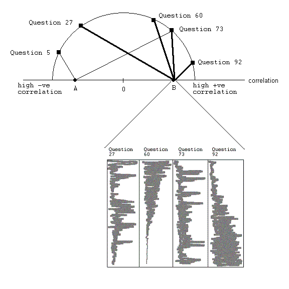
After finding an interesting relationship, the user will probably want to explore that particular subset of the data in more detail. To that end, I propose linking this display to a parallel coordinates display. By clicking on a point on the diameter, the user will be shown a parallel coordinates display where the raw data for each of the questions will be laid out on a separate coordinate. The user can then explore this relationship more thoroughly, with the parallel coordinates revealing more detailed patterns that would have been obscured in the overview display. It may be that to decrease the abruptness of this transition, it will be necessary to keep the parallel coordinates display open at all times, and then cluster the appropriate coordinates when the user requests it as above.
Additionally, I believe that other methods may be necessary to facilitate the overview by the user. For example, consider a situation where many questions are weakly correlated, and that range is selected on the slider. In this case may points will still be clustered into a relatively small range on the line. I propose some sort of zooming to expand the space, perhaps by expanding selected range to fill the whole diameter. The user may also want to see the actual phrasing of the question, and all the choices available to the respondent, instead of exploring assigned values. Something like a small contextual pop-up on mouse-over of every question point, that displays the question and the answer choices as presented to the respondent, may be appropriate. These are areas to which I will devote more attention only if time allows.
Suppose the user loads a survey dataset in, and would like to find all sets of questions that have a very strong relationship amongst themselves. Initially, they will see a big mess of lines as all the relationships are displayed (this will depend on the default setting of the sliders, which will probably require some experimentation). By selecting only the top range on the "correlation" slider (corresponding to those sets having a high positive correlation between all the questions in the set), the user will see plots of all the points on the correlation axis that fall within this range. Presumably, these are the items of highest interest, in general. They may also choose to limit the "dimension" slider to more than 5 variables, since they want to explore wide-reaching trends, and are not interested in pair-wise comparisons.
After the filtering parameters have been set up, a much smaller subset of these plots is visible. By looking for the thickest lines, the user will be able to find the correlated set that has the largest number of questions, and still falls in the selected correlation range. Alternatively, they can look along the "correlation" axis, and find the right-most point. By clicking on the point discovered, the user will be taken to a parallel coordinates plot, which will display the data only for the questions in the set.
If the user wants to get the context of these results, they will be able to do so by looking at the text of the survey question and its response options on demand, for each of the questions in the relationship. If this is implemented unobtrusively, e.g. with a mouse-over pop-up as suggested before, I think that it will offload some of the cognitive effort from the user, and the information will now be available in one tool, instead of having to jump between the statistical analysis package and the description of the survey and question listings.