|
Good visualization
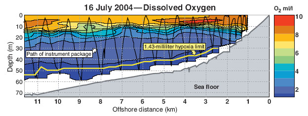
This visualization represents an underwater diagram of the central Oregon coast taken on the 16th of July 2004 by towed array sensor called an "acrobat" for it's ability to 'fly' underwater with hydroplanes. Represented here is the sea floor in gray and a narrow band in white above the sea floor where the sensor package was unable to make measurements. Above this the volume of oxygen in ml/l is denoted using a color chart and further defined by providing borders in black between the layers. There are two additional pieces of information, one is a zig-zag line showing the path of the sensor package, and the second is a yellow line drawn onto the diagram to show the 'hypoxia limit' of 1.43 ml/l beneath which most marine life cannot survive.
Source: Service, Robert F.
"OCEANOGRAPHY: New Dead Zone Off Oregon Coast Hints at Sea Change in Currents" Science 2004 305: 1099-
There are several elements to this visualization that make it both visually appealing and easily interpreted. The critical information the author wishes to convey, the hypoxia limit, is clearly visible and labeled in a large enough font to be readable. Using a dialog box around the text prevents clutter from the chart from obfuscating the text. The use of color showing the distribution of oxygen by volume through well designated layers is much easier to interpret than if the author had simply used a black and white or gray scale chart and noted the densities in type on the chart. None of the lines on the chart interfere with one another and the path of the sensor package itself is primarily on a different axis than the lines designating the oxygen density layers which allows it to be distinguished, and again this zigzag line is clearly labeled in a readable font. The vertical axis (depth) and the horizontal axis (distance offshore) are intuitive for almost any viewer.
Bad visualization
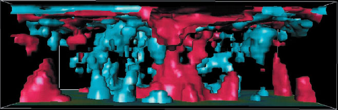
This visualization represents structure in the mantle taken by seismic tomography (models and images created through measurements made from earthquakes or explosions). The blue areas represent where the shear wave velocity is 0.6% higher than normal, which is considered cold material. The red areas are where shear wave velocity is 1% lower than normal, representing hot material. The top of the visualization is the earth's surface, the bottom is the core mantle boundary (CMB). Downwelling oceanic plates are sinking towards the CMB, and two large red plumes under Africa (on the left of the visualization) and the pacific (center of image) are rising.
Source: Tackley, Paul J. "Mantle Convection and Plate Tectonics: Toward an Integrated Physical and Chemical Theory"
Science 2000 288: 2002-2007
This visualization is initially appealing because of its fluid, three dimensional appearance, and provides what could be described as the "gee wiz" factor. However, it isn't at all clear from the visualization what is being modeled, where geographically we are looking, nor does it give any axis references to provide the viewer with a scheme for observing relative distances. The write up explains that the large red mass in the lower left is under Africa, and the other large red mass is under the pacific, but this chart might just as easily show the heat dispersion patterns in a pan of lasagna. There is unquestionably a lot of data being displayed here, but it isn't in a format that is usable either to a researcher in the field, or even to a layman. At a minimum axis labels and a color chart would assist the viewer in interpreting the data being displayed here.
|