CPSC 533C
Assignment #1
Meghan Allen
Good visualization:
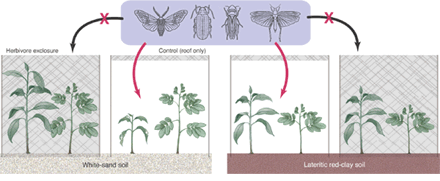
Source: Science, Vol 305, Issue 5684, 619-621 , 30
July 2004 (http://www.sciencemag.org/cgi/content/full/305/5684/619)
This
picture illustrates an experiment in which the survival rate and growth of trees were
measured. Different species of trees
were transplanted into two types of soil and either enclosed in mesh to keep
out insect herbivores, or exposed to the insect herbivores.
I think
this is a good visualization because I get a good sense of what the
experiment is about without having to read the text. The arrows with an X through them clearly
show that insects do not have access to the trees in the grey enclosures and
the red arrows clearly show that the insects do have access to the trees in the
control groups. The two types of trees
shown in each of the 4 enclosures demonstrate that it is the same species used
in each situation. Finally, the two
different types of soil are coloured appropriately so I can easily see that
they are different.
Bad visualization:
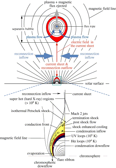
Source: J. Lin and W. Soon, Evolution of
morphological features of CMEs deduced from catastrophe model of solar
eruptions, New Astronomy, Volume 9, Issue 8, October 2004, Pages 611-628.
(http://www.sciencedirect.com/science/article/B6TJK-4C6XTPT-3/2/d8c111ae2b3eff94c001f1b171b79d47)
doi:10.1016/j.physletb.2003.10.071
This
diagram shows the disrupted magnetic field that is created during a solar
eruption. The corona, a current carrying
flux rope, is forced upwards which stretches the adjacent magnetic field so
much that it essentially opens up.
This
visualization is confusing and unclearly labeled. It appears that some of the labels are connected
to their corresponding part on the diagram with a line, but others with an
arrow. Arrows are also used as part of
the diagram, which adds to the confusion.
The image, particularly the bottom diagram, is very cluttered with
labels and it is difficult to determine exactly which label corresponds with
each part on the diagram. It is unclear
to me how the top and bottom diagram relate to each other, and it is not
mentioned in the text. The text
indicates that colours are used to display the plasma layers in different
temperatures, but no legend is shown to explain what each colour represents.