Good Visualization
Kerstin Lindblad-Toh,
Claire M Wade, Tarjei S. Mikkelsen,
Elinor K. Karlsson, David
B. Jaffe, Michael Kamal, Michele Clamp, Jean L.
Chang, Edward J. Kulbokas, III, Michael C. Zody, Evan Mauceli, Xiaohui Xie, Matthew Breen,
Robert K. Wayne, Elaine A. Ostrander, Chris P. Ponting,
Francis Galibert, Douglas R. Smith, Pieter J. deJong, Ewen Kirkness,
Pablo Alvarez, Tara Biagi, William Brockman, Jonathan
Butler, Chee-Wye Chin, April Cook, James Cuff, Mark
J. Daly, David DeCaprio, Sante
Gnerre, Manfred Grabherr, Manolis Kellis, Michael Kleber, Carolyne Bardeleben, Leo Goodstadt,
Andreas Heger, Christophe Hitte,
Lisa Kim, Klaus-Peter Koepfli, Heidi G. Parker, John
P. Pollinger, Stephen M. J. Searle, Nathan B. Sutter,
Rachael Thomas, Caleb Webber and Eric S. Lander (2005). Genome sequence,
comparative analysis and haplotype structure of the
domestic dog. Nature 438,
pp. 803-819.
Available at http://www.nature.com/nature/journal/v438/n7069/full/nature04338.html
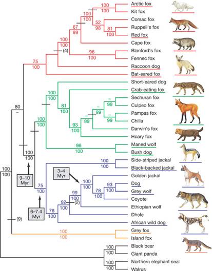
Original Figure Caption: The phylogenetic
tree is based on approx15 kb of exon and intron sequence (see text). Branch colours
identify the red-fox-like clade (red), the South
American clade (green), the wolf-like clade (blue) and the grey and island fox clade (orange). The tree shown was constructed using
maximum parsimony as the optimality criterion and is the single most
parsimonious tree. Bootstrap values and bayesian
posterior probability values are listed above and below the internodes,
respectively; dashes indicate bootstrap values below 50% or bayesian
posterior probability values below 95%. Horizontal bars indicate indels, with the number of indels
shown in parentheses if greater than one. Underlined species names are
represented with corresponding illustrations. (Copyright permissions for
illustrations are listed in the Supplementary Information.) Divergence time, in
millions of years (Myr), is indicated for three nodes
as discussed in ref. 1. For scientific names and species descriptions of canids, see ref. 119. A tree based on bayesian
inference differs from the tree shown in two respects: it groups the raccoon
dog and bat-eared fox as sister taxa, and groups the
grey fox and island fox as basal to the clade
containing these sister taxa. However, neither of
these topological differences is strongly supported (see text and Supplementary
Information).
The above figure is a phylogenetic tree of canine species demonstrating speciation
over time and genetic similarities between groups. The x-position illustrates when speciation
occurred, and what species derive from this speciation. When information is available, phylogenetic trees often display evolution times according
to y-position (this was not possible in the present diagram). Colour is
frequently used to illustrate species groupings or categorical traits held by
species. This particular tree is based
on exon and intron
sequences and demonstrates the probable evolutionary branching that
occurred. This data representation is
typical of modern phylogenetic trees with all living
species aligned with one another, speciation represented by branching lines,
and genetic diversity and similarity implicitly represented by the branching
order, and the physical proximity of one species to another. Many phylogenetic
trees provide statistical support for their chosen orderings. Branching order for this figure was
determined by two means: bootstrapping and Bayesian posterior probability
values. Dashes in place of a number
indicate that the bootstrap values were below 50% or the Bayesian posterior
probability was below 95% (the chances that such genetic similarity is by
chance is less than 5%). Branch colours allow the reader to quickly categorize and group
canine species. Finally, species illustrations
are provided on the far right to illustrate what animals from each group look
like. Illustrations correspond with
underline species names of matching colour and
approximately matching y-position. Known
evolutionary dates are individually identified.
As stated above, this figure is a
fairly typical phylogenetic tree. Phylogenetic
trees are a traditional way that evolutionary biologists can quickly and
clearly group animal species by evolutionary history (based on species
proximity), illustrate common ancestors (where branching between species
occurs), and visually illustrate genetic disparity between species (the number
of branches between species). The
x-position of any speciation event can also correspond with a time scale in
some phylogenetic trees. Appropriately, there is no hierarchy amongst
modern species. For this particular
tree, the statistical justification for the given branching order is provided,
and line colours enable the reader to quickly group
species. Finally, this visualization is
appropriate for its target audience.
Nature is not a journal exclusive to biologists so common names are used
and illustrations are provided. These
illustrations also provide an informal means of comparison between
species. Speciation timelines are
probably not known for each branching event.
Individual known speciation times are thus identified individually.
Bad Visualization
Hilmer,
G., Elliott, G., Cunliffe, D. and D. Tudhope (2000). Open
educational hypermedia systems: an n-dimensional framework for user profile
interchange. In proceedings of EDMEDIA
2000,
Abstract viewable at http://www.editlib.org/index.cfm?CFID=32335993&CFTOKEN=79248554&fuseaction=Reader.ViewAbstract&paper_id=16107
This figure seems to have little
or nothing to do with the accompanying article.
Hilmer et al.’s work discuses Educational
Hypermedia Systems and how modeling user knowledge can help the system to be
more pedagogical effective. The authors
discuss “dimensions” of user modeling, and how to share user models between
systems that require different dimensionality.
The above figure was preceded with the following statement: “The
following chart visualizes our n-dimensional mapping approach of UPI in OHES:”. OEHS stands for
Open Educational Hypermedia Systems (the authors seem to have inverted two
letters), UPI is User Profile Interchange and AHS is an acronym for Adaptive
Hypermedia Systems. This chart seems to
be trying to demonstrate how user model dimensionality can be changed from one
application to another.
The above figure does not really
display any real information, despite its large size. One axis is unlabelled while the other does
not clearly articulate any information other than graphically displaying 5
levels along the y-axis. The x-axis is
assumed to also be showing AHS dimensions, although this is not actually
illustrated. Neither axis has the
dimension numbers labeled nor is it clear why the top and right sides of the
chart are terminated with a curved line.
The purpose of this chart seems to be to show how user model
dimensionality can be changed from one application to another, but this
visualization doesn’t demonstrate how this occurs. This chart really doesn’t seem necessary in
any way.