Empirical Guidance on Scatterplot and
Dimension Reduction Technique
Choices
Abstract |
Paper |
Supplemental Material |
Talk |
HighRes Figures
Abstract
To verify cluster separation in high-dimensional data, analysts often reduce the data with a dimension reduction (DR) technique, and then visualize it with 2D Scatterplots, interactive 3D Scatterplots, or Scatterplot Matrices (SPLOMs).
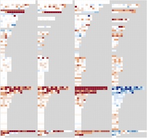
With the goal of providing guidance between these visual encoding choices, we conducted an empirical data study in which two human coders manually inspected a broad set of 816 scatterplots derived from 75 datasets, 4 DR techniques, and the 3 previously mentioned scatterplot techniques. Each coder scored all color-coded classes in each scatterplot in terms of their separability from other classes. We analyze the resulting quantitative data with a heatmap approach, and qualitatively discuss interesting scatterplot examples.
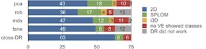
Our findings reveal that 2D scatterplots are often 'good enough', that is, neither SPLOM nor interactive 3D adds notably more cluster separability with the chosen DR technique. If 2D is not good enough, the most promising approach is to use an alternative DR technique in 2D. Beyond that, SPLOM occasionally adds additional value, and interactive 3D rarely helps but often hurts in terms of poorer class separation and usability. We summarize these results as a workflow model and implications for design. Our results offer guidance to analysts during the DR exploration process.
Paper
Empirical Guidance on Scatterplot and Dimension Reduction Technique Choices
IEEE Trans. Visualization and Computer Graphics (Proc. InfoVis 2013)
19(12): 2634-2643,
2013.
Supplemental Material
Video: Lookup table of all 816 scatterplot representations we inspected in our study.
→
AVI video (60.8 MB, no audio, tested on VLC 1.1.12)
Supplemental figures, examples and explanations
(List of all datasets, further heatmaps, further selected examples, SPLOM evaluation, Coding guidelines):
→
PDF (4.1 MB)
Talk
Talk at InfoVis 2013 in Atlanta, Georgia, USA (Oct 18, 2013):
→
PDF (12.6 MB)
HighRes Figures
High resolution images of heatmaps and scatterplot examples can be found in the supplemental material:
→
PDF (4.1 MB)
(Blue bars reflect how often 2D was good enough; green show how often SPLOM was notably better than 2D for at least for one class; yellow shows how often i3D was better than that; and red indicates that neither 2D, SPLOM, nor i3D revealed any class that scored higher than two. Gray indicates the 28 cases when R could not compute the di- mension reduction. Top four rows = within-DR analyses, Bottom row = cross-DR)
Michael Sedlmair
Last modified: Aug 20, 2013