GEViTRec: Data Reconnaissance Through Recommendation Using a Domain-Specific Visualization Prevalence Design Space

Anamaria Crisan, Shannah Elizabeth Fisher, Jennifer L. Gardy, and Tamara Munzner


Abstract | Paper | Open Source | Figures | Supplemental Material

Abstract

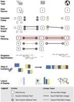
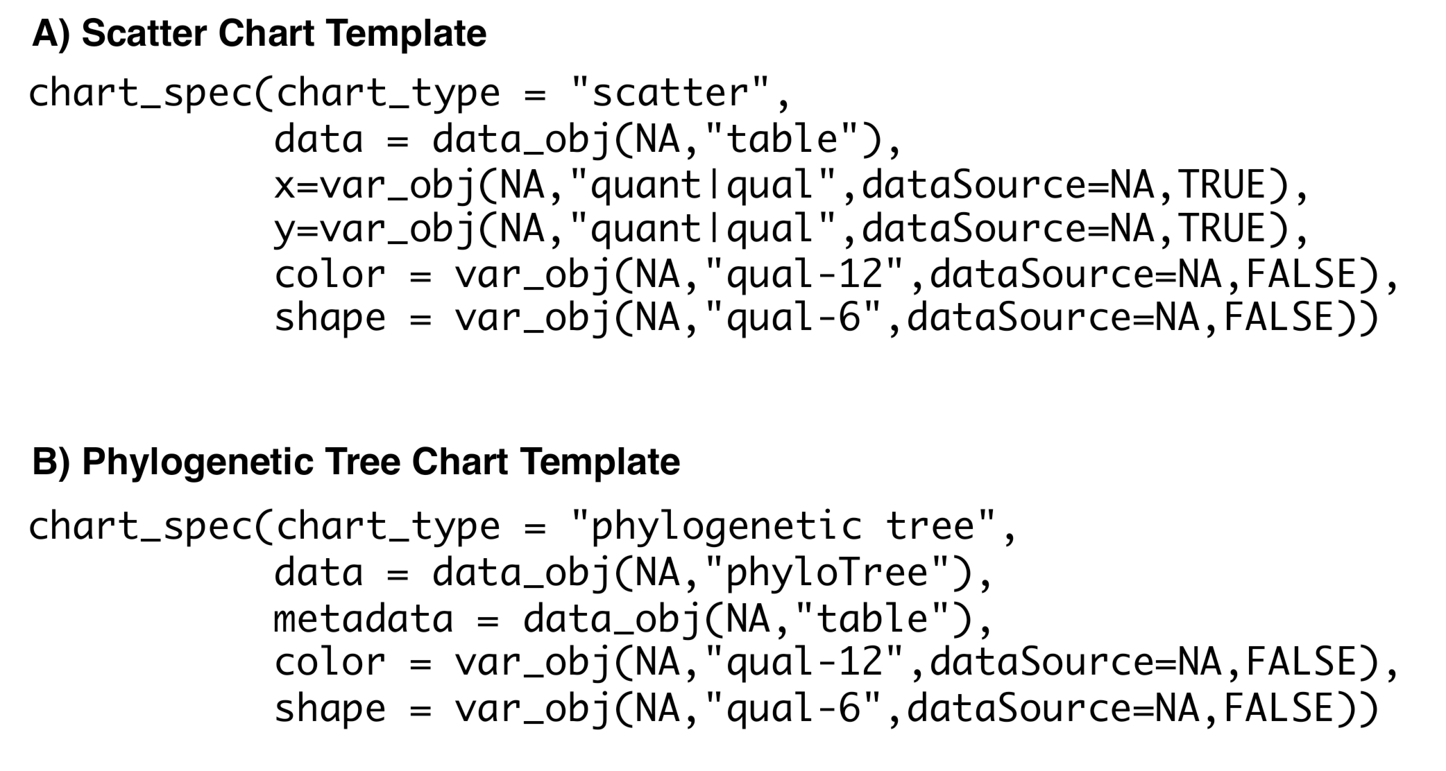
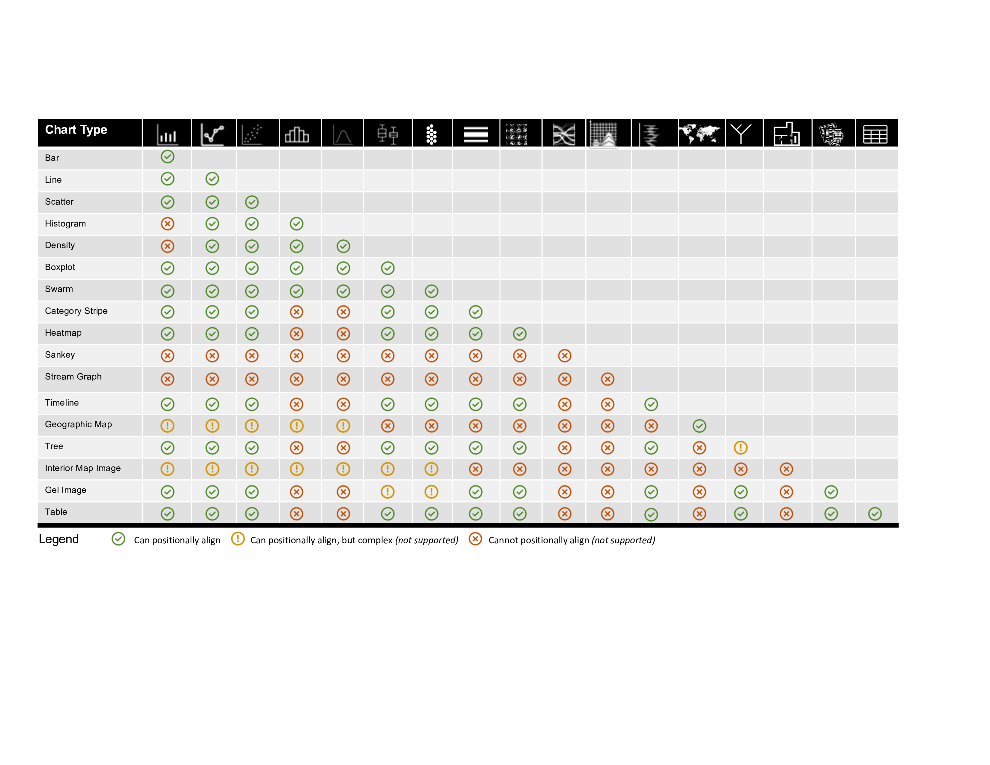
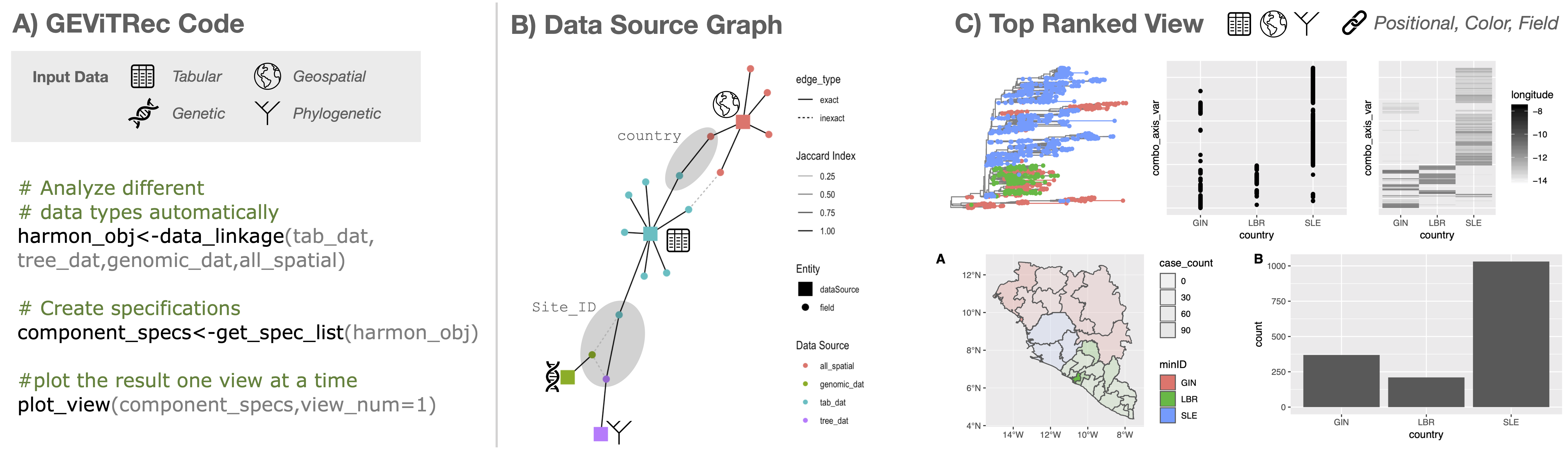
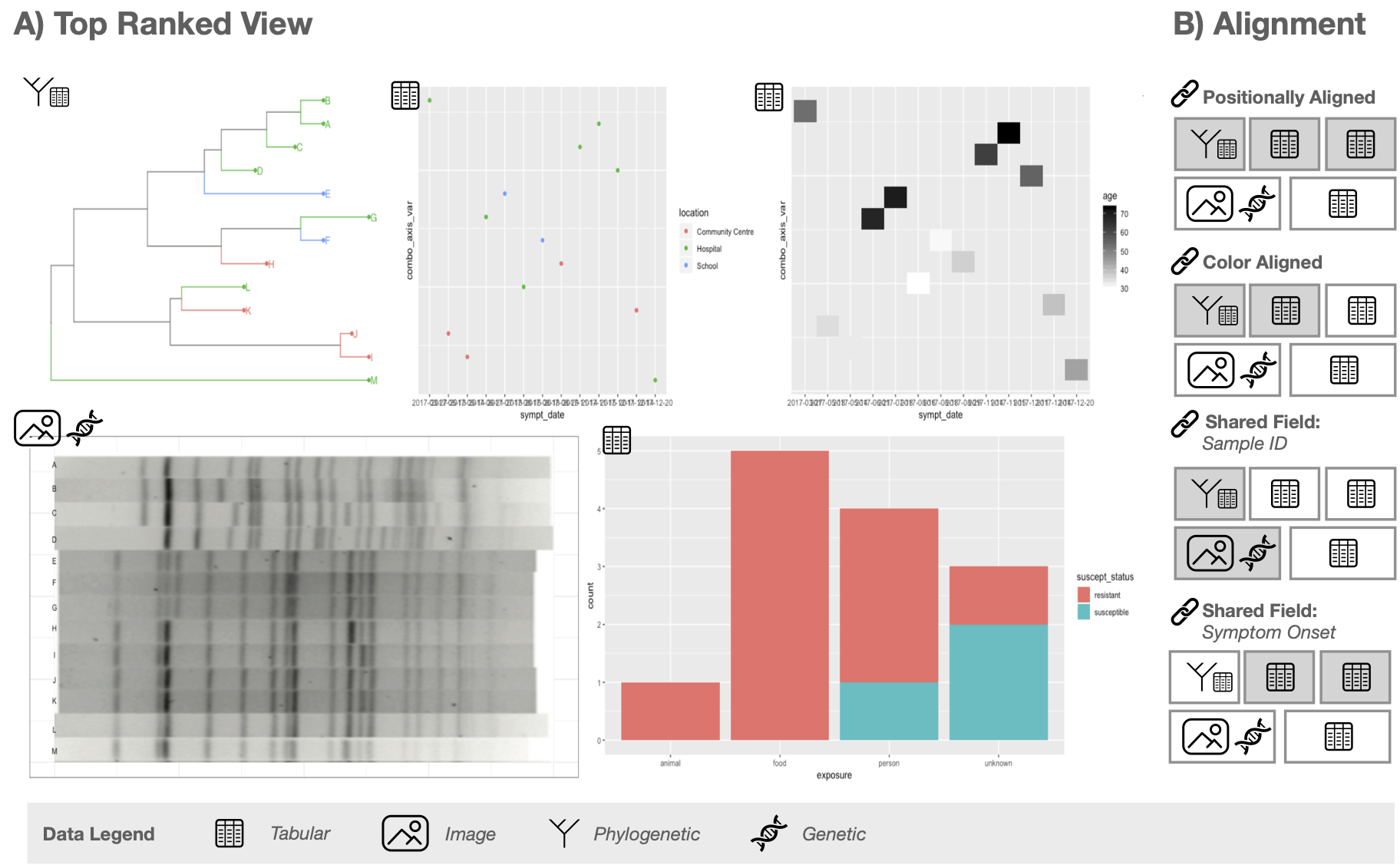
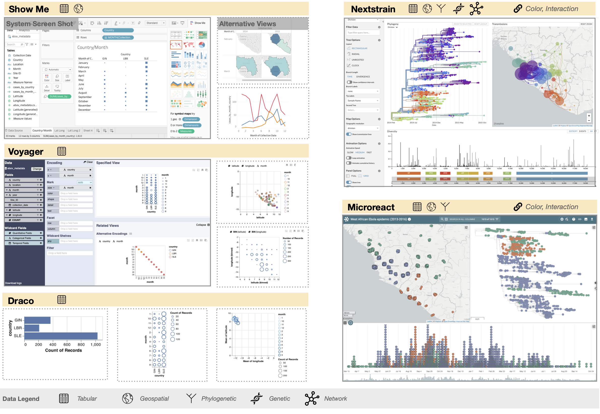
Genomic Epidemiology (genEpi) is a branch of public health that uses many different data types including tabular, network, genomic, and geographic, to identify and contain outbreaks of deadly diseases. Due to the volume and variety of data, it is challenging for genEpi domain experts to conduct data reconnaissance; that is, have an overview of the data they have and make assessments toward its quality, completeness, and suitability. We present an algorithm for data reconnaissance through automatic visualization recommendation, GEViTRec. Our approach handles a broad variety of dataset types and automatically generates visually coherent combinations of charts, in contrast to existing systems that primarily focus on singleton visual encodings of tabular datasets. We automatically detect linkages across multiple input datasets by analyzing non-numeric attribute fields, creating a data source graph within which we analyze and rank paths. For each high-ranking path, we specify chart combinations with positional and color alignments between shared fields, using a gradual binding approach to transform initial partial specifications of singleton charts to complete specifications that are aligned and oriented consistently. A novel aspect of our approach is its combination of domain-agnostic elements with domain-specific information that is captured through a domain-specific visualization prevalence design space. Our implementation is applied to both synthetic data and real Ebola outbreak data. We compare GEViTRec's output to what previous visualization recommendation systems would generate, and to manually crafted visualizations used by practitioners. We conducted formative evaluations with ten genEpi experts to assess the relevance and interpretability of our results.

Paper


GEViTRec: Data Reconnaissance Through Recommendation Using a Domain-Specific Visualization Prevalence Design Space
IEEE Trans. Visualization and Computer Graphics. (Early Access)

» UBC Pre-Print PDF
» IEEE TVCG DOI


Open Source

» Open source code on Github


High-Resolution Figures

Fig. 1. GEViTRec Overview. The algorithm is illustrated with sources of three data types: #1 tree with associated tabular data, #2 tabular, and #3 spatial. The exploded attribute fields within these data sources are classified into numeric and non-numeric field types. The similarity of categories between pairs of non-numeric attribute fields is computed with the Jaccard index to establish exact and inexact linkages between data sources. The data sources, their attribute fields, and the linkages between their fields are used to generate a data source graph. The paths of the data source graph that link pairs of data sources are enumerated and ranked according to their link strength, diversity, and total relevance. For each path, in order of rank, partial specifications are generated for individual charts. They are modified to express linkages through aligned positional axes or color palettes, then arranged into a grid layout and the specifications are rendered into displayable pixels.

Fig. 2. Chart Templates. These initial partial specifications for chart templates are pre-defined and internal to GEViTRec, not exposed to the user. Examples: (a) Scatter chart. (b) Phylogenetic tree. Visual encoding design space for non-contiguous time series slices. Green: Supported, Yellow: Partially supported, Red: Not supported

Fig. 3. Compatible chart types for positional alignments.

Fig. 4. GEViTRec results: real Ebola outbreak data. A) The GEViTRec code required to generate this view. B) The data source graph generated by GEViTRec. C) The highest ranked view generated by GEViTRec contains five charts of different types, featuring a positionally aligned combination across the three top-row charts and color alignment between the tree on the top row and the map on the bottom.

Fig. 5. GEViTRec results: synthetic genEpi data. A) The fourth ranked view generated by GEViTRec for simple dataset with 13 samples. B) Diagram depicting the types of alignments between the five charts.

Fig. 6. We summarize the visualization recommendations of ShowMe, Voyager, and Draco alongside the human curated dashboards of Nextstrain and Microreact. Where applicable, we show a screen shot of the whole system (solid border outline) and a subset of alternative views (dashed border outline) that are generated by the system. For ShowMe and Voyager, the UI also contains the specification in the form of data columns dragged to encoding positions. The specifications for Draco are in the Supplemental Materials. Adjacent to the name of each system we also summarize the types of data sources that each system supports as well as the way that visual coherence and, if applicable, interaction is used to link information between charts. Both Nextstrain and Microreact have rudimentary linked highlighting, applicable to only a single point at a time through a click operation. Finally, Nextstrain and Microreact have pre-defined specifications of the visualizations that are created by the tool designers and exist as a fixed set of visualization templates in the interface that are populated by fields of the input data; they do not have alternative views. The directly comparable GEViTRec results are shown in Figure 4.

Supplementary Materials

» Supplemental Material
(PDF)
Last modified: Mon Oct 25 14:12:44 PDT 2021